AAALLLMOST THERE
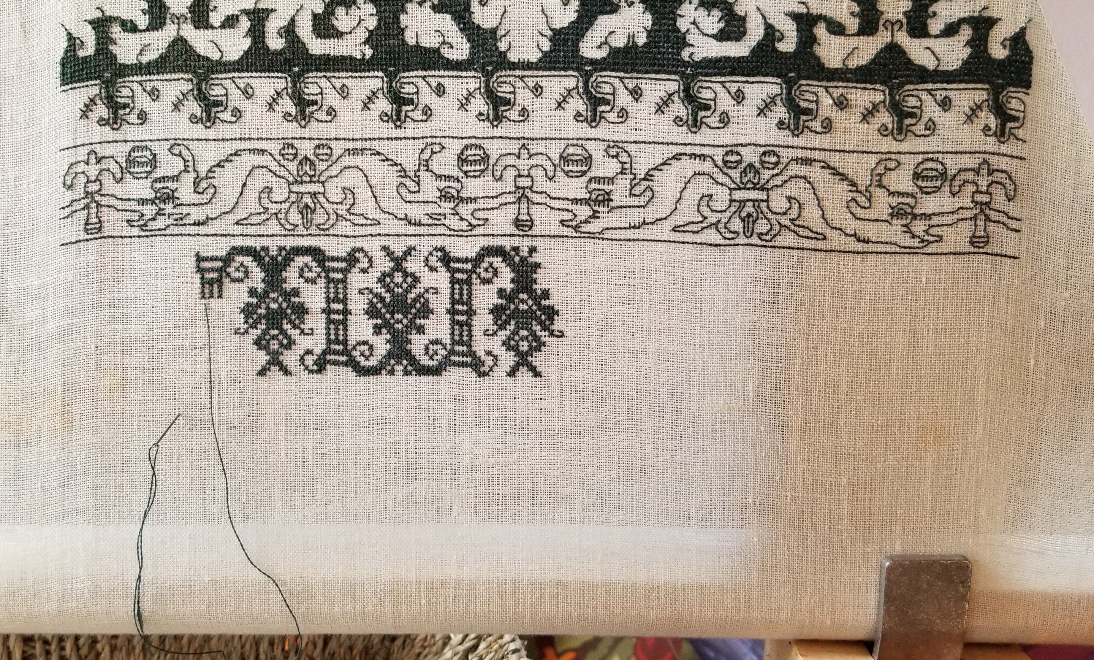
The hounds and pelican strip is finished!

I know of two mistakes on it, which I may or may not go back and pick out. I’m also thinking of adding another heart-bud immediately underneath the hounds’s forepaws. It’s not in the original, but that area looks a bit barren to me.
Now to go on to the next strip. Here’s the whole piece laid out, so you can see the (problematic) real estate that remains:

I was originally planning for two more strips, one medium dark, and one quite dark to add balance to the piece as a whole. But there’s this…
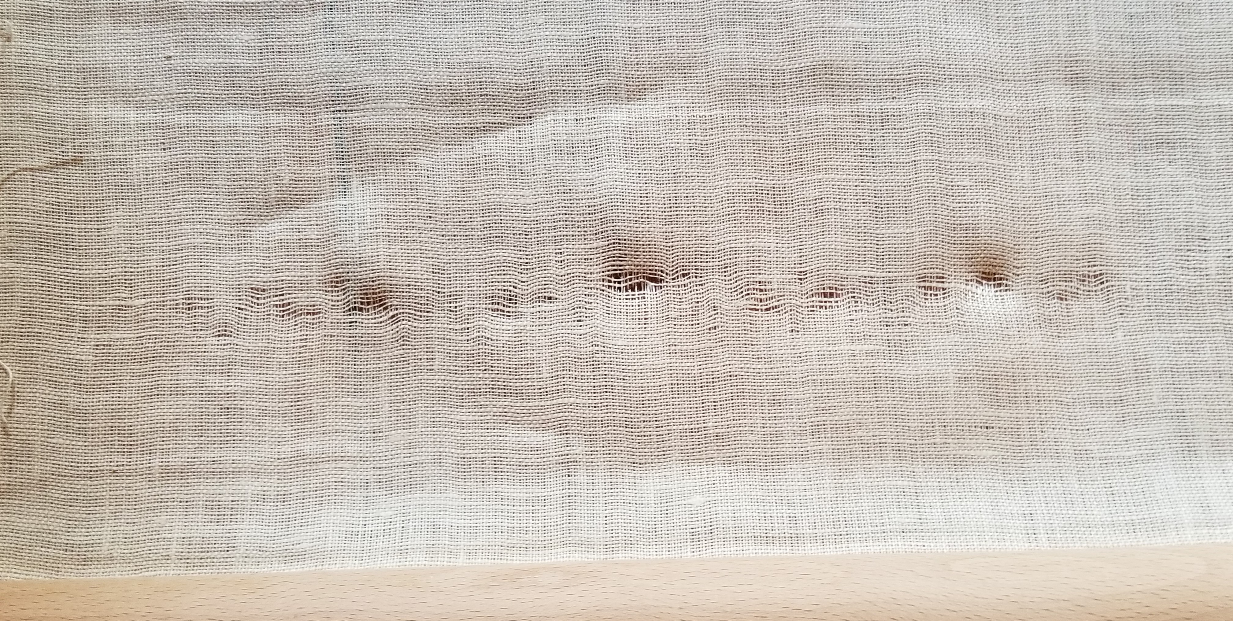
Damage! And not just distorted weave that can be gently stroked back into place – actual breakage of multiple warp threads, and too many to compensate. There’s no going around this. I have to end my sampler out about three or four inches short of my intended length.
How did it happen? Many reasons:
- Very gauzy, fragile linen ground to begin with.
- Abuse during two shipments back and forth to India. While it was unmounted from the verticals, I left it on the horizontals of my frame, scrolled up so that the unworked portion was on the outside. The resulting bundle was then wrapped in a thick cloth, and put into the shipping crate that held my hobbies. Where it probably abraded somewhat against the surrounding objects.
- Abuse since returning. I’ve been schlepping the thing around with me to show off at gatherings where embroiderers might be present.
- Not sufficiently padding the unworked portion. I put a couple layers of scrap muslin in between the stitched portion of the piece as I advance the scroll while working. But I did not pad the unworked portion. That was a mistake, leading to extra tension when I remounted my Long Green for work last month
- It has been what… nine years since I started this?
The aggregate result was that the area that had been rubbed and abused over time, and that had been fragile to begin with, under tension of my re-mount, began to give way. Note to self – no matter how tempting, avoid gossamer grounds and stick with more beefy linens…
So now instead of two or three strips to finish, I’m looking at one or two, in order to leave at least three inches between the breakage area and the bottom of the stitching. I may also reinforce the bottom bit by actually basting on some muslin to help take the strain of remounting for stitching – an extra precaution that I would remove before mounting for display.
OK. What to finish with. I’m not sure. First I have to measure out my area to figure out the maximum height of what can be stitched there. Then depending on how tall that workable area is, there are several classic designs I’m considering. But a couple of them I have not yet drafted up (T3CM fodder?), so I may take a quick side journey into another simple piece while I’m thinking it over.
Stay tuned!
BUNNY-HOUNDS AND PELICANS
Last week’s columns and plume flowers strip was a quick one. Not the least because it was in plain old cross stitch. I am pleased with the darker-but-not-overwhelming density. And as you can see, I’m on to the next one, featuring the hounds and pelicans, yet another design that will be in the ever-forthcoming T2CM:
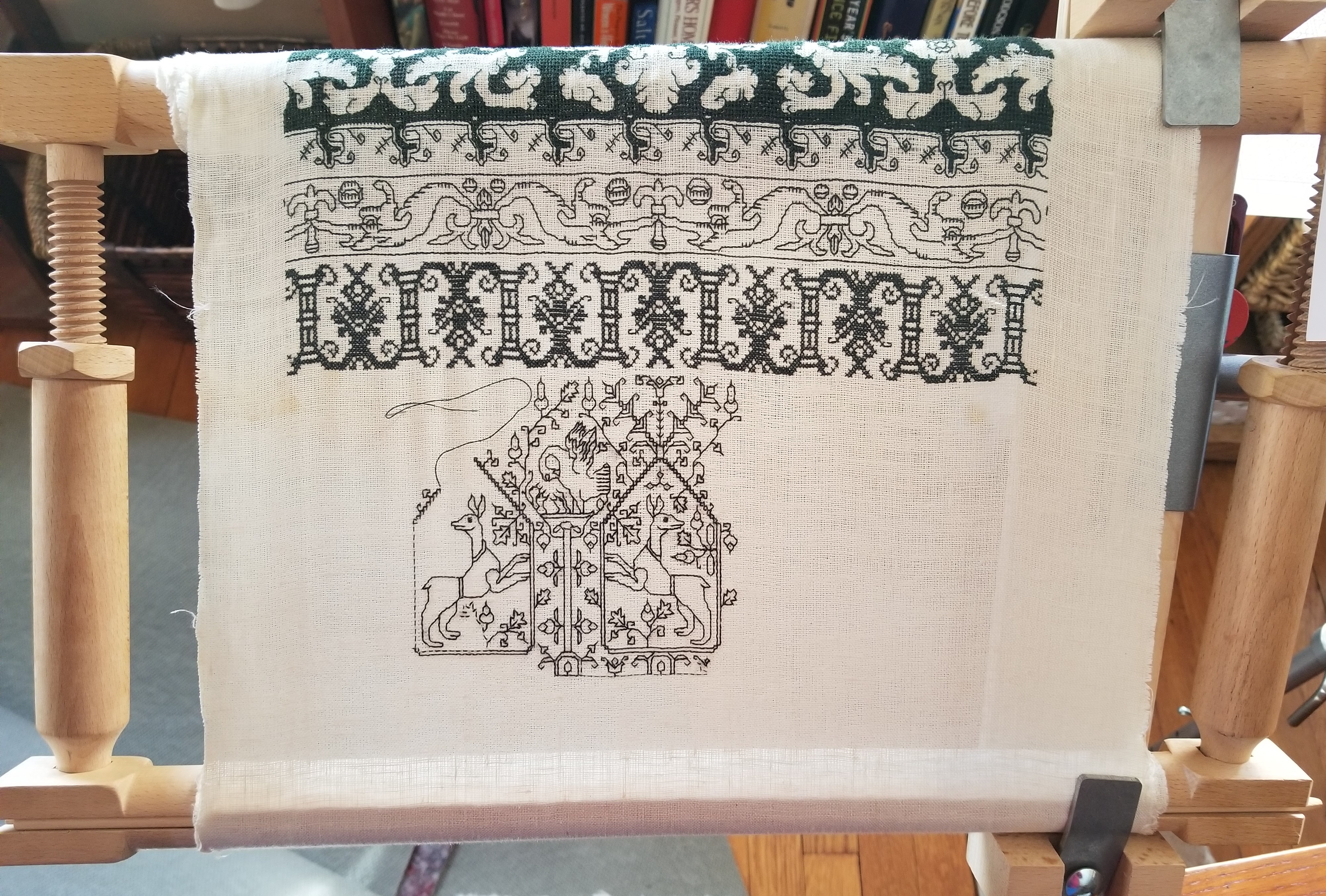
I am looking forward to unrolling this piece when this new strip is done, to see how much more real estate I have to cover, and to make plans for how dark or light those strips will need to be. Then I get to go hunting for what to stitch next.
This week’s strip is an interesting one on a couple of fronts. First, in terms of history, it has a specific point of origin – in 16th century Sweden; not Germany or Italy or any of the other countries better known for linear embroidery at that time. It’s in the Swedish History Museum, Inventory number 19600.
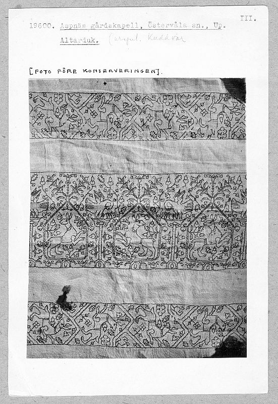
The museum citation says that the piece is from a chapel in Uppland, Östervåla; stitched in red silk on white linen. It also includes the matching vertical border which I haven’t graphed yet, plus a sweet row of heart-shaped cartouches bearing heraldry, the frames of which are also on my futures list. I haven’t stumbled across another piece of linear stitching in this style from this region/time, so it’s a bit of a mystery. How prevalent was it? Was this type of work limited to church linen? Did it appear also on clothing? Obviously more research is needed. If you know of any other pieces in this family, please let me know.
Now on to iconography. While this piece has non-secular origins and was part of a chapel’s furnishings, its religious symbolism is not as direct as most church hangings. No martyrs. No pascal lambs, sacred hearts, or other standard symbols. Just pelicans and hounds. Even slightly misshapen, the quadrupeds are identifiable as coursing/sight hounds of some type. They are collared and belted, slim waisted and long legged, with floppy ears and pointy muzzles. Dogs, especially hunting hounds would have been seen as symbols of fidelity, determination, and loyalty. Pelicans are a bit more esoteric. Here they are shown “vulning” – piercing their breasts with their beaks, in order to feed their young with drops of blood. This was a standard bit of common folk legend at the time – along with the belief that worms spontaneously generated from the soil, and hedgehogs carried berries home to snack on later, impaled on their quills. Obviously the imagery was associated with self-sacrifice, devotion, and parental care.
Therefore, we have a cloth covered with symbols of devotion, loyalty, and self-sacrifice – something that would have special meaning in the religious setting. The background for this may be Sweden’s departure from the Catholic church in the late 1520s. Perhaps this rather humble, non-demonstrative bit of stitching (no gold, no gems, no saints) with its generic paean to virtues fits into the schism between Catholicism and Sweden’s developing Lutheran-based faith.
I admit I knew the pelican story courtesy of the Society for Creative Anachronism (SCA). It’s no secret that I’ve been involved with it deeply in the past, and continue to have many friends active in the organization today. The highest SCA award for service is the Pelican, and its badge is a pelican vulning. This highly respected honor recognizes those vital individuals whose labor, largely voluntary, is the fuel that keeps the organization running. If you ever attend an event and see someone with a brooch or pendant with a pelican, know that the person you have met is Very Important, and widely respected by their peers. My sampler will have pelicans on it, but I am not a member of that order, nor do I intend to display it in an SCA context. I could wear a badge with a laurel wreath, but that’s another story for another time.
Finally, I announce that we have embarked onto another Great Home Improvement Journey. This time it’s the basement. I will post before/during/after pix, but right now I am still packing up and stowing my needlework library, office area, and craft room. The chaos is palpable. Here are a few of my stitching and knitting books. I’ve already had reason to refer to them, but have had to sit on my hands and just contemplate my wall of boxes. Work on the basement proper should begin by April. Until then, it’s lift, sort, box, and stack for me.

ANOTHER WEEK. ANOTHER MOTIF
Moving on from the dolphins, we leap to the next motif. I wanted something both darker and less dense than the massive meshy panel, and hit on this column/flower meander. It’s another one from my ever-forthcoming The Second Carolingian Modelbook (T2CM – it includes both linear patterns and block unit designs).
The columns design appears on Plate 70 of my book, but it’s source is a 16th century Italian openwork piece in the Metropolitan Museum of Art, Accession 20.186.27

The museum description is rather cryptic. It says “Bobbin lace, buratto, punto a rammendo.” To me it looks like buratto – darning on a woven gauzy ground, and not bobbin lace or a withdrawn thread technique (punto a rammendo). Buratto and lacis are very close, with lacis being worked over a hand-knotted net mesh, and buratto being worked on a purpose-woven gauzy linen fabric. It’s structure is not unlike Penelope canvas, but made from much finer threads with much wider gaps between them. It’s effect is entirely that of an open mesh – no where near as dense as the Penelope. Admittedly this piece might be lacis. I am not seeing knots at the junctures of the meshes, but sharper photos might reveal their presence.
While my treatment of it in plain old cross stitch isn’t necessarily something that can be defended as a common historical usage, the use of these designs for both openwork (lacis or buratto, or even withdrawn thread designs) and surface embroidery on the count is well documented. Since I am not doing a historical piece I chose POCS because it on this ground with only one strand of silk, presented an airy and lighter contrast to the mesh technique, and the long-armed cross stitch and Montenegrin stitch that I’ve used in elsewhere on this piece.
Oh. And the source for the dolphins? Plate 29 of T2CM. But it is my rendition of an illustration in Lady Marian Alford’s Needlework as Art (Plate 42), originally published in 1886. There it is cited as 16th century Italian. I tracked it down. That piece from Lady Alford’s collection and shown in her book is now in custody of Belton House, Lincolnshire UK, and registered with that country’s National Trust (#426944). I know of no no on-line photos of it. If you do, please share the citation in the comments.
As mentioned before, the original shown that I drew up for T2CM features the dolphins and connectors (but not the rondels) and the background of the original is voided – filled in, but with a grid of tiny one-unit squares.
When will T2CM be out? I know it’s been a very long wait, for which I apologize. However I do know that if all goes well, my schedule will emerge from some significant time constraints in late spring, and I will be able to devote myself to publication. I am loathe to promise after so long, but 2021 has every indication of being The Year.
CAT AND MOUSE
An odd confluence of happenstances and the resulting doodle.
Last week there was a discussion in one of the Facebook groups dedicated to 1500s costuming or blackwork that started with someone asking for a historical blackwork design that featured cats. There aren’t many examples, and the chat covered iconography, citing that cats weren’t the most auspicious of symbols at that time.
Then an unusual source came across my feed: a line-rendered group of cats, but not from the period in question. This plate flew across my Twitter feed. The source is Ernest Allen Batchelder’s Design in Theory and Practice, New York: Macmillan, 1910.

This appears on page 157. The book is a rather lively examination of design principles across history, and appears to be a transitional work, including the natural elements of the aesthetic/Art Nouveau style, but more solidly grounding the more angular principles that characterize the Art Deco/late Craftsman mood. For all I know it may be a seminal point in decorative design history, but I will leave that point to be hashed over by any readers who are schooled in design theory and lineages.
In any case, here were some linear cats just crying out to be graphed and stitched. So in response to a generalized (as opposed to Elizabethan-specific) demand for cats and to delight cat-loving friends and family, here is what the Batchelder sketch inspired:

This is rather large to be used as a fill pattern in inhabited blackwork (the subtype with outlines and fancy fills), but it is in scale for use as a large all-over design. I could see it being worked as is, in double running or back stitch, in monochrome or in multiple colors (those yarn balls cry out for variegated thread). It could be done voided, with the background filled in. The cats could be solidly stitched or left as is, or customized to match the markings of favorite pets (I provide a rudimentary tabby and tuxedo but any other markings might be fudged in). A frieze of this as the leftmost third of a placemat might be fun. I leave use up to you.
Like my other designs of late, this is “good-deed-ware.” If you like it and use it, I encourage you to look around and make a donation to a local cause that is helping people hit hard by plague-related economic challenges. “Starving artist” should be a metaphor, not a life description.
REACTIVATION AND SPOILING
I admit it. I was horribly spoiled this holiday past.
My family has fitted me out with all sorts of stitching goodies for the new year. There were silk threads and linen grounds from my mom and the Elder Offspring – enough to keep me going for quite a while. In addition, The Resident Male drew inspiration from a recent Facebook post (plus the general state of the stitching supply midden next to my favorite chair), and gave me a mercer’s chest from Sajou in which to store my embroidery supplies and tools. A princely gift. And yes. It’s already full.
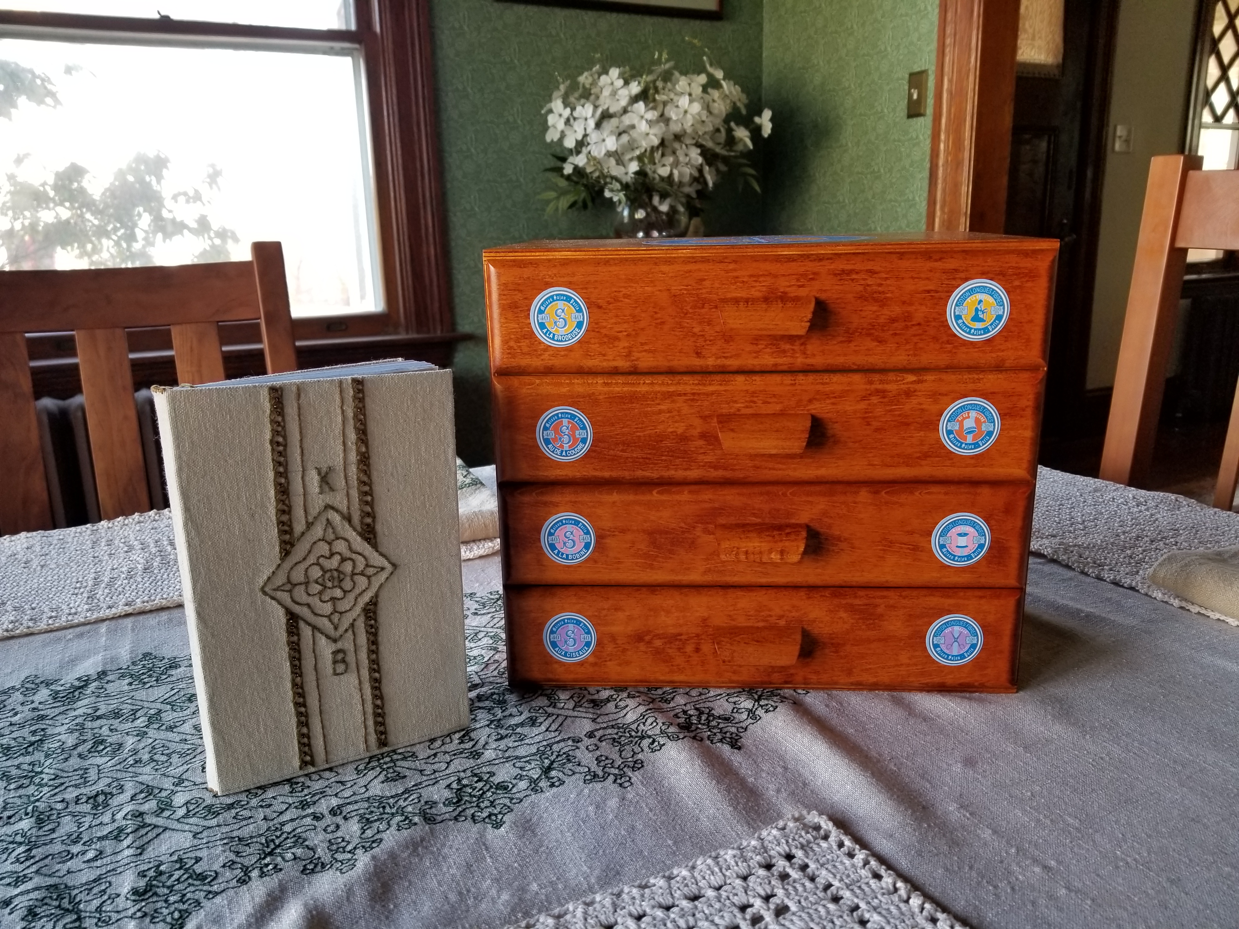
Younger Offspring hand crafted me a Special Object. That book next to the chest – assembled and bound, with an embroidered and beaded cover all of their own devising, it’s full of graph paper pages – perfect for stitch design and doodling. I think my family knows me very, very well.
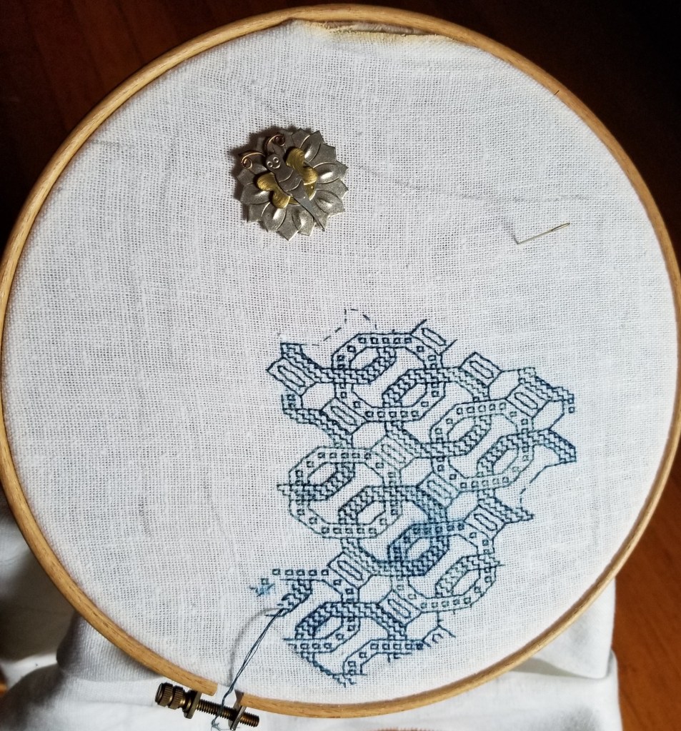
During the supply sort and consolidation to populate my new tiny chest, I stumbled across the thread I had been using for my Long Green Sampler. That’s a project from about six years ago. I was working on it just before we departed for our expat stay in India. I brought it with me but had no well lit comfortable place in which to work on it, so it languished. I poked at it a couple of times in the years since, but I hadn’t set it up for reactivation. I remounted it and set in again yesterday evening.

No, that’s not a real cat. I would love to have one, but I am very allergic to them. It’s a stuffed toy, liberated from the Spawns’ menagerie. It usually does duty as a very conveniently sized elbow rest, but here he’s blocking sun glare. He can be both obliging and versatile, although (sadly) not very affectionate.
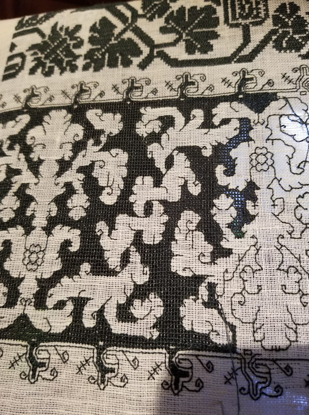
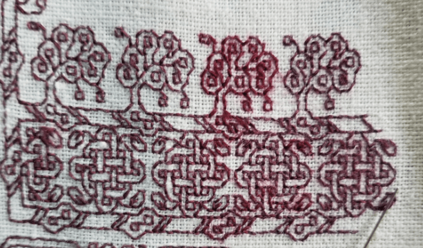
To reprise, Long Green is a long strip sampler, done in Au Ver a Soie’s Soie d’Alger, in color #1846 on 40 count linen (20 stitches per inch). I am picking my strip patterns on the fly, mostly from my ever forthcoming book, The Second Carolingian Modelbook. This particular strip features my attempt at the tightly pulled and totally overstitched meshy background found on so many historical artifacts worked in the voided style. The design is one that appears in museum collections, and that exists in several clearly related versions. I’ve nicknamed this one “The Lettuce Pattern” for obvious reasons.
My redaction with its curious Y-spring companion edging is largely based on this version in the Boston Museum of Fine Arts collection, Accession 99.176:
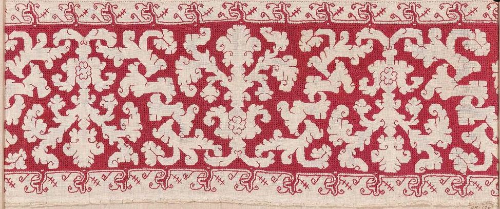
The date attribution has wandered forward a bit over the years, but is now listed as probably 17th century, possibly being of Spanish or Sicilian origin. Here is another example of Lettuce, also from the MFA, now cited as being Spanish and 17th century, Accession 95.1116 :

Although this one shows quite a bit more in-motif detail than the one above, it is still clearly a closely related pattern, and not a slice off the same original artifact. Both of these have meshy grounds, worked by tightly stitching and displacing the warp and weft, bundling them tightly together – NOT by cutting and withdrawing threads, then stitching over the remaining scaffolding. That’s another technique but distinctly different from the one employed here.
Here’s another example of the Lettuce family. This one features a simple boxed ground (no drawn meshy work here). The original is in the Brussels Museum of Art and History, Accession 20048516. The description cites it as being stitched in red silk, and dates it to the 1500s, but does not include a geographical provenance.

The Brussels example has another special spot in my heart. You can’t see more than a sliver from my clip, but it pairs Lettuce up with another favorite design, proving them to be contemporaries.
As you can see from the photos of my green piece, I’m about half-way done with this band. Here are the others above it, a photo montage shot and composed by fellow India Expat, artist, and friend Tamar Alsberg. I’m a bit greyer now, but so are we all in these salon-challenged days.
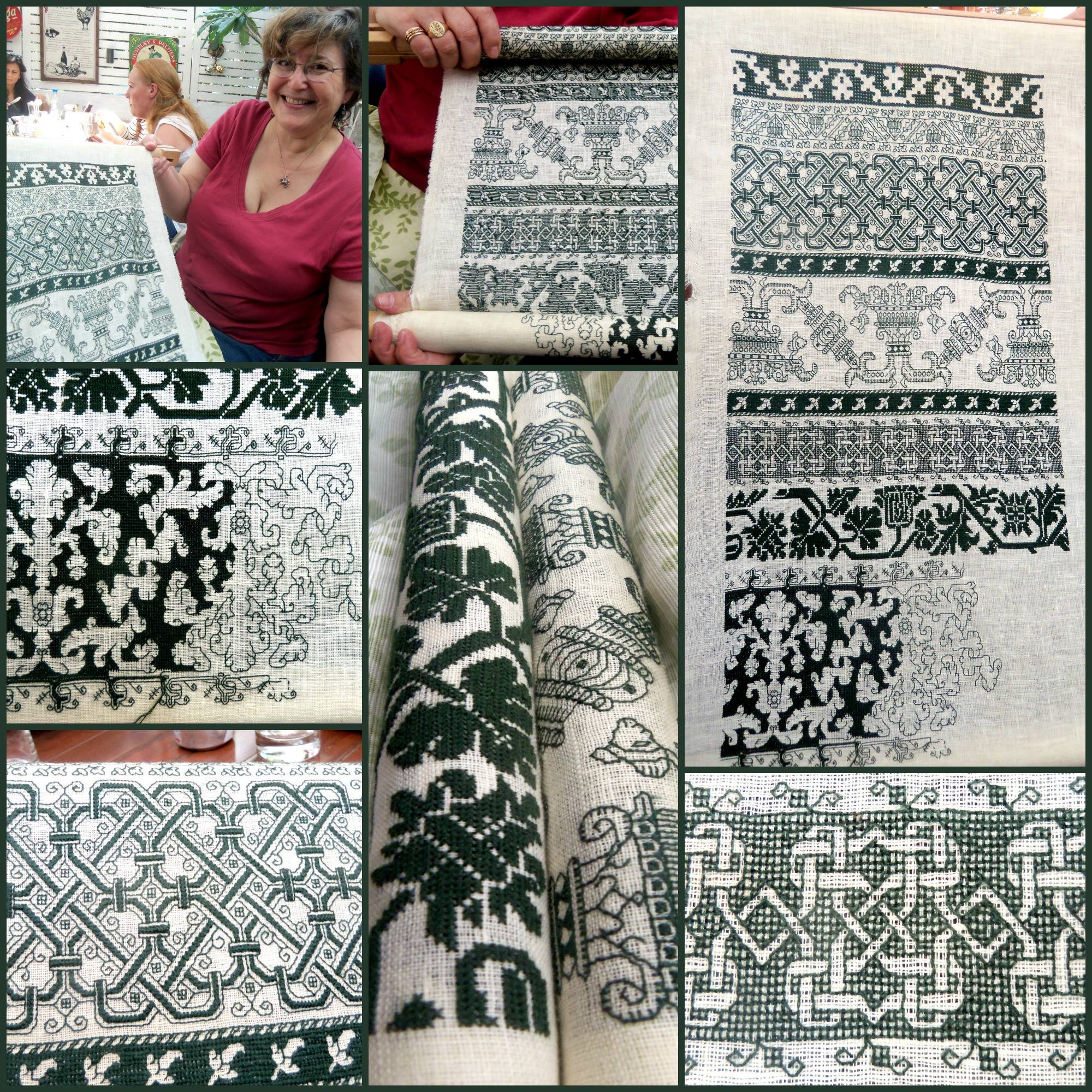
Some highlights – bit of braiding in the lower left was a ton of fun – the solid stripes are done in Montenegrin Stitch, and the bit between my hands in the center top – that’s the back. Double running rules!
If you still want more info on these individual bands, you can call up the whole project (in reverse chronological order) here.
MASKS AND DOODLES
I continue on with the mask project. I’ve finished two sides for the first one, and have started (and am well into) the second.
Here are the two green sides:

And here’s the red one, in process:

It’s pretty obvious that I haven’t cut them apart yet. I want to do the red mask, and possibly one in black before I do that. There’s very little room between layouts on my ground cloth, and if I were to separate the pieces it would be difficult to stitch on the remaining scraps. So I continue.
Another thing that’s obvious is that I’ve made big mistakes on both. I’ve “colored outside the lines” on both the blue and red pieces. But it doesn’t matter one bit. My work plan is to finish all my decorative stitching, then run each mask piece around several times on my sewing machine before I cut them out (oh, for a serger!). The machine stitching will help fix the embroidery in place and give some stability to the rather ravely edges of the ground cloth, and the overage will land on the literal “cutting room floor.” The nice, fixed edges in turn will make it easier to stitch the fancy bits to their linings – two or three layers of tightly woven high count 100% cotton percale. The easy-count fabric may be just right for counted work, but has almost no value as a protective layer. I’ll depend on that percale to keep me safer.
Now on the designs I used. Both are from my latest freebie book Ensamplario Atlantio II. The blue mask with the chain like interlaces is Design #195 in that book. And yes – I chose it for that design’s visual allusion to knightly mail. It’s a straightforward implementation of the design as shown, but flipped left/right for the two complementary sides of the mask.
The second is also from the same book – Design #191. But in the book it’s presented as a strip design, useful for borders. I wanted to use it slightly differently, so I played.
The original:

The design at the left below is the most obvious way to make a full repeat. Yes, we can quibble about mating up the column ends so that there’s no blank line between, but that’s inconsequential. The strong verticals and horizontals are the most prominent feature. It’s a very regimented and in spite of the embellishments quite a forbidding layout, looking a lot like a Victorian era cast iron fence, or the bars of a very fancy jail cell.

By contrast look at the one on the right. It’s the same major design element, just shifted over one-half repeat, so that the large flower lozenge aligns with smaller two-bud cross. It has a different energy. It’s exactly as dense as the bit on the left in terms of stitching, but it looks lighter, more energetic, and more open. I preferred its movement, and the greater play it gives to the diagonals.
Those red bits in both? Just ways to visually unite what are clearly strips, to make a more melded all-over look.
Never being one to let well enough alone, I note that there’s ample space to play with this. For example, take the original repeat (black), rotate it, and add a couple of design elements. Most notably that Green Man that Ann and Lois spotted lurking in the original.

I’d stitch this up in one color, or if I used two – not as shown (that’s just to illustrate the old and new parts). I’d probably use the second color for the Green Man’s face, the larger flower sprigs at the center lines, and possibly the stand-alone motif in the middle. And this bit goes into my bin for further refinement and eventual release in Ensamplario Atlantio III (why stop at two?)
Finally – this is just a long and drawn out way to say “GO DOODLE!” While this example a bit overelaborate, the core idea is to take a design element and use it as a springboard to creativity. Pull out those drawing pads, sheets of graph paper, drafting software platforms, or needlework-specialty sketchers, and have at it. It’s fun. I promise!
MASK MADNESS
I am working on a couple of things here at String Central. One I can talk about. The other is mysterious and can’t be shown yet.
First – the progress on the masks. First side of the first one about at the half-way point. I had to take a week off from stitching for family reasons.
As anticipated, this early-experiment thread sheds dye, and picking it out leaves smudges. As explained before, I don’t care. These masks are not undying heirlooms of my house. They will bleed and spread dye during wash anyway. And I think that once that happens, the effect will be interesting.
The pencil outline you see barely traced onto the cloth is for a mask of this style:
The source of the pattern is the two-tie fitted variant published in the New York Times, back in March.
UPDATE: The link above appears to lead to a page that’s behind the New York Times paywall now. But fear not! They in turn got their design from FreeSewing.org, The edition of the design The Times posted nests three sizes on one printable PDF page, a pretty standard approach for sewing patterns. But since their original issue in March, FreeSewing has expanded the range of sizes for their design. If you click here, you’ll go to a page that lists a full range, from toddler to men’s ultra, plus how-to directions. More sizes for sure, but still the same basic pattern I used.
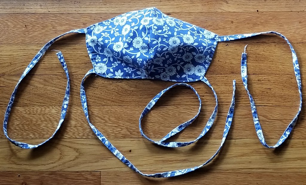
I’ve made quite a few of these for family and friends. It’s a bit more complicated than the pleated kind, but it fits us better. I make the largest size for adults (what in the update is now called Men’s Large), and use two or three layers of tightly woven 100% cotton percale (well washed). I substitute a long double-folded strip of the same fabric for the ribbon ties called for in the original pattern directions – mostly for durability in the wash. Precision isn’t important for the ties – I cut a long strip on the grain (not bias) – about 5 to 6 feet long and about 1.5 to 2 inches wide (152 to about 183 cm long, and about 3.8 to 4.5 cm wide). I iron it in half, folded down the center of the strip (parallel with the long side), then iron the cut edges to the center fold. Then I sew down the entire length of the long strip, an cut it into four equal pieces for the tie.
The blue flowered one above is sewn from the last remnant of the sheet set I took off to college in 1974. I had this print in red and blue, with a matching comforter. Over time the set became curtains, tote bags, cushion covers, baby carriers and crib furnishings. Ever dwindling in size, and picked apart for reuse multiple times, I had just enough left for several masks.
The fabric on which I am stitching the fancy design is no where near tight enough to provide effective coverage, so it will be a top, decorative layer over a double thickness of the standard high-count bedsheet percale.
My ground cloth has four two-unit sets traced onto it (each mask has a left and right side, seamed together at the center). I intend to stitch as many as I have the patience to do, but not cut them out until all I will be making are complete. But the loose weave and the embroidery both pose problems. I could cut veeerrrryyyy carefully to avoid nicking the stitching, but even if I did, the edges of the rather coarsely woven ground would ravel either during assembly or more probably, when the things are washed between uses.
So I am deliberately stitching past the half-inch seam line, right up to the cutting line (my pencil mark). The seaming line is a half inch (about 13mm) inside the cutting line. That half inch is the seam allowance – the bit you see turned inside at the seams in most sewn items.
Before I cut these apart I will throw the entire piece onto my Ancient Elna sewing machine, and stay-stitch all the way around each mask piece. I will probably sew multiple rows of reinforcement, but all within the seam allowance area. Then I will cut out the individual pieces and assemble the finished masks. The stay-stitching should secure both the ground cloth and the stitching. Since the reinforced area will be turned under into the seam, it won’t be visible. And I may even go a bit further and apply one of the non-fray fixatives sometimes used to reinforce stress points in applique or quilting. But I’m not sure about that yet – I never use the stuff and I am a bit wary of how it will survive laundering.
Will this work? Stay tuned! Eventually you will find out.
HARSH FINISH, SOFT BEGINNING
Setting a new overland speed record for completion, I offer my Harsh Language piece. I began it on 22 August, and finished on 30 August. Eight days. Lightning fast, especially considering that I only stitch for an average of an hour and a half per day (more on weekend days, less midweek). Here it is in all its glory. I’ve redacted not the offending verb but the dedication, because as I’ve said before, the recipient wishes to remain anonymous.
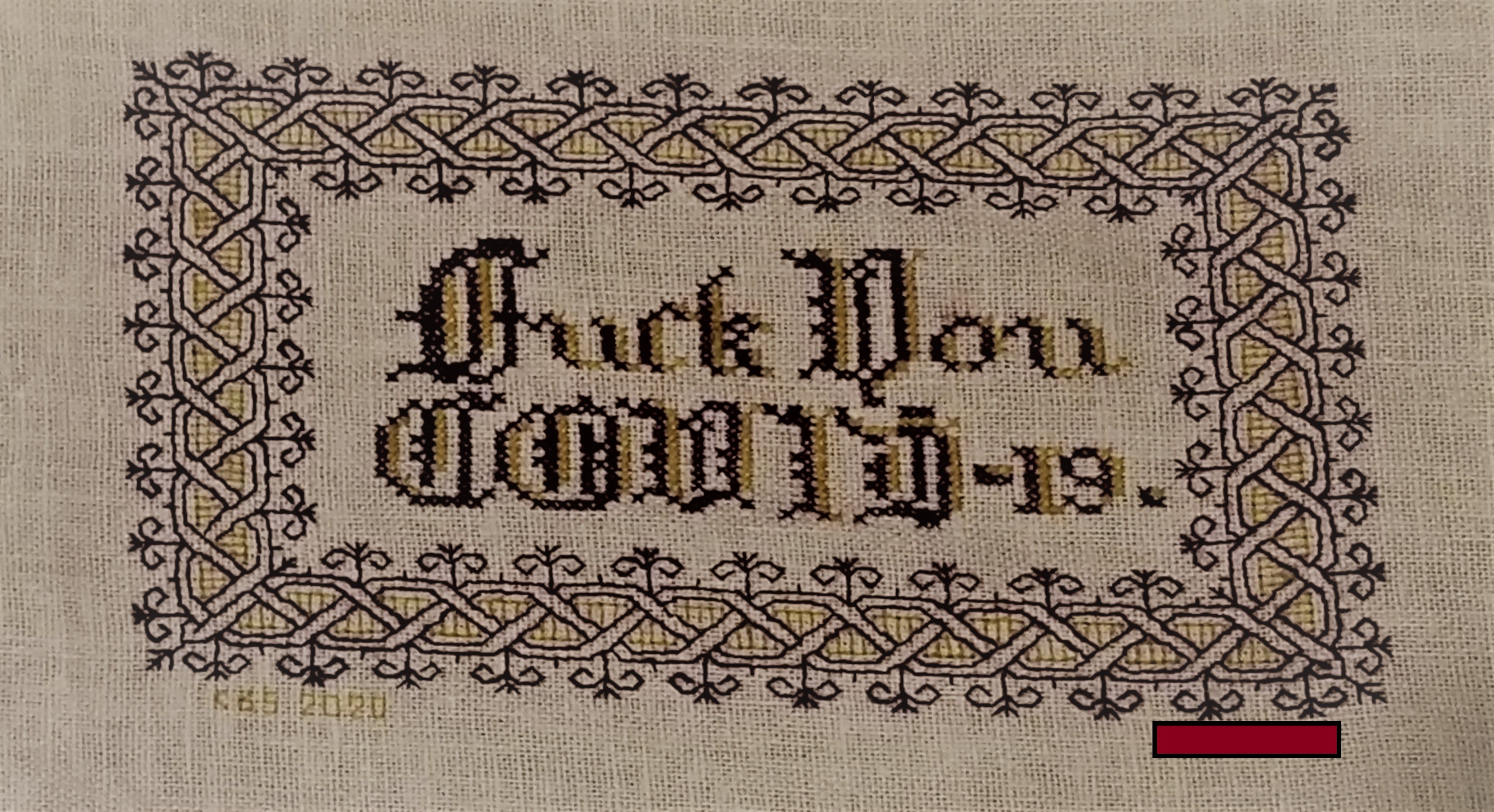
I did have fun playing with the wool. It was much thinner and more tightly spun and cleanly finished (read non-fuzzy) than tapestry/needlepoint wools, and a joy to use.
In addition to the hints I offered up before, I would add that even with the shorter length, care must be taken to let the needle and strand spin freely, in order to counteract the twist imposed during the stitching process. That twist can loosen the spin of the wool strand enough to denature it to the point of shredding. You can see a couple of heavy stitches in the piece, where I was nearing the end of the strand, and the thread had “bloomed” but I kept going.
And yes, the weave of the ground wasn’t quite proportionally even. I don’t remember where this stuff came from – purchased retail, found at a yard sale, acquired as a gift – but it’s been in my stash easily since 1996, and has a yellowed selvage edge to prove it. But aside from that flappy edge (no where near this stitching), it was sound. It’s probably a cotton/linen blend. You can see the skewing in this detail. Horizontal stitches are just a tad wider than verticals, and diagonals are not 45-degrees.

What’s next?
Well I pulled out this remnant, and used about a third of it on this little piece. The remainder will go to become decorative outer layers for some masks. This open weave fabric is pretty useless as any sort of barrier, so I will line the masks with two or more layers of nice, tight 100% cotton 300-count pillowcases (retired from their prior duty). They are navy blue.
I will be using more thread provided by Stealth Apprentice for beta-testing. It’s luscious silk, dyed in one of her early indigo vat experiments. The color of the thread ranges from a nice deep denim down to Wedgewood, and was the child of serendipity, not a planned effort to produce a variegated.
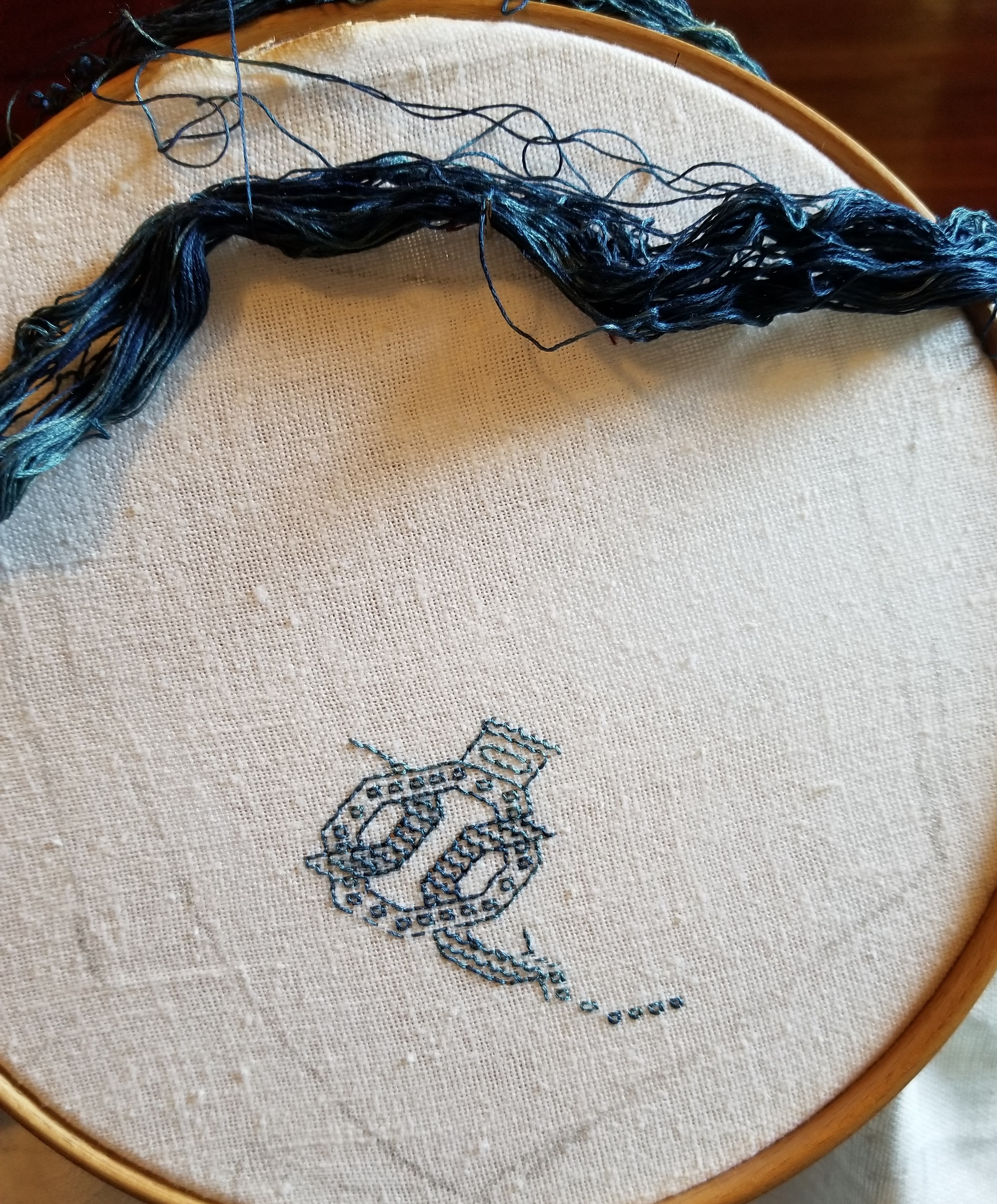
I admit I put this hank off because it posed some minor problems. It’s a multi-strand floss, but during color processing it became rather matted and tangled (it was before she learned better methods to secure the hanks during dyeing), and the indigo itself does crock quite a bit, leaving blue fingers and traces on the ground as it is stitched. However this blue was an very early experiment long before she went retail with her products, so all is forgiven.
To deal with the matting I’m using the full strand and not trying to separate the plies. To tame the tangle, instead of trying to wind it I cut the skein in one place, and looped it over a stick. I’m teasing out strands one by one at the loop, and using them in full “cut length.”
There can be no mistakes with this stuff – it does leave very evident marks if picked out. And I fully expect the color to migrate onto the backing during washing. But that’s o.k., too. I think the look will be quite interesting after haloing. The navy inner layers may peek through the somewhat loose weave and camouflage some of that halo.
Challenges considered, I am very glad I saved this thread until just the right project appeared. This piece will certainly change over time as it is subjected to my ungentle care. Masks after all need vigorous cleaning. The blue may bloom onto the ground cloth. Such leeched color may dissipate over subsequent washes, or the threads themselves might do a old-jeans fade. All are anticipated and none are unwelcome. So while the thread might not have been optimal for some other more formal projects, it’s spot on perfect for this one.
I’ve got enough fabric for at least four masks. Possibly five. I’m not sure if I will do them all in this blue, or I’ll play with other threads – either monochrome or in a wild mix (I think there’s only enough blue for two, anyway). I don’t know if I’ll stick to all-over designs. I might for example doodle up one in an inhabited blackwork design – the scrolling flowers with heavy outlines, with patterned or speckled fillings. I’ll probably skip metal threads and spangles though, due to the laundering requirement. Or I may do one with scattered, themed spot motifs – insects, for example. Or I may do several “zones” and use different fillings in each. Or I’ll work band designs on the diagonal. The possibilities are endless, and (sadly) I don’t see the need for masks going away any time soon.
Will I make all four? How will they play out? Will something else catch my easily distractable eye, and I’ll do that instead? Will I keep these or give them away? Stay tuned. (And they say needlework has no excitement, mystery, or suspense.)
Oh. And there is no “bad” thread. There’s a perfect project for just about anything that can be used. I love this blue silk and I will enjoy stitching with every inch.
ROUND THE BEND
Yes! I have successfully rounded the corner, and reached out a tendril that confirms that the entire piece is spot on count and accurate to the repeat.

Now it’s just a matter of filling in that little bit at the upper right.
Of course, now I may go in and add something on either side of “TA” just to balance out the design. Still thinking on that, but in any case, the finish line is palpably near. Here’s the proof of alignment “tendril” – the inner border along the top edge fits perfectly, mating with the work I laid down at the very start of my journey around the edge (the bony boi and the border above his head, at the hoop’s right edge).
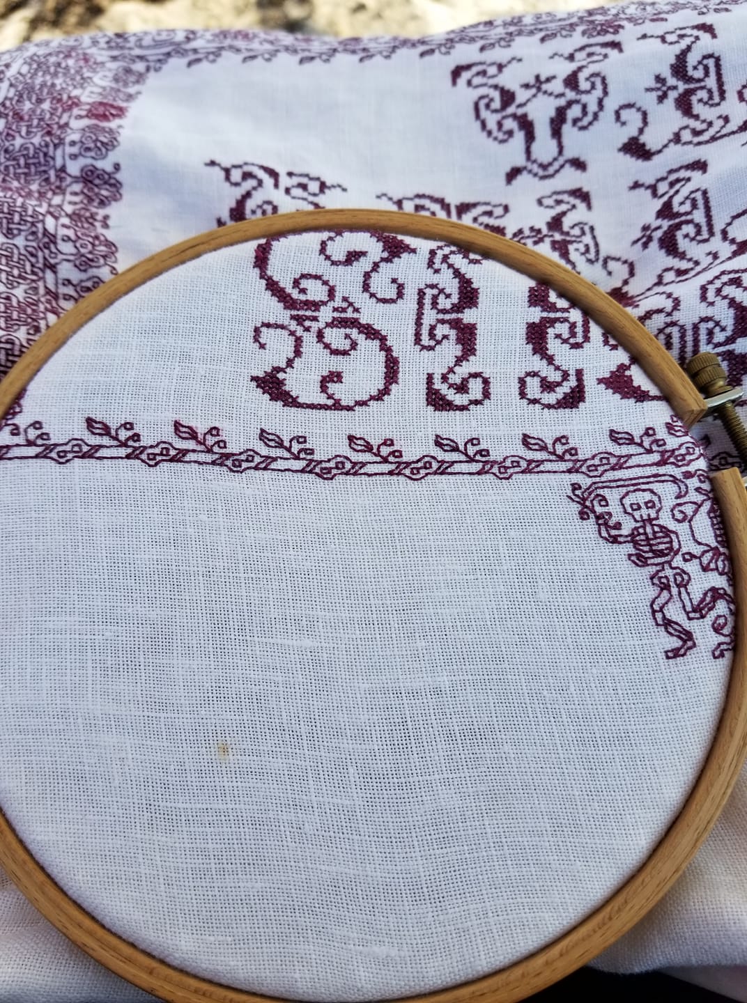
To put this in perspective for my non-stitching pals, this rendezvous is like marking a chalk X in front of your house, standing on it then putting on a blindfold and dancing wildly around the block nonstop until you decide you’ve gone far enough; then taking off the blindfold, looking down and realizing you have arrived exactly back on your point of departure.
Why not so much progress this week past? It’s been hot. We got back from our week on the beach in the middle of the heat wave. Like many in the northeast US, we have no air conditioning. Sitting under a halogen work lamp in the evening was more than I could contemplate in temps of 85 to 100 deg F (29.4 to 37.8 C), with high humidity.
I’ve been marling the offending brighter red (glaringly odd third inner plume flower up from the bottom of the right inner border) with thread in the color (or closer to the color) I have been using. By using one strand of “good” and one strand of “less optimal” together major color discontinuities are not so evident. I may go back and replace that offending plume flower. Or not. The “bad” red seems to crock considerably more than the other batches, and removal will leave a very evident halo.
Before I forget, extra special thanks go out to new stitchpal Paula from Austin, Texas. She read about my thread shortage problem and dug into her own stash, sending me oddments of various colors in and around the values I needed. Her generosity is what has enabled me to pursue the marled thread strategy.
Paula, I truly would not be able to finish this piece to my satisfaction without you help. My gratitude is eternal. When such things can happen again, the next time we are down that way visiting family, I reserve the right to drag you out for a special treat!
THE CLASSIC PROBLEM
Too much stitching left to do. Too little thread. With about a quarter of the stitching remaining I have a problem.

I am using thread I brought back from India. I found it in a shop in the old shopping district in Pune. They specialized in crafting materials, especially beads, pre-embroidered pieces, knitting yarns, and other goodies. But they had a few skeins of what looked like silk floss in one of the display cases. I pointed at it and asked the shopkeeper if he had more. He sent a little boy up into the storerooms, and he came back with a very dusty and crumbling cardboard box full of odds and ends. All of the same type of thread (which turned out to be “art silk” – rayon) but all of very limited quantity. I picked out all of what remained in non-pastel colors, including several multi-skein hanks of deep red, and bought it all, for an astonishingly low price.
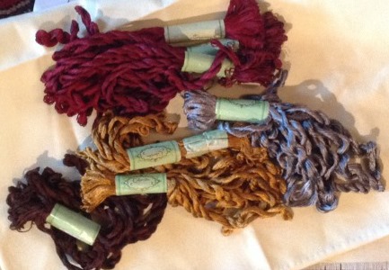
As you can see there’s a pile of crimson there. What remains of that pile now is much less –

The wound bobbin in the middle is what I’ve been using (with a caveat). It’s Cifonda Art Silk color number 145. So is the hank on the left. The hank on the right is color number 144. It’s in the same continuum, but a click lighter. At the bottom is flaming cherry red 530, not even close.
The caveat on the bobbin? It’s holding two skeins of 145. Underneath is New-145. On top is Old-145. I wound off the new one, then after stitching the bit below, went on a Wild Hunt, and found one last remaining skein of Old-145. You can’t see the difference between them, right? Neither could I until this happened.
I bet you can see it now. Leaf #3 and part of the interlace below it stands out. I stitched it with the New-145. It’s redder, more garnet in tone than the established work. Clearly the same color number, but a different dye lot (even though dye lots are not labeled ). Even if I could get more of this stuff the chance of matching color with my very-well-aged stock is practically nil.
I will finish out as much as possible with my last skein of Old-145. I may or may not pick out this leaf . Still thinking on that… And also thinking on how to finish out the piece using only what I have on hand. Go for New-145? Go lighter with 144? I’ve seen historical pieces whose stitchers faced the same problem and blithely ignored it. Which is what I will end up doing, one way or the other…
