PAST PROJECTS AND LESSONS LEARNED – PART 2
Thanks, all for the kind reaction to the last post in this omnibus series. Thus emboldened, I blather on.
The New Carolingian Modelbook came out in 1995. As mentioned before, it started as my working notebook collections of designs redacted from book photos, microfilms of early modelbooks, and sketches of artifacts, then grew from there. Although it was well received, I didn’t get much recompense for my 13 years of work – the publisher only paid royalties on the first 250 books out of 2,000, and ran off with the rest. But I didn’t stop collecting patterns. As originals and artifact photos became increasingly accessible, I kept at it, trying to transcribe designs, norm repeats (artifacts rarely are stitch perfect, and often need to be averaged out – blending all variants and mistakes into one representation), and most of all – collect specific citations and links. This material is the core of my ever-forthcoming The Second Carolingian Modelbook. And along the way, starting around 2010, I couldn’t resist trying out what I had found.
We left off last in the 1990s at the start of my blogging career, so my projects are a bit better documented. As before, I zigzagged between knitting, crochet. I tended to knit more around the time my two spawn were born, and for a while thereafter, and then return to stitching when they were around kindergarten age. For most of the early 2000s I was consumed by knitting and with running the wiseNeedle website with its collection of crowd-sourced yarn reviews. But eventually I began stitching again.
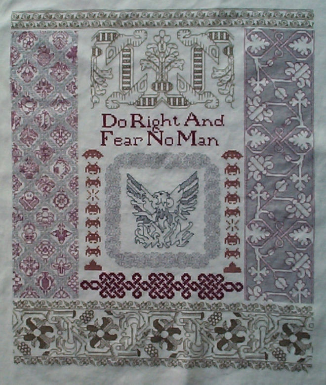
Elder Daughter went off to college in 2009, equipped with this bit of parental nagging. It is about 14.5 x 18 inches, worked on 30 count linen in Danish Flower Thread. Note the debut of the little skull and bones hiding amid the flowers from my Buttery interlace. The graph for the center phoenix is also here.
Lessons Learned: Around the time this was done with the help of Elder Daughter and others, I had figured out a new software solution for linear graphing because the method used for the phoenix wasn’t suitable for publication, and the hardware/software used for my previous work was now obsolete/unavailable. I started consolidating my doodles from various notebooks, backs of envelopes, and marginalia to better learn the methods and quirks of my GIMP-based custom drafting solution. Those experimental notes are what became Ensamplario Atlantio, and all graphs/charts I’ve done since have used the GIMP drafting method.
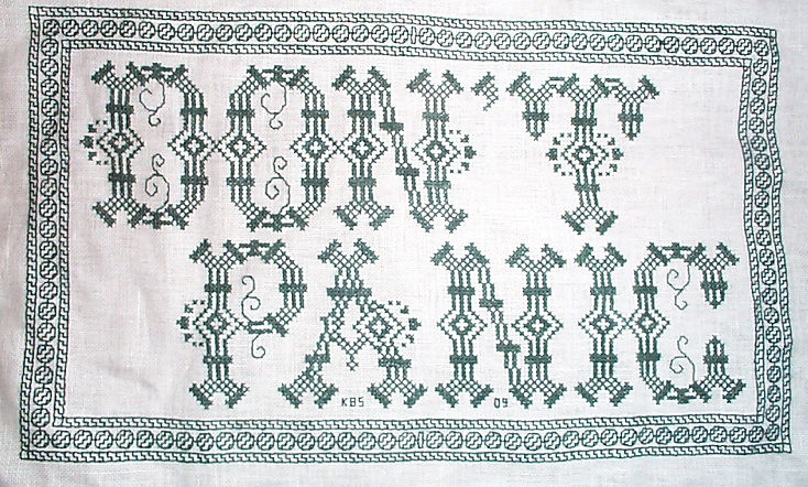
Fresh off the last piece I still had the itch to stitch. I did this part in homage to the Hitchikers’ Guide, part as appropriate decor for my office workspace (by trade I’m a proposal manager in high tech – deadlines and panic are my stock in trade). And possibly part because as parent of a new college student let loose on the world, I needed reassurance. It’s about 8 inches across, and was done in DMC cotton floss on 32 count cotton/linen blend. The bead border chart has been up on String for a long time, but I’ve also recently released a free full-graph pattern for this piece. Enjoy!
Lessons Learned: I was still experimenting with graphing out the lettered part ahead of time. Previously I had just guessed. This was also the first piece with a border I started in the corners rather than at the center, so that any “fudging” could happen in the center. While the north south bits of the frame worked out evenly, you can see the improvised bar in the center I inserted when it became clear that my bead repeat would not fit. And I bet you would never have noticed it if I hadn’t pointed it out.


Continuing the SF theme into 2010, I did this piece, featuring a quotation from noted author Arthur C. Clarke. It’s the first one to have designs from The Second Carolingian Modelbook (T2CM) on it, along with patterns from my earlier books. The new bits include all the full width designs between “ADVANCED” and the adaptation of Bostocke’s strawberries at the bottom. The narrow bands left and right of the wreath and column are a mix of older and newer designs. This one also hangs in my workspace now, to the confusion of my (mostly non-SF loving) coworkers.
Lessons Learned: I had a lot of fun with this one. I played with multiple thicknesses of thread and density of design, along with the two colors, and enjoyed balancing the effects that could be achieved with that limited group of variables. The strips are a mix of one and two strands of standard DMC floss. The solid ground voided strips are all in LACS, as is the foreground stitched daSera repeat from TNCM at the very top. I was particularly pleased with the hops panel shown in the detail. The design was done in two strands, but the (non historical) ground behind it – the diagonals worked mirrored – was done in single strand.
By 2012 I was full throttle on pulling together a sequel to TNCM. Drafting and writing for The Second Carolingian Modelbook (T2CM) was off and running. And of course I had to playtest the designs as I went along. Most of these (with three exceptions I worked from Lipperheide) are in the sequel. The big black sampler is done in silk on 36 count linen. The stitching area is about 24 inches across. Understandably it took me about 13 months to finish, and will be on the cover of T2CM. It was an eventful year, that included Younger Spawn’s appendix adventure, and the demise of my all-volunteer wiseNeedle independent website, out-competed by Ravelry and other paid-advertiser info sources.
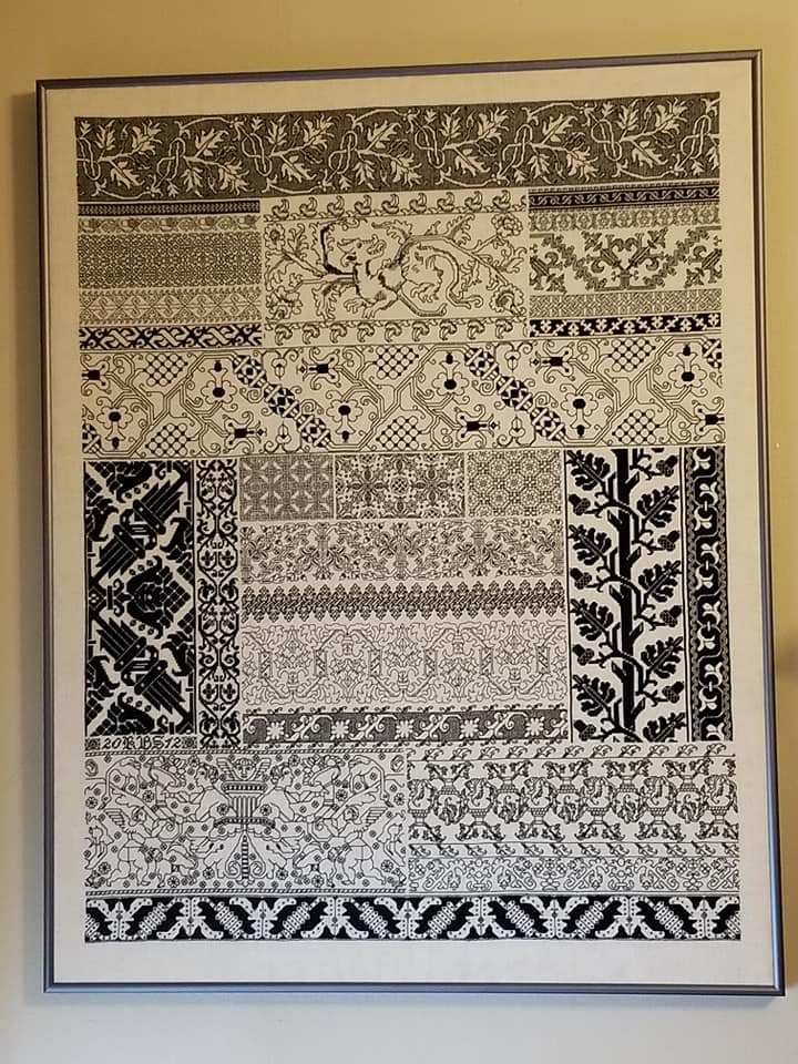
No new stitches to speak of in this one but I did use long armed cross stitch on the panel at the very bottom, the oak leaf and acorn bit, and in the spot fillings for the “beads” in the wide meander just below the lion/dragon beastie. The texture it produces when massed has a very plaited appearance compared to plain old cross stitch.
Lessons Learned: Composition and balance work better if you impose a tiny bit of order on the chaos. I basted in several guidelines, dividing my total piece up into several zones. Although I picked them on the fly with no real advance planning, worked my individual panels and strips inside those zones, making sure to ground the piece at the top, bottom, left and right with darker, denser designs.

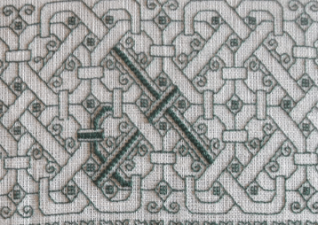

2012 marked the start of Big Green, done in silk on 50 count linen. Unlike the ones above, he is still unfinished. The designs on this one are entirely from T2CM. I WILL go back and finish this piece, but other things have gotten in the way. I took it with us for our sojurn in India, but between the heat and lack of a good spot to sit and stitch, I never got much further on it. Also the meshy technique is amazingly time consuming. One two-hour evening will produce a patch about the size of a quarter. One thing to note about the meshy stitch – I now know why it has survived on so many pieces even when the surrounding linen is long gone. It’s amazingly dense, near indestructible, and I can say truthfully – impossible to pick out. By contrast surface voided work is fragile, catching and degrading with abrasion, washing and wear.
Lessons Learned: I have been using this piece to experiment with stitching techniques. The interlace (first detail) uses Montenegrin Stitch. The straight runs were pretty easy, but without the most excellent Autopsy of the Montenegrin Stitch by Amy Mitten, the bendy bits would have driven me insane to figure out. And the big voided repeat where I stalled out (a stitching family I’ve nicknamed “The Lettuce Repeat”) is done in the tightly pulled meshy technique so common among voided artifacts. I had first tried out a different pulled thread technique for the topmost design, but the effect was nowhere near that of the historical pieces. But at maximum tension Italian Four Sided Stitch, based on the technique in Christie’s Samplers and Stitches (1920) was spot on. But it has to be done in silk because cotton isn’t strong enough to stand up to the force required to achieve the solid mesh. (My previous reference to the stitch was based on another edition of Christie’s work, now no longer accessible on line). And it’s (relatively) easy to hide ends while working it – burying them in spots that will be totally overworked later.

That 2013/2014 stay in India necessitated a scouting run to find housing and schools in May of 2012. I needed something small and portable to do on that trip, so the first two book covers were born. I worked these from T2CM patterns on 30 count linen/cotton blend, using DMC floss. They were small Moleskine-look-alikes, and were donated to the SCA East Kingdom’s largess program, to be given as small gifts by the seated royalty. Although I put notes in each one hoping that the recipients would get in touch, I have no idea where these ended up. Still, they were quick stitch pieces and fun.
Lessons Learned: While I have always known that stitching is a wonderful icebreaker, especially during International travel, at this point I had no idea that Kasuthi existed. It’s a traditional Indian stitching style and very close cousin to Blackwork’s precursors. A lady in Mumbai airport remarked on the black and red book and asked where I had learned to do it. That sparked yet another flurry of research.

Most of my production in India was knitted, largely lacy pieces. I did a couple of test knits of pieces designed by the generous and well-followed MMario, now of blessed memory, and a couple of other bits of my own design. I had many knitpals in Pune, whom I had “met” via Ravelry prior to our arrival. That kept me more or less in that craft, but I did do some small excursions into stitching. One was the red Ganesh cloth, above. I stitched it in 2013 as a new-house gift for the parents of our driver, Rupesh. I do hope it has brought the family the intended luck. This one is pretty well documented here on String, including the source of the outlines and Ensamplario Atlantio fill numbers for all of the motifs I used. It’s done on a not-so-even weave 32 count cotton/linen blend, in DMC floss.
Lessons Learned: The Italian hem stitching I used to finish off the cloth neatly actually took more time to do than Lord Ganesh himself. But I liked it, and filed that family of stitching away for future reference. Someday.

In 2013 I tried my hand at Kasuthi. This little motif is a traditional one, and is worked entirely in double sided double running stitch. It’s on a relatively coarse 28 count cotton, also in DMC floss. My main reference for Kasuthi was Karnataki Kashida by Anita Chawadapurkar and Menaka Prakashan. It’s in Marathi, but friends helped out by reading bits to me in translation. Here’s a post I did on the style.
Lessons Learned: I had originally intended on making a set of napkins, but when I washed this piece, the oh so carefully ended off threads, so well buried and invisible here, did fluff up a bit. So I scotched that idea.

Also in India, just before we left in 2014, I started this piece, with the intent to make a pouch for my stitching tools. The cloth is a standard linen dish towel, bought at a local supermarket. The thread is also linen. It remains unfinished.
Lessons Learned: While this ground started out as a very stitch-able 32 count more or less even weave, tossing it in the washing machine shrank it in unexpected ways. The threads in one direction ended up being about 30 across. Those in the other direction ended up something closer to 42, so the dimensions of the thing deformed. But undaunted I tried to stitch anyway, working over 2×3 threads. But the smaller threads were very hard to see, and the linen thread frayed beyond belief (this was before I learned to use beeswax). It sits in my Chest of Stitching Horrors(tm), never to be completed.
This takes me up to around the time we returned from India, in 2014. And I’m not done yet. If interest has continued, I will do one more of these, to finish out up to the most current things on my frames.
DETERMINING THREAD COUNTS OF SMALL-GAUGE LINENS
Lately I’ve been seeing discussion of linen, and whether or not it has to be even weave, sold specifically for counted thread work to be suitable for blackwork, cross stitch or other forms of grid-aligned stitchery. I maintain that while that does make things easier, and guarantees a certain precision look, it may not always be needed. Here’s a sample of a not-quite even weave being used for double running stitch.

First thanks to My Stealth Apprentice for the lovely linen remnant I’m using.
While it looks pretty uniform, it’s not. Up close you can see that the thread count is not even in both directions. Also you can see the combo of thin and thick threads that I admit can make stitching a challenge. But you can also see that both circumstances don’t quite matter as much as one might think.
My own counts, estimated by trying to take measurements between two pins placed an inch apart have been off up until now. But totally by accident, I’ve hit on a better way to calculate thread count, and it happened by using a standard US penny as a reference point to show relative scale.
The penny is three quarters of an inch across by specification. By taking a zoom-in photo, then counting the threads it obscures, we get a vertical thread count of about 33 threads in 3/4″ (counting the threads “tall”), and a horizontal count of about 25 threads in 3/4″ (counting the threads “wide”). A bit of math – multiplying both values by 1.33 – and that works out to a thread count of about 43.9 x 33.25 threads per inch. Not even weave in the least. But I can still work a (slightly squashed) rendition of the design on it. It’s distorted, but in a way that would not be apparent if this was to be done entirely as a strip.
However, I AM working this design as a frame around my central motif, complete with corners, so the skeleton dance will appear rotated to fit all four sides. Just as this bit is slightly squashed north-south, when I get to the side 90-degrees from this, the design will be squashed east-west – making my bony bois and pomegranates taller and thinner than they will appear here.
Optimal? Maybe some folks would object. But I am betting that it will still look good.
Oh, and add a penny (or any other coin or flat object with fixed and known dimensions) to your stitching gadget box, along with your phone’s camera. It’s much easier than those pins…
LETTERING COMPLETE – ON TO THE DANCE
I’ve been working away on my admittedly odd fandom sampler, and have finished the motto.

US penny provided for scale.
With more precise counting, the ground cloth is approximately 46-48 threads per inch but isn’t exactly even weave, so the piece is roughly 23 x 24 stitches per inch, with small variations for slubs or skinny threads. But that’s ok.
As for what this rather curious saying in the equally curious and difficult to decipher font says, it’s “Lucus orthai ta.” It’s a saying in an alien language that figures in The Resident Male’s forthcoming book. It translates to “Life’ll kill ya,” and so was fitting to be something ringed round with the skeletons from my Dance pattern page.
Having finished with the plain old cross stitch part, now comes the fun stuff. In an unusual move for me, I’ve graphed out an adaptation of the Dance strip and corner, specific for this piece. I usually don’t bother, but in this case I wanted to be sure that everything was centered. You can see just above the “LUC” I’ve begun a course of the innermost edge of the wide border. It’s mirrored at the center point, over the C. I did this so that my corners would meet up perfectly. Now of course as I go on we’ll see how well I have been ensnared by hubris. But for now, I can hope. Also consult my pattern graph.
Oh. And for the strip across the top, the skeletons will be upside down. You have been warned.
Questions about materials or technique? Comments on the futility of producing a tribute to an as-yet unpublished book? Desire to read the first book in the series? Post your queries here and I’ll try to answer.
THE DANCE
UPDATE: The Dance is now available as an easy PDF download via the Embroidery Patterns tab, above.
More free patterns. My stress abatement in this time is to doodle and design in addition to working on my own stitching and knitting. The designs below will eventually be part of a future work, but for now, I am sharing it as a broadside, so others whose stress abatement is stitching have ample food.
But before I present the pattern, some discussion. The main strip in this broadside mini-collection started out as a special request for a Danse Macabre design. I did it up, with some personally significant secondary motifs also requested, and delighted the recipient. But I wanted to play with it a bit more. I’ve changed it up somewhat, removed or changed the personal bits, and added a corner and secondary framing strips. And then having a partially empty page and an abhorrence of wasted space I just kept going, adding an unrelated border pair featuring swords and dart-like shapes, and as a lagniappe, a lemon meander. All are of my own design. The inspiration for the main strip will be evident in a moment.
Back to the Danse Macabre – that’s an allegory image from the 1400s and early 1500s. It’s something that appears in both religious and secular works, and is usually interpreted as a strong caution that no matter one’s station in life, wealth, or age – life is fragile, and all should be mindful of both mortality and the transitory nature of human vanity and pleasures.

But I have to say that I reject that morbid and moribund classical framing.
Instead, and in the current context, I look around. I hear about neighbors doing what they can to help each other. I read about people with talents – musicians, actors, artists of all levels of fame and proficiency – sharing what they can of themselves to enhearten, inspire, and entertain a frightened world. I witness the bravery of front line first responders and medical personnel, and the selflessness of many people in vital industries. I see many more small acts of kindness than I do malevolent and spiteful actions (although those latter ones do affect far more people proportionally per incident).
Now I see those dancing skeletons differently. They dance in defiance of mortality. They celebrate life in the face of danger and death. Living for others, to protect the lives of others, is the ultimate act of rebellion against an implacable enemy.
So, for all reading this, don’t break discipline. Keep away from others as much as possible. Heed the calls to do your part for community health. And if you are so inclined, feel free to stitch my Dance, with the joy with which I present it.

I make this file freely available for YOUR OWN PERSONAL, NON-COMMERCIAL USE. (NOTE: CHART IMAGE UPDATED ON 22 APRIL 2020)
As with my other offerings of late, this is “good-deed-ware.” Pay this gift forward by helping out someone else in need; phoning or getting in touch with a family member, friend or neighbor who could use a cheerful contact; volunteering time or effort; or if you can afford it – donating to one of the many local relief charities or food banks that are helping those displaced from work.
Finally, some notes on the patterns. In true historical style, the lesser framing borders have absolutely NO count relationship to their larger main motifs. This means that a square or rectangle of the Dance, which will meet up neatly at the corners provided full iterations of the repeat are used, will NOT be neatly framed by the plume flower or inner band, with the corner of the plume band guaranteed to present as shown. The same thing goes for the swords and companion darts. THEREFORE, I strongly suggest working the main band first to establish the width of your project. Then starting the companion border from the corners, and working it towards the center MIRRORING the corners and the direction of the plumes (or darts). When you get to the center of the work, fudge it.
The easiest way to fudge is to stop with the last full presentation of the plume or dart, symmetrically on the left and right of the center, then place a box in the “leftover” area around the center line. You can fill that box with your signature or a date. Or you can design a little supplemental motif to fill that space. And if all else fails, write to me or comment below with your problem area’s count, and I’ll see if I can help.
Stay safe and stay busy. And above all stay well!
HARSH LANGUAGE FOR HARSH TIMES
UPDATE: This pattern is now available as an easy-download PDF file, via the Embroidery Patterns tab, above.
I start with a gallery of finishes. Sanity saved! Smiles spread! (Think what you must about the phrasing – I’m happy that my goal of preserving both have been achieved).
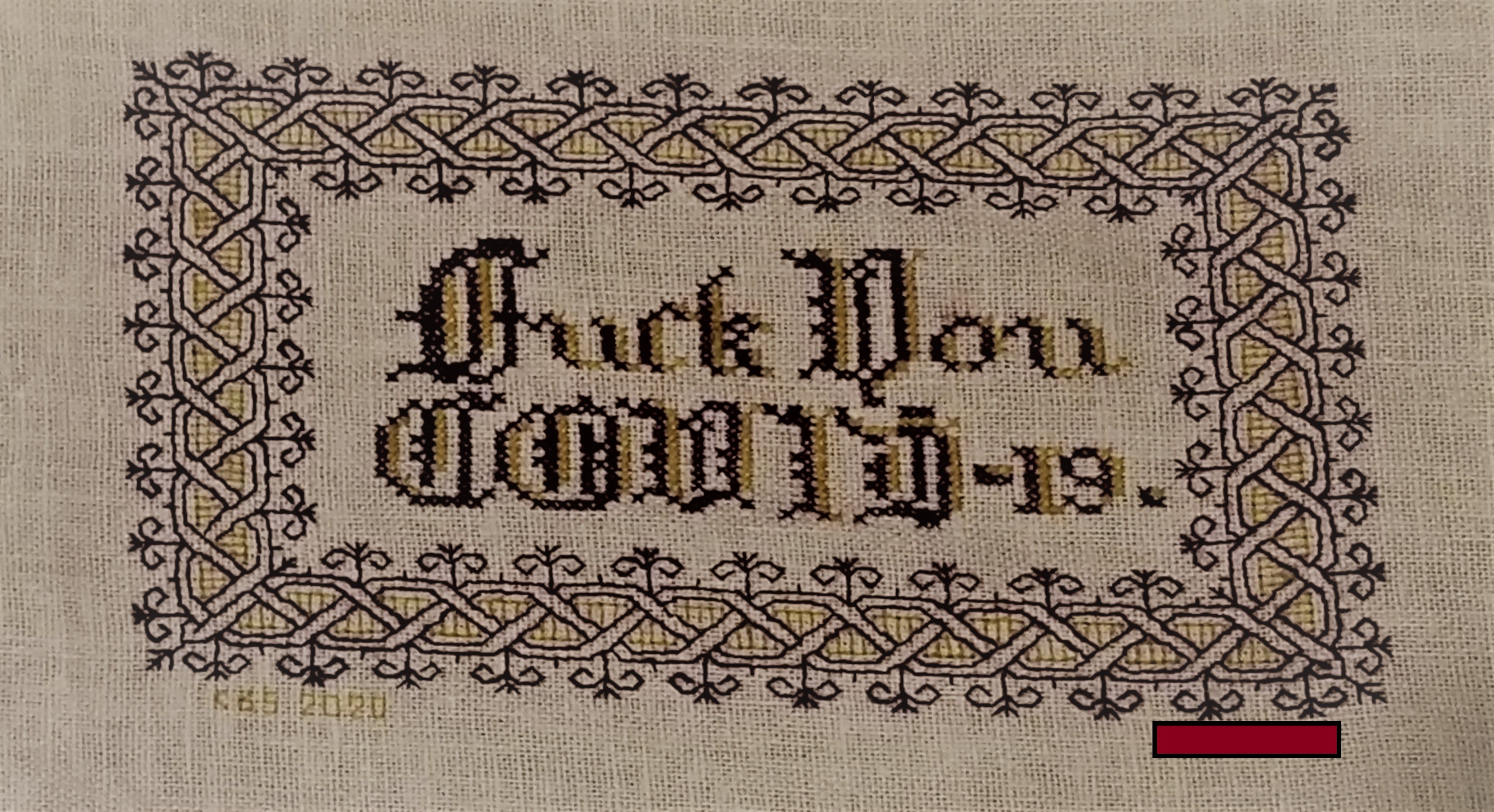
My own finish. Naturally dyed claret and mustard yellow wool on linen/cotton blend. I played with the color placement and letter forms a bit, since I can’t do anything verbatim these days.

Photo (c) 2020 by Madeline Keller-King, reproduced here by permission

Photo (c) 2020 by Breen Pat, reproduced here by permission
A couple of days ago I posted the design for my “Don’t Panic” piece, which has become shockingly relevant.
Friend Edith points out that harsh times call for harsh language, and that while some people might be soothed by a gentle statement, more strident expression suits many others.
Therefore for Friend Edith, and in the spirit of Dame Judy Dench, who is famed for stitching up provocative statements, I make this chart freely available for YOUR OWN PERSONAL, NON-COMMERCIAL USE.
Consider it as “good-deed-ware.” It’s tough out there right now. Pay this gift forward by helping out someone else in need; phoning or getting in touch with a family member, friend or neighbor who could use a cheerful contact; volunteering time or effort; or if you can afford it – donating to one of the many local relief charities or food banks that are helping those displaced from work right now.

Right-click on the image above to save it as a JPG.
This piece is intended to be done in cross stitch (the lettering), and double-running or back stitch (the frame). While it’s shown in black and red, use one color if you like, or substitute in as many other colors as you wish.
The source for the lettering is yet another of the offerings in Ramzi’s Patternmakercharts.blogspot.com collection. The border is from my recently released Ensamplario Atlantio II, a free collection of linear designs – mostly blackwork fills and borders.
Thank you Edith! Your inspiration and request will brighten the hearts of many, while rendering their walls cheekily NSFW.
(And there goes my PG blog rating, and any remaining shreds of reputation for gentility. But it’s worth it if someone smiles.)
BOOKMAKING 107: THE HUBRIS OF FAULTY LAYOUT (AND PLANNED RECOVERY)
OK. Here I am, showing off my overconfidence in front of everyone. I admit it – I’m not perfect,. Often my enthusiasm gets in the way of prudence, and I forget things like double checking all measurements.
And so this happened
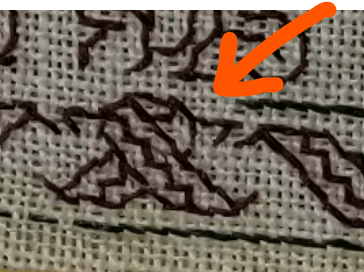
Here you see the “knot” I designed as the cheat at the center of the mirrored top and bottom border. It’s just fine – plump and happy. But wait! See that three stitch (6-thread) gap between it and the green border edge line coming in from the right? That shouldn’t be there! The spot the orange arrow indicates SHOULD be the center of that knot, to align with the center axis I’ve designated for this second side of my book cover.
Panic ensues. I go back and look at the entire border bit, from this center back to the right edge…

Nope. I didn’t miscount. The repeat is true. Why then am I off. (A deeper sense of panic sets in.)
I measure the leafy side of the book cover. It’s true to my original planned dimensions. Hmmm…. Can it be?

YES!
It looks like I made a major mistake in my layout that I did not notice when I worked the previous side. I inadvertently added the width of the spine to the width of the first side I stitched, over and above the spine width that’s already there and marked. I have nade a first side that’s marginally too big – about six stitches too big, and a second side with a main field that is no longer centered.
What to do?
I’ve got several choices
- Bury the thing in my Chest of Stitching Horrors(tm) and abandon it forever. Nope. Not going to happen. For one, there are witnesses (you); also a major promise of delivery.
- Do #1, but begin again. Not going to happen, either. I’ve gotten to far along to set this much effort aside.
- Pick out the entire first side and redo – or pick out the entire second side and redo. Tempting (especially the latter) but also not a favored option. While the mistake is real and is six stitches per side, I don’t think it warrants total destruction.
- Figure out a way to use as much as possible of the stitching done to date, and adapt. Being a bungie-jump stitcher, this is not the first time that things have gone seriously awry. Adapt. Reuse. Redirect. That’s my way. That’s what I will do.
Taking a moment to let the panic subside (as it usually does once I’ve figured out where the original mistake happened), I look at my options.
First, I point out that while being off six stitches on the front and six on the back sounds like a lot, at the thread count I’m using it’s only 3/16 of an inch per side, at most the book cover will be a teeny bit deep compared to the substrate notebook, but not enough to matter. Second, there is a blank area set aside for the spine – it’s six stitches wide. I can cannibalize it to compensate for half of the overage.
OK. Things are looking more manageable. Because the center of the second side is an eccentric repeat, in spite of my effort to balance it left/right, a skew presentation will not be all that noticeable, not compared to the same error on a totally symmetrical design like the flower-side. I can leave the double sprig and diamond ground section as-is.
For the border, I can leave in what I have, including the tell-tale center knot, and work the left side of the knot to mirror what I’ve already done on the right. If I do that by the time I get to the leftmost edge of this second cover I will be six stitches off count – eating up those six stitches I had set aside for the spine. The front and back covers should meet up along the single green line that marks the rightmost edge of the flower-patterned side above.
I hope. It should work. In theory. (The suspense is palpable.)
Stay tuned!
A MISSING LINK?
Folk who play around poking into historical styles of counted work often note far flung similarities and make wild conjectures about cross-pollination, imported influences, and neighbors-in-commerce catering to each other’s markets. I’m no different. But I try to contain myself. Still sometimes things present at just too convenient a time or place to NOT raise eyebrows, and make one wish one had the time for real academic research.
Oxford’s Ashmolean Museum houses several artifacts that make my heart flutter.
Where did the style of inhabited blackwork come from? By inhabited blackwork, I mean the style characterized by heavy outlines and geometric fills (ok, sometimes they are freehand, and are not always counted). My old coronation dress underskirt is a classic example.

The style hit big time in Tudor England, cloaked in vague associations with Moorish styles imported from the Iberian regions. There were certainly monochrome or limited palette pieces done before then, scrolling leaves/flowers worked with outlines, and certainly things done on the count. But all of those elements together? And where are “ancestral pieces” in Spain? What can we point to as a seed of the style?
Apparently there isn’t much. Some folkloric associations with Queen Catherine of Aragon, and “general knowledge” but not a lot of actual items that are clear ancestors of the Great Tudor Blackwork Explosion.
That’s where the Ashmolean’s Newberry Collection of Islamic Artifacts comes in. Dating is not very precise, and the provenance is Fustat, Egypt, where many fragments were found, preserved by the dry climate and fortuitous funerary customs. There are lots of bits there that look like the precursors of double running strapwork – bands of repeats done stepwise, that look a like the famous Meyer bands in the Holbein painting.

But there are also these.
Ashmolean Jameel Centre Newberry Collection, “Textile Fragment with leaves and squares”. Egypt, Fustat. 10th to 15th century. 6 x 47cm (warp x weft approx 18 x 19 thread count/cm) Accession EA1993.222

Ashmolean Jameel Centre Newberry Collection, “Textile Fragment with scrolling vine leaves, flowers, and leaves”. Egypt, Fustat. 10th to 15th century. 6 x 47cm (warp x weft approx 18 x 19 thread count/cm) Accession EA1993.223

These are not Spanish, but they are from a part of the greater Islamic world. They are not monochrome. Being rather broadly dated they only vaguely inch up to the period of inhabited blackwork’s rise to popularity (The 1400s are not the 1500s).
BUT. What we do see here are scrolling leaf and flower forms, with prominent outlines, and simple geometric/abstract fills, with a strong stylized (as opposed to representational) iconic feel. They would have been thought to have vague Moorish associations at the time blackwork arose.
Did works of this type make their way across the entire length of the Mediterranean to Spain, and by extension – to England, to influence the style we know so well? Trading and travel were robust, so it’s not an impossibility. Remember, we have no way to know for sure.
You have to admit though, it’s a juicy bit of speculation…
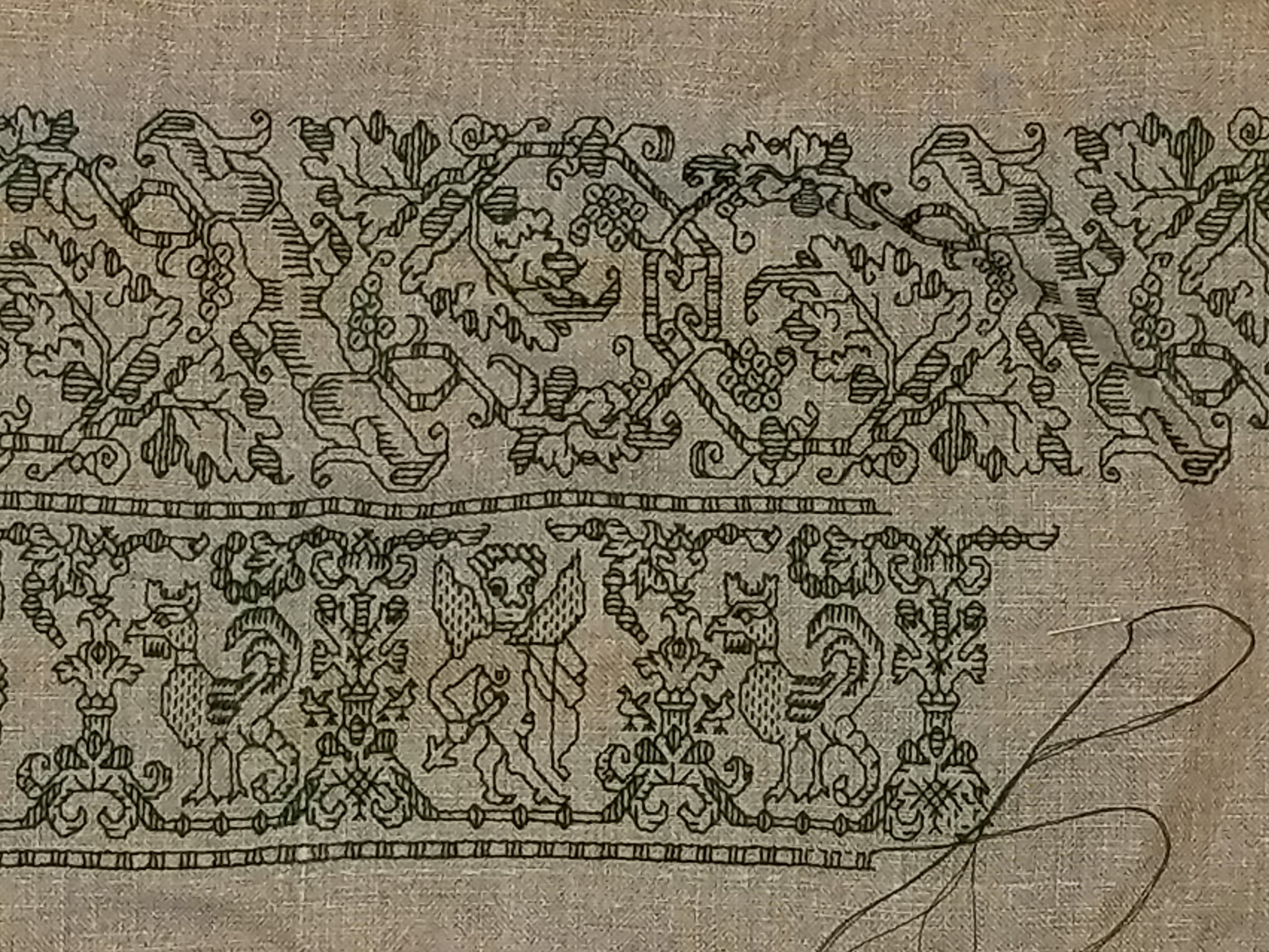
QUESTIONS ON THE LEAVES
Questions about my current project are popping in. I’ll try to answer the ones so far. Feel free to send more.
First, a progress shot:

As you can see, I’ve established the border on the second long side of the piece. I still have not decided on whether or not there will be wide borders along the short sides. That decision probably won’t occur until I have to advance the piece on the rollers of my roller frame. Right now the ground cloth’s center is (more or less) at the center of the exposed working area.
On to the questions.
How do you get the design onto the fabric?
I don’t. This is a counted style. I have a paper pattern that shows my repeat, graphed up into a grid. I look at that, then replicate the design on my cloth, using each group of 2×2 threads as my graph grid. It’s just a matter of looking left, seeing “Five stitches in line straight, then one diagonal to the left, then three straight left,” and stitching it.
As I work I constantly check back and forth to make sure that the newly stitched pieces are on target – true to the count of the design. To do that I tend not to work out on a long lead. I try to work adjacent areas so I can check them against each other as I go. For example on this design, I’ll confirm that the ed
My teacher told me that I always need to baste in an even grid before I start a large charted project. Why haven’t you done that?
Because I don’t need to. I do have basted lines that indicate the edges and center point of the area I will be stitching, but I tease them out and clip them as I go along to keep them out of my way. I’ve never used a fully gridded ground with guidelines basted in every ten or twenty stitches apart. I’m comfortable working that way, although I know that others need more alignment aids than I do.
Will you be making this available as a chart or kit?
Not as such. This leafy design will be included in my (ever) forthcoming book, The Second Carolingian Modelbook. (News of that book’s publication will be here on String first). But I won’t be issuing a project chart or kit for this piece.
What thread are you using?
I’m using the vintage “art silk” floss I bought in India. I wish it were real silk, but we do with what we have. One nice thing about it – it’s very fine, and presents much like finger spun if stitched closely.
For the green double-running stitch, I am using two strands of this floss, heavily waxed. For the satin stitch, I am using three strands, unwaxed. The stuff is a bit unruly, and keeping the satin stitch even and smooth is much harder than establishing the design in double running.

What’s the count of your ground?
It’s an 40-count evenweave 100% linen, stash aged. I’m not sure where/when I got it, but I dug it out from the bottom of the pile, so it wasn’t a recent purchase. I’m working over 2×2 threads, so that works out to about 20 stitches per inch. But I think there’s a minute variance in count north-south vs. east-west, so it’s probably more like 20 spi x 19.5 spi.
What will this be when you are done?
A monument to the time it took to stitch.
Seriously, while I had originally thought it would make a nifty pillow for our sofa, complementing the room’s colors and being a different finishing treatment from yet-another-wall-hanging. However, I’ve decided against that. The art silk in satin stitch is too friable, prone to snags and catches. The thought of throwing myself on the sofa and having the rivets of my jeans play havoc with those shiny, smooth bits is a harsh reality check. This will probably end up on my walls, like so many of my other pieces.
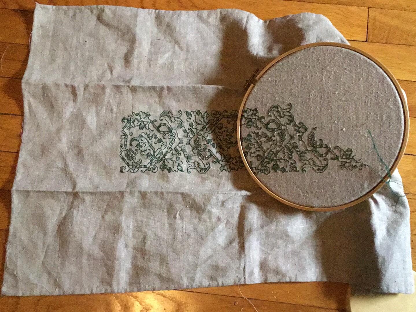
TAKING ON A LIFE OF ITS OWN
I continue on the Italian Renaissance leafy multicolor piece.

The skewed weave you may see is an artifact of image compression, and is not indicative of the appearance of the ground cloth.
Originally I had thought to do yet another sampler cloth, with lots of designs grouped rather willy-nilly, but I have changed my mind. The look of this particular ground is so striking that I want to do a larger example of it. I also have a companion edging for this all-over that I’m itching to apply. Right now I’m leaning towards a large rectangular piece, surrounded by that edging, possibly using some surface work in gold thread for added bling. I’m not sure what the finish will be, but I am considering making this into a pillow, which is one of the possible original uses for a design of this type.
Along the way I am re-learning the delights of Satin Stitch. It never was one of my faves, but the play of light using the faux silk thread can’t be beat. The deep green I’m using for the counted outlines in double running is waxed, but the satin stitch in-fillings are not in order to maximize sheen. And no – I’m not going to stitch every area in every leaf. I’m going to leave the piece partially filled in as it is above. That’s more or less along the lines of the original, but possibly leaving a bit more unfilled. The decision on working the red on the other half of each large leaf is still being made. On one hand it would look interesting, but on the other hand, so much red would overpower the rest of the stitching. Opinions are solicited here.
I’ve also learned the hard way how NOT to handle the multicolor fill on the branch. Originally I had done it as multiple rows of one-unit tall satin stitch, vertically. That broke up the color too much, so I picked that out and re-did it wider, but with the color broken up by the little bits of cross hatching on the sides of the stem. I am not entirely pleased, in part due to clumsy execution of the first. Working that bit horizontally is right out, both for fidelity to the original reasons, and due to the breadth and spread of those areas. I may need to explore threading my satin stitches underneath some of the crosshatches. Or just learning to do them more neatly…
The current plan is to work up the rest of the area inside this hoop, and then transfer the piece to my big flat frame. The thought of hooping over all that satin stitch brings the visceral feel of fingernails on a chalk board.
CORNERED AGAIN
I’m still doodling on the Stupid Cupid sampler, having fun with some of the larger strip designs that will be in The Second Carolingian Modelbook.
As usual, I’ve leapt off into the deep end with no particular plan. I know that some people hyperventilate unless they have drafted out every stitch of a piece or are working from a fully graphed kit, but I have more fun improvising as I go. I have learned to leave myself as many options as possible as I work, so that I don’t “paint myself into a corner.” I’ll try to explain…
Ground Prep
The first thing I did was standard prep. I like to hand-hem all four sides of my ground cloth, cutting off any skew-to-weave edges before I hem. I also lay down minimal guidance lines. At the minimum I will use a light color/barely visible standard sewing thread to baste a line of demarcation across both the horizontal and vertical center lines of the piece. Sometimes I also add a perimeter line, measured from the cloth’s edge, to mark the edge of the area to be worked. I don’t count the threads I go over as a baste (the basting stitches are not uniform in length), but they do follow the weave exactly. This gives me a nice, stable piece to work on, with pre-defined center points and stitching boundaries.
Thread Selection
I pick a thread color (or colors) that work well with my ground. If multiples, I try to pick colors from stash that are in quantities that would allow me to make my selection on the fly, rather than limiting what can be done to fit what’s on hand. Depending on the size of my piece, the fragility of the threads to be used and whim, I drag out either my flat scrolling frame or my sit-upon round frame. In this case, I picked the green DMC floss (#890) I had left over from my tablecloth, to coordinate with the natural light brown of my linen.
Design Selection and Placement
Then I begin thumbing through my design notebooks and collections. Sometimes as I prep my ground, an idea of what to do is already forming. If it does, I may add some additional guidance lines to help reserve areas for words, or to further subdivide the available area – but to date I have never laid down a grid over the entire piece, nor have I ever outlined specific counted-out areas in which to place particular strips/fills/motifs. Others may wish to do those things, but I don’t find it necessary.
Once I find my first pattern, I decide where on the cloth I want it to go (top, bottom, centered, offset from the center a bit), find that design’s calculated or motif-visual center, and start. I always begin at one of my center lines and work from there.
Here’s the current piece at this stage of work.
You can barely see the pale blue threads that mark my centers and my margins. That “tail” hanging off the bottom of the piece is part of one. They don’t live long. I never stitch over them. As I encroach upon my marking lines, I pick them out and snip the about-to-be-crossed bits out.
At the point above, I hadn’t decided on what to put north and south of this bit. I hadn’t even decided up and down because this design is north/south symmetrical. And I wasn’t thinking yet of any framing mechanism. But that didn’t last long.
As you can see in the bit above, I decided on a second strip, and decided to separate them with a narrow barred border, stolen from the stems of the first pattern. I began adding the bars north and south, but not knowing what was coming next, or in fact where the roly-poly cupid/cockatrice bar would end relative to the first strip, held off adding them to the left and right.
And here I found my first problem. I had aligned the center of the vase between the first cupid and the cockatrice with the center of the symmetrical strip, above. But I didn’t notice that the areas bearing the figure and the creature were not of equal width. Because the cupid’s alcove is wider than the cockatrice’s, the left and right ends of that strip did not end neatly aligned to the area already worked.
What to do?
Ignore it and keep going.
So I did. I added the third major strip, the cupid/lion/fleeing boxer/dolphin panel. It’s a VERY wide repeat, with no exact center, but I aligned the visual center of the featured cupid with the already established center line.

Again, the design repeats, but the counts are not exact, so worked my piece left and right to a “good stopping point.” As I did so, I noted that the bottom strip would probably be the widest, so I added the bars left and right to finish out the frame around that section.

I then continued the bar north from the surround of the bottom strip. And encountered the second challenge. How to deal with the empty area to the left of the center strip?
I thought about several possibilities including finding a one-word motto to stitch vertically; continuing with the center strip design to fill out the area; or making this bug into a design feature. I chose the lattermost.
At the bottom left of the photo below you can see it. I continued my outer bar north, but added a second one, that defined a narrow strip. Then I improvised a standard acorn meander. I didn’t even bother to draw it out. I just found my center point, replicated an acorn from the top strip, and stitch-doodled up the linkage.

Then I took a stand-back look and decided that I didn’t want to add more strips to this piece. But a deeper, coordinating yet frilly outer companion border would work. So I flipped through my to-be T2CM collection and picked one out. I started in the north/south center of the left edge and stitched it until I got to the corner, then rounded the corner and continued on, spacing the edge of the first plume on the top roughly equally far away from the exact corner point as the bulk of the foliage on the left.
This time to fill in the empty space between my top stitched band and the newly established border(s), I decided to eke out the existing design. That’s what I have on-the-needle in the photo above.
Purists will note that I am using Heresy Stitch for the baseline of my frilly plumed border, rather than sticking to strict double running. I’m going back and adding a narrow border, using Heresy I can move along faster with minimal re-setting of my hoop.
Challenges yet to come….
- How will the plume border butt up against the three corners to come? Will I be able to round them as gracefully as this one?
- Will I go back and engineer some sort of corner treatment for the point of the plume border after I get all four done? Will I be able to use the same one for all four?
- The center strip is short on the right-hand edge, too – but not as short as on the left. Will I have room to add another supplemental bar and narrow border there? Will I do something else?
- Where will I sign and date this thing?
Now these burning issues may not seem like the epitome of suspense in your world. But in mine, they are fraught with danger and excitement.
