AND NOW WE ARE FOUR
I report the finish on my RESIST sampler. Completed, signed and dated.

Don’t worry about that dot on the bottom margin – that’s just fluff I neglected to brush off prior to the photo. The message is dead serious, but there are some silly bits in it. Like the dragon heads that parade across the top. The eyes in the original are empty – no pupils. But I put some in on this strip, and got several emotions when I did. My dragon heads look angry, attentive, contemplative, attentive, and bored. And more. Just a whim.
I am also pleased with the Pegasus strip – doodled up just for this piece. It will be included in my forthcoming Ensamplario Atlantio Volume III (EnsAtl3). No timeline yet for that release. Here are the sources for all fifteen bands, top to bottom.
- Dragon head edging – The Second Carolingian Modelbook (T2CM), Plate 25:4. Redaction with impromptu manic eyeball improvisations.
- Acorn meander – T2CM, Plate 25:3. My original.
- Line interlace – T2CM, Plate 11:3. Adaptation of non-graphed modelbook design.
- Twisted meandering eels – T2CM, Plate 27:2. Redaction
- RESIST using alphabet border – Whole alphabet blocks and bits that fit around them, EnsAtl3. My original.
- Lily buds – Several versions in my various works, this one from my free class handout available on my patterns tab. Adapted redaction.
- Kittens and string – EnsAtl3. My original.
- Large floral all-over – EnsAtl3. My original.
- Doubled simple flower strip – T2CM, sample figure on building larger borders from narrow ones, on the write-up page for Plate 7. Original narrow strip, T2CM, Plate 6:3. My original.
- Cursed bunnies eating my hostas again – I had fun stabbing these guys, too, for obvious reasons. EnsAtl3. My original.
- Very large sprouting all-over. Broadside available here on String here and on my patterns tab. Redaction.
- Block edge border T2CM. Plate 23:2. My original.
- Thistles – T2CM, Plate 30:3/ Adaptation of non-graphed modelbook design.
- Pegasus strip – EnsAtl3. My original.
- Rooster edging – (Turn it upside down and you’ll see them). EnsAtl3. My original.
Now RESIST joins the three fangirl samplers I have completed, celebrating the science fiction works of my Resident Male. That’s a lot of stitching since June, shown here on my Wall of Shame, where all my finished but not yet framed works live.

What’s next? Probably another in the PERSIST-RESIST grouping. ASSIST will be longer than RESIST. Also on a high count not-so-evenweave linen remnant. As you can see, the prep step of hemming has started.

I’m torn about colors and threads. And I have to calculate the thread count of this scrap piece. I have a feeling that it’s a bit more skew than the other four, and probably a skosh coarser than RESIST. I have some silks in various colors that might work on it, doubled in happy polychromatic chaos. Or I might do it all in deep red, possibly with a spot of a shiny black for emphasis.
As to what to put on it, I’m also contemplating options. The word, for sure. Possibly some voided bits or heavy foreground long-armed cross stitch strapwork bands (I haven’t done much of that recently). Or maybe I’ll work in some tiles of fills. But not worked inside freehand drawn shapes – just in geometrics. I have LOTS of fills begging to be taken out to play, some of which I came up with on the fly for the Unstitched Coif project. Since that’s off at the V&A, it seems proper that I stitch them up on something I can look at and enjoy here at home.
Stay tuned for more stitchy mischief.
RAGE STITCHING CONTINUES
I’ve made more progress on the non-name sampler I’ve been working on since the beginning of November:

I’ve added three strips since the last post. The pink/purple and blue one at the top, and the bottommost two below the bunnies.
From top to bottom, RESIST was done in some vintage Belding Corticelli silk, size A. I have a bag of about 15 small wooden spools of the stuff in assorted strident colors. All are unstarted 100 yard spools, and most are singles. There are only a couple of colors for which I have two spools. Here are the two I stitched with on this project, along with the no-name black silk I’ve been using for (most of) the rest of this piece (small embroidery scissors and laying tool for scale).

They were among the goodies re-homed to me by a fellow townsperson who was clearing her late mother’s stash of knitting and stitching supplies. It’s tightly twisted silk, and is perfect for stitching at this gauge. I have fallen in love with it. Sadly, it’s a limited resource. The Belding Corticelli mill closed in 1932. I’ll not be finding more when these are gone. Such is the nature of true love.
The boxed alphabet used for RESIST is from my free book Ensamplario Atlantio II, Plates 33 and 34. I drafted up a band with a design element that looked like an H. Once I had that it occurred to me that folk might like to put mottoes or initials along edges of chemises (a historical usage), so I doodled up the rest of the alphabet for use with that design band. The eagle eyed will spot that the design band I employed with RESIST is slightly different than the one in the book. I can’t help it. Anything worth tinkering with is worth tinkering with again. Oh. And the color choice? It’s not a coincidence.
Moving down to the bottom, the very involved wide floral panel beneath the bunnies is also available free on this site. It’s the all-over I used for the discussion of how to redact a design. That discussion is here, complete with a link to the downloadable pattern. It can also be found on the Embroidery Patterns tab here on String. I enjoyed stitching this one. It went much faster than I expected because the design though involved covers a lot of territory but uses comparatively few stitches to do so.
In deliberate contrast to the open airy nature of the floral strip is the close geometric immediately below it. That one is original, a “roughly inspired by” that appears in my (not free) Second Carolingian Modelbook, Plate 23:2.
Now…. What to add next? As usual I really will not know until it hits me. To that end I am paging through my own pattern books, both published and pending. I may use something from one of them or from the free broadsides on the Embroidery tab page, or something from the Epic Fandom Stitch-Along, or I might draw up something new. Right now I’m on the hunt.
ASIDE: That Epic Fandom Stitch-Along tab is rather cumbersome to use if one is interested in downloading the whole project at once rather than week-by-week piecemeal. Would anyone like me to put the whole thing into a single booklet and add it as a free download to the My Books page here on String?
RESISTANCE IS NEVER FUTILE, AND OTHER MISTAKES
I continue my quest for distraction, working on the impromptu doodle sampler I mentioned in my last post. I still haven’t decided what it will bear, but right now I’m leaning towards the single word “RESIST.” Time will tell, but I’m already looking at typefaces. Warm and fuzzy/ultratraditional/edgy and threatening? All nuance the message and are under consideration.
In the mean time I go back to my mail and comment inboxes and note that there are a few notes that claim envy of my work because I “never make a mistake.” Few things could be further from the truth.
I make mistakes ALL the time. In spite of how well I try to idiot-proof my methods, I consistently prove that I am beyond idiot-proofing. I could throw out excuses – I stitch mostly with divided attention, while watching TV, armchair kibbitzing/team playing video or console adventure games, listening to podcasts or books on tape, or sitting in a conversation with family or friends. I also confess to “stitching under the influence” – often our evening TV hour is accompanied by a glass of wine. I pick patterns on whim, and don’t always hit the right contrast/compliment point I was after. And I suffer from Memory Hubris. Once I’ve established two or three repeats of a design (in any orientation), I go “off paper” and attempt all future iterations from memory and by copying the initial segments, even if the newly stitched bits are mirrored or rotated from the prior work. I also fall prey to the common double-running flaw of trying to get away with using a too-long strand of thread. Needless to say all of these contribute to a healthy stream of problems.
These problems include:
- Missing the correct start point or alignment line, so that the work doesn’t meet up with or is uncentered against established stitching;
- Stitching off grid (not hitting the exact over-2 or over-3 spot) so lines and angles are off by a thread or two;
- Losing my place in a design and repeating an element where it was not supposed to go, or skipping one altogether;
- Veering off into hyperspace – getting totally lost on the number of stitches I need and their proper placement, especially on long diagonal runs with nothing to steady me nearby; and
- Deciding that I don’t like my bungee-jump pattern choice, and would prefer something else instead;
- Confronting errors in thread management – for example, twisting, knotting, snagging, catching the tail, disrupting the spots of prior starts/finishes.
What do I do about them? In rare instances if the problem is just an errant single stitch that doesn’t upset placement of the rest of the design, I might leave it in. This however is rare. That single stitch will glare at me with dragon eyes every time I look at the piece, even if no one else can spot it. Mostly I pick the errant work out and start again.
There are comparatively few descriptions of how to rip back safely, without danger to the ground or surrounding stitching. I’ll try to outline my method for doing so in double running. Cross stitch, back stitch and the like would follow most of the same process, with a little accommodation for stitch structure and working protocols.
OK. Here’s the latest sin on the latest sampler. I made a very big alignment error on the unfinished bit at the bottom. The top of the hearts and arrows design as stitched here may look good, but it’s only half of the pattern. There’s a vertical flip that I had barely begun, with arrows that point up. As stitched, that second half won’t fit. (Oh, and I’ll be reworking the previously released chart to make the logic easier to stitch. )

I also felt that I wanted another narrower band here before working a wider one. So, since I would have to rip back 90% of the hearts and arrows band anyway, I decided to eliminate it totally.
Here’s my frogging kit – a laying tool, my best embroidery scissors – sharp all the way to the tip, with a rounded safety end on one blade, a pair of precision tweezers – the kind sold for electronics assembly, and Silly Putty, which I’ve written about before. Note the absence of a seam ripper or any other cutting implement. (Yes, I remembered to take this photo after I had already begun the Big Rip).

I could “unstitch” the piece, slowly drawing out each stitch in turn, reversing the direction in which the double running stitch was created. I will do this if I’ve got just a few stitches to remove because of an alignment misadventure, and then I’ll keep stitching with the same thread. But it’s not optimal for a big removal. For one, drawing the stitching thread through the ground that many times will degrade it and make it unsuitable for re-use. Long lengths of thread drawn through the ground also run a higher chance of crocking (depositing dye on the cloth), or leaving fuzz behind. When the errant bit is this big, better to snip and remove.
But you can’t just snip willy-nilly. Each snip is a chance to wound the ground cloth, and the condition of the cloth and the soon-to-be sacrificed thread must be taken into consideration. For example, if the thread is very soft and fuzzy or prone to shredding or crocking (think wool and most commercial cotton 6-ply flosses), I might make my snips in the front, but pick the work out from the back. If the thread is long-staple, structurally sound and unlikely to crock I will both cut and pick from the front.
The first thing to go is the long stitching tail. Snip. Gone. Then I start at one end of the work and snip two stitches side by side, preferably diagonals because they are longer and easier to grab. I usually do several of these pairs at a time. But I don’t rush in with my scissors. First I use the laying tool to gently “pry up” each stitch to be cut. Not enough to deform the ground, just enough so I have slack into which to insert the lower blade of the scissors. Here you see the laying tool making room under a stitch for scissor blade placement.
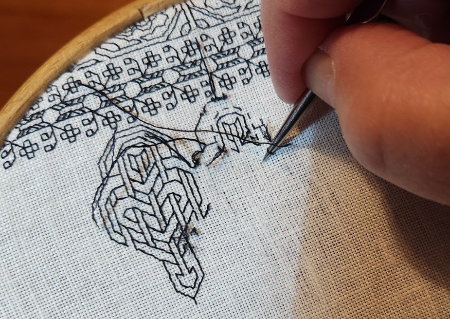
That lower blade is the one with the rounded bump NOT the thin and wickedly pointy other blade. This safety end helps guard against inadvertently catching and cutting the ground.
Once two stitches are cut I tease them back an inch or so, stitch by stitch, using my laying tool, and occasionally the tweezers. I work two at a time because of the every-other stitch construction of lines laid down in double running. One of those dashed lines will have been stitched after the other, and by cutting two adjacent stitches I can tease out both of them, quickly determined which path is newer and then do that one first, followed by the other. It’s always easer to remove the newer stitching first because it sometimes pierces the older stitching, which can cause snags as you rip. Once I’ve freed an inch or two I snip the freed bits off about a quarter inch from the surface. I’m about to remove that long thread seen in the piece above. I do this to minimize the length of thread pulled through (remember – crocking, fuzz).
Removal stitch by stitch, snip by snip, taking care not to hurt the rest of the piece is tedious. It takes me considerably longer to rip back than it does to lay down the stitching in the first place. One thing I was thankful for in this piece is my thread choice. Since I’m working in silk here there was very little residue left behind as I remove the stitching. That reside is where the Silly Putty comes in. I dab it on the surface to remove any remaining dye and fibers. No erasing or rubbing motions – I support the fabric from below with the plastic shell, and do a quick and light vertical press of the stuff. BEFORE you try this on your own precious work please check out the article I linked above. I am willing to accept risks for my work, but you might not want to. Know what they are before you attempt this.
Once everything is picked out, and surface fuzz/dye crocking has been Silly Puttied into oblivion, I have a blank canvas again. Some of the stitching holes are a little distended. I will use the tip of my laying tool and gently stroke the ground cloth at a 45-degree angle to the weave. That returns the threads to proper alignment. The result:
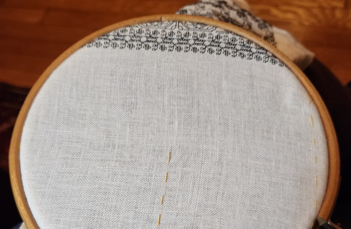
And what goes there? Bunnies.

And yes. There’s a mistake in the bunnies already. The rightmost finished bunny is looking at a partial leaf. I’ll go back and catch that “oops, I skipped over it” error when I’m done with the current thread.
Perfect? Not me. Never.
PERSISTING THROUGH BUSY WORK
It has been a week that was. A couple of them in fact. But I’ve tried to maintain equipoise by keeping hands and mind occupied as much as possible. To that end I have several bits of progress to report.
First is the start of yet another sampler. I’m not sure if this one will be adapted as another tribute to The Resident Male’s literary output, it will remain un-themed and completed with patterns picked at random, or if it will end up bearing a motto. I didn’t even decide which direction was up or down until the latest band was begun. The yarn-crazed kittens, being directional, made that determination for me. For now, I can only present progress. Two bands finished. The kittens are the third.


Keep an eye on those cats. They will resurface by the end of this post.
I also embarked on a project to send a holiday preparation care package to Elder Offspring and Companion, who have moved cross country, and are not going to be able to make it back here to share the family celebration. To that end, I’m selecting some of the tree ornaments we have made over the years, and am augmenting that with some additional crocheted snowflakes, including the holiday stocking for Companion I knit in late summer that matches the one I did about 28 years ago for Offspring, and making a really silly scrap fabric garland.


The crochet snowflake patterns came from a variety of sources, and to be truthful, I didn’t take notes. About half came from the book below, the rest were free patterns I found via Internet search. I had aimed for 12 but there are 13 here. One of these was especially wonky, so I felt guilty and made an extra to compensate. As for the oddnesses among them (yes, there are lots of errors), I plead distraction. I did these (and the garland) entirely while team-playing Skyrim with the Resident Male. He mans the controller, we cooperatively navigate the puzzles. Occasionally I appear to have lost my place in the pattern, but kept going anyway.

The no-sew garland consisted of taking strips of scrap low-fray fabric – in this case fleece remnants left over from a charitable project at a former workplace – and knotting them onto a sturdy cotton cord. Lots of scissor work reducing the scrap squares to strips, and a bit tedious to do, but there was no waste. The fabric odds and ends I saved from the dumpster have a new and decorative life.
I’ve also re-upped to serve as a volunteer indexer for the Antique Pattern Library. No pix for that, just lots of paging through and taking notes. It’s going slowly due to too many other things in process, plus overcoming the deep ennui brought on by the current political climate. But it is moving along.
Last but not least is fulfilling a promise. Several people were interested in working up their own version of the Persist mini-sampler I did back in 2017, and that I recently salvaged for re-use as an on-line avatar image. Since I had never charted it up in the first place, it took a bit of work to retro-engineer. Here is the thing in its original form:

Those kittens? They now run across the bottom of the sampler, below the tumbling voided flower panel, inside the snail border. It seemed a fitting tribute to current events, and the piece really needed better vertical balance. There are other tweaks made to the alphabet, spacing and other bits. I consider the new version to be vastly improved over the 2017 version.
As usual, I share this for your personal use only. And I request it be Good-Deed-Ware. If you download it consider me paid back if you do something nice for someone else. A work of small kindness or empathy. Reach out to someone who needs cheering up or companionship. Volunteer to do something to aid your community. Every little bit counts, and right now counts more than ever.

In any case, click here to download a PDF containing the three-part chart above plus commentary.
I have also added this chart to the Embroidery Patterns tab elsewhere on this site.
WHAT I DID SUMMER TO FALL
Starting 27 June and finishing yesterday evening, 25 October, I have cranked out three small samplers, one after another.

All three were inspired by books written by my Resident Male, although not all of the source books have been published. Here’s a better shot of the latest, fresh off the hoop. (Yes, I will eventually press and frame them all.)
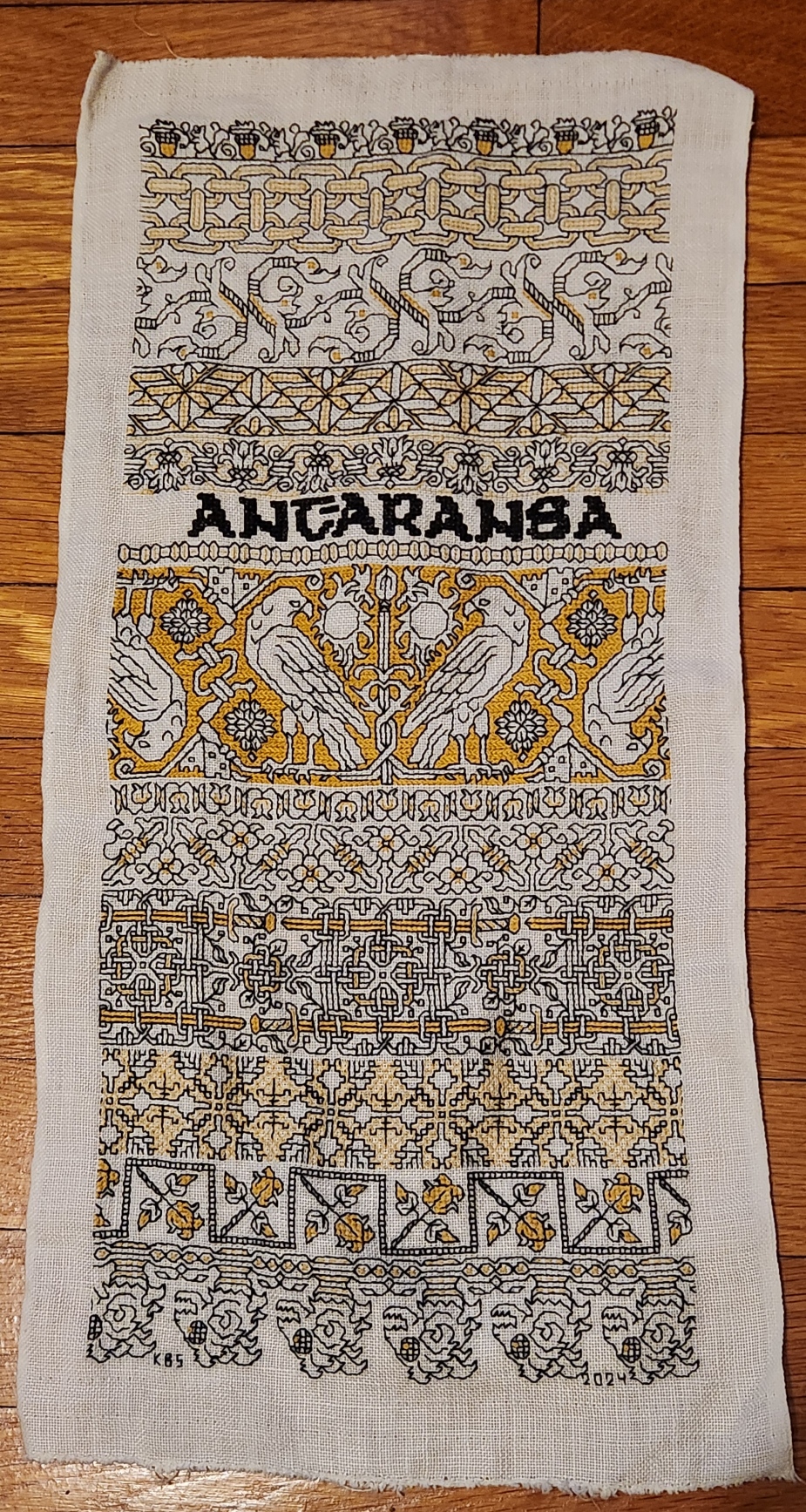
The last strip at the bottom is in the tradition of 16th and 17th century band edging patterns that often accompanied a wider main band design. While most of these narrow bands were floral, foliate or geometric, some of them featured creature heads, occasionally bird-like, lizard or dragon shaped, but all cropped and facing in the same direction. Those edgings would present with the baseline against the main design, so that ones below the main design were upside down, and dance around the corners. With those in mind, I have ended my Treyavir-inspired piece with the severed heads of lantern-eyed goblin monsters, gelnids, among the formidable foes of the novel’s hero Reignal.
To recap, I used black Sulky #30, double stranded. For the accent color I used standard DMC floss, #3820, sometimes two plies, sometimes one ply. All of the black foregrounds were done in double running stitch. Several treatments were used for the fills and accents. Here’s the list of accent treatments along with pattern sources:
- Acorns – plain old cross stitch (POCS), two plies. My own design.
- Chain – double running, two plies. My own design.
- Leafy meander – mix of double running and four sided cross stitch, two plies. My own redaction of a pattern appearing on a sampler dated 1687, accents are my own mods.
- Geometric triangles – simple boxed fill in double running, one ply. My own interpretation of an idle doodle done by J.R.R. Tolkein, more on this here.
- Flower meander – contour lines in double running, one ply. My own design.
- Motto – four sided cross stitch, two plies in the black Sulky. My own alphabet based on a mashup of several Uncial-derived pixel alphabets from the early Macintosh era.
- Narrow bead – double running and single stitches, one ply. My own design.
- Falcons – Long armed cross stitch (LACS), two plies. My own design.
- Tulip buds – double running, two plies. My own design.
- Flower and rod meander – POCS, my own design.
- Sword interlace – POCS, two plies. My own design.
- Step birds – simple diamond fill, one ply. My own redaction of a sleeve decoration on a portrait, circa 1500. It’s on the Patterns tab, here on String.
- Roses in boxes – POCS, two plies. An adaptation of a pattern appearing in my Second Carolingian Modelbook, plate 27:4 – my redaction of a border from a historical artifact.
- Monster heads – POCs, single running stitch, French knots – two plies.
Everything described as “my own design” above, will be in either my forthcoming books Ensamplario Atlantio Volume III, or The Third Carolingian Modelbook – both currently in process.
Now with this sampler done I can’t sit idle. Progress on the next might be a bit slower because I have various holiday deadline related projects to complete and ship out. And I have to decide if I am going to continue the series immediately, with the next bit of embroidery dedicated to either the Resident Male’s mixed SF/Fantasy short story collection The Temple of Beauty, or one of his other in process works; or if I’m going to go totally off script and do a piece entirely on whim.
But to be prepared, I’ve already selected a small stash remnant, hemmed it, and basted my edge and centerline guides, shown here between the completed pieces for scale:

It’s not as long as the last two, and significantly narrower than Stone by Stone. And the linen is higher count.
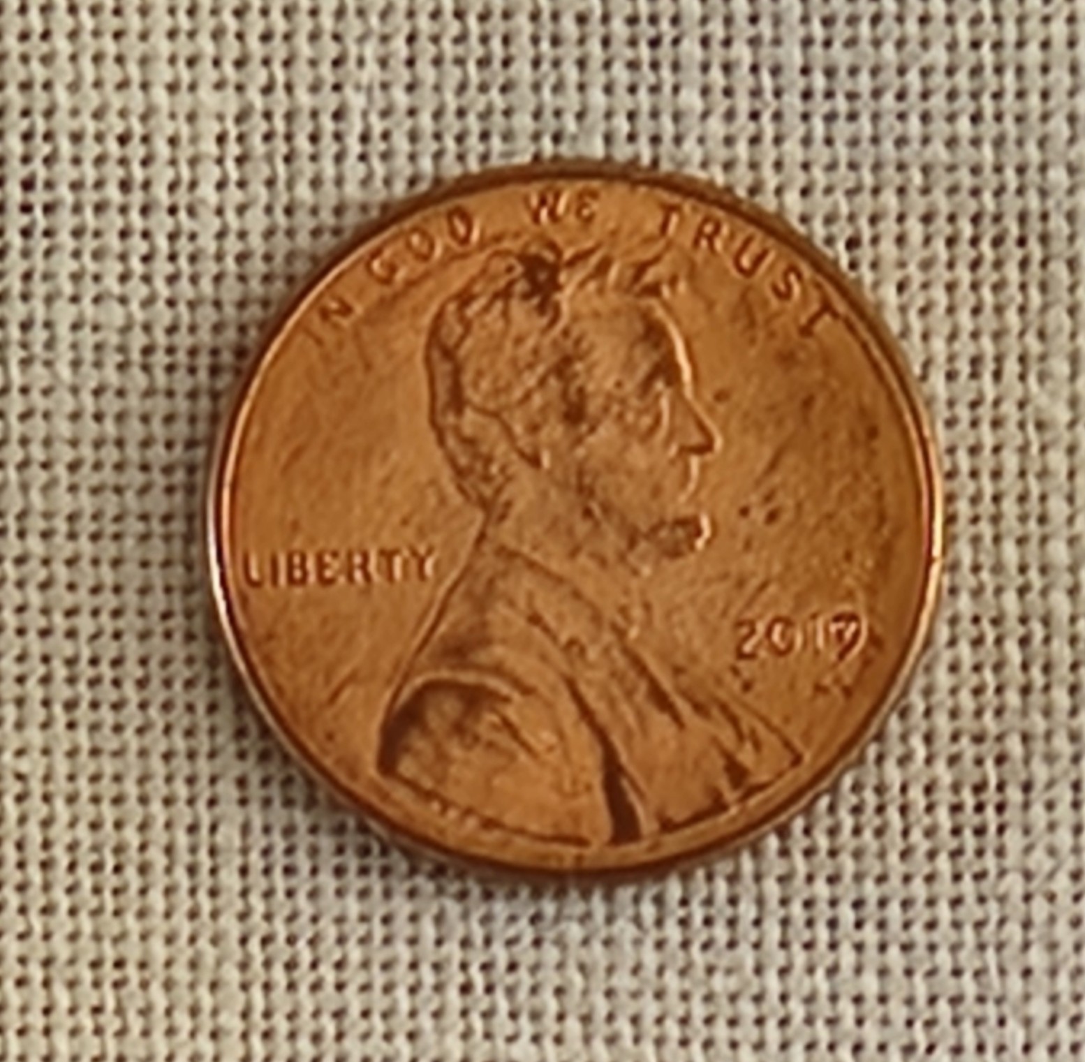
By my penny method, the coin covers 30 threads north-south, and 30 threads east-west. Multiply by 1.33 (a penny by definition is .75 inch) and we get an evenweave thread count of about 40 threads per inch. Green and black Stone by Stone was stitched on 33.25 thread per inch evenweave. The blue and red piece for Fractured Symmetry was on skew count 37.25 x 32 threads per inch linen, and the black and yellow Treyavir piece was on big-as-logs 26 threads per inch evenweave.
While this next piece will be physically smaller, the available “real estate” for pattern display will be roughly similar to the previous larger pieces that were worked on coarser grounds.
I haven’t decided on whether this one will also employ two colors. Right now I’m leaning to an all black piece, but one that uses multiple thread thicknesses. The reason is because I have come into a wealth of black threads in various weights, mostly rayon, but some cotton and silk as well.
Back in late summer when I was getting ready to go to Cape Cod for an extended stay I noted that I was rapidly eating into my spool of black Sulky #30. I was unsure if I would have enough to finish the yellow and black piece. Not having time enough for mail order, and not trusting that mail order would find me at our beach place (no street address delivery, you have to pick up mail and most UPS or Amazon sends at the post office), I went hunting in person. I started at the store where I had originally bought the Sulky, three years ago. They no longer stocked it, nor did several other local possibilities. But as I was chatting with one of the sales clerks and commiserating about mid-project disappointment, the next person in line said that she had the thread I needed in stash, and would be happy to share. We exchanged contact info, and she went home to stash-dive. I drove over to her house (just the next town over) and found a delightful bag of goodies awaiting me – several spools of black in assorted weights. I left my own thank-you present behind and scurried home with the goods. So my possibilities have multiplied. And on the finer ground, the elegantly fine faux silk rayons provided by my ever so generous benefactor will shine. (Oh, if you are reading this Kind Benefactor, ten thousand thanks again for helping me out of that jam!)
Don’t be surprised if I now segue to crocheted snowflakes, both production and blocking, or other crafts. I will be picking up this stitching either alongside those efforts, or after. But you can be sure that in terms of embroidery, I’m armed and dangerous, and I can’t be stopped.
PENULTIMATE, BUT ROSY
Having fallen a bit behind in timely progress posting, I present current status covering three strips.
First, here is the sword interlace – my own design with no direct historical precedent. Here it’s finished and the color accents have been applied. Since I wrote about it in my last post there’s not much to add other than I am pleased with the way it turned out. The yellow bits are worked in two strands, using plain old cross stitch for the blades and pommel, and two strands in double running (on skew count) for the interlace embellishments and sword hilts.
This pattern in its original slightly taller and more graceful form it will appear in Ensamplario Atlantio Volume III. I think this would make killer trim on the shirt of someone who might favor martial motifs rather than floral or plain geometrics.

The next strip down has debuted here on String, about a year ago. It’s available at my original post, and in the embroidery tab page on this site, where it’s listed as “Sleeve Band, 1500.” I may put it into The Third Carolingian Modelbook, as well. (Yes, I’m working on that one, too). The short story is that I redacted it from a portrait in the collection of the Bristol Museum and Art Gallery, Accession K1651; Italian, circa 1500. Here is its page in Art UK.
Although the majority of the design is as close as I could get to the sleeve decoration in the portrait, for this decidedly non-historical piece I took two liberties. Obviously the first is my use of the second color – in the case done in single strand, simple diamond mesh to contrast with the strongly horizontal/vertical foreground in black. The other departure is the small black square I added at the centerpoint defined by where the birds’ tails meet. That detail isn’t on the original and isn’t on my chart of it. I added that because I work in double running, and it served as a very convenient bridge point that helped me navigate jumps between the non-contiguous motifs.
The only connection I can see between this motif as a tribute to the Treyavir source material is that this style of pattern persisted for a very long time, working its way from haute adornment for noblewomen during the Renaissance to becoming part of a peasant folk tradition that could have been stitched anywhere from the Baltic to the Aegean at any point in time over the past 300 years. And there is a very brave peasant woman in the Resident Male’s novel.

The third band is something that started out with historical underpinnings but took a whole bunch of left hand turns along the way.
If you have a copy of my Second Carolingian Modelbook to hand you will find the original on Plate 27:4. The accompanying blurb cites it as being redacted from an embroidery at Belton House, Lincolnshire, UK, registered with the National Trust as Inventory Number 436944. But in the original the roses were a supporting secondary border, all sprouting from a single straight baseline in the same direction.
I started working the first one that way, then decided to go feral, and do them more closely spaced together, and in the zig-zag manner below. I also added the second color accent I didn’t bother regraphing the design, I just did the mental rotation and kept going. If you like it this way, you can find the book and do the flip yourself, too.
As for why I did it, this is a themed piece after all. Treyavir features an estate that’s a safe haven for women who are economic refugees or endangered survivors of a feudal, patriarchal society. So I’ve taken that and put my roses each in their own secure room, open to come or go as they please, yet protected from life’s more brutal realities. Non standard presentation, but I think it’s an improvement on the rather humdrum original.

Finally, here is the whole thing to date so you can see the balance of density, accent color, and movement. I have room below the roses for one more strip. And I’ve drafted up something special to put there.

FALCONS AND SWORDS
Of course we’ve got them. This is of course an homage to an epic fantasy adventure.

A finish on the voided falcon panel. Foreground first in double running stitch, using black thread. Background then worked in the same accent yellow I’ve been using, in long armed cross stitch (LACS). The telltale plaited look of LACS done in rows that alternate direction is clear:

Working the voiding after the outlines can be tricky. First, on a design this dense, there are lots of angles and small spaces that need to be accommodated. Those starts and stops are a headache for sure, and make the texture a bit murky in that last stitch where the fill abuts an outline. And then there’s the care taken to not snag or penetrate the outline stitching itself, so that it isn’t covered by the voiding. You can see a couple little spots on this were I wasn’t totally successful, and a black outline has been eclipsed by the later work in yellow. I did my best, but no one is perfect.
On to the subsequent three strips. First two fillers – a simple bud meander to balance the narrow border just above the falcons. My own invention, and destined for Ensamplario Atlantio volume III (EnsAtl3). Just a touch of yellow in the tulip like flower, and a stitch in the long leaves to bring the color into this band.
The one below with small quad flowers and slanting rods with fleur-de-lys terminals is also my own, and will be in EnsAtl3. I was thinking the rods or staves of office held by seneschals and stewards. A design element congruent with such folk in Treyavir. Again, just a touch of accent yellow to keep it in play.
The current panel is a bit of a departure. I did a spot motif of similar style on my big dancing skeleton Fangirl Sampler, based on an entirely different as yet unpublished book by my Resident Male.

I have since done some modifications, morphing that spot motif into a repeating border. I really like it – lacy and complex. That border will also be in EnsAtl3. But the design didn’t quite fit here. There was too much empty space, and that was distracting. So I picked out the small bit that I had started, and redid my concept specifically for this sampler. The main elements of the design are still there, but they are denser. I think that it will balance out the lighter, more airy two strips just above it. I’m not sure how to deploy the yellow. Possibly filling in the sword blades and embellishing other elements of the interlace. We will see where fancy takes me as I continue with this strip. This variant will NOT be in EnsAtl3.
After this comes one or two more bands, tops. No clue as to what they will be yet. Existing pieces? Prior art reworked? Something entirely new, doodled up to fit? Keep watching these skies and you’ll find out.
DO WHAT’S RIGHT
And we have more progress to report on the latest sampler strip in my series of stitched pieces commemorating the literary output of my Resident Male.
First we start with the now expected Mysterious Saying. In this case, “Ant-Aransa,” a quotation from the inspiring work – Treyavir. It translates roughly to “Do what’s right.” An admonishment that should be heeded more often for us all.

The lettering is not from my usual source for typefaces. I started by looking up pixel based fonts, many from the early days of screen display, and mashed up several Uncial like adaptations to chart out the letters I used. There is no one clean source, but the closest would be Scriptorium. I probably should have allotted more space for the hyphen, but so it goes. The lettering is worked in four sided cross stitch (each cross stitch outlined by a straight stitch on all four sides. I did that to make the saying pop, and to have optimal coverage.
Below Ant-Aransa is a very narrow ancillary border from the upcoming Ensamplario Atlantio III. I believe I show it there in combo with other design elements, and without the second color accents.
Moving on, I designed the strip in progress specifically for this sampler, with specific points of reference to the source inspiration. Treyavir is a work of fantasy with science fiction elements. It tells the story of Reignal Maigntar, Falcon Knight, so of course there have to be prominently featured falcons. Other story elements here include the waning sun, his spear, Grey Hallet (his castle/manor house), and curious crystalline magic gems. All present and accounted for.
As usual the foreground black stitching is worked in double running, but I’ve chosen to do the yellow voiding in long armed cross stitch. This choice was probably not optimal, due to the headache of squeezing that stitch into a few of the very narrow spaces between the foreground motifs. But again, there it is. I might include the falcon strip in Ens Atl III. That decision is still pending. As is revisiting the center of the suns to add some interior decoration. I will wait to see the whole strip completed, including voiding before I make that choice.
What’s left? As you can see below I’m only at the halfway point and there is still plenty of real estate to cover. Probably more swords or other weaponry. In a knightly story there is always room for armaments. Other than that, I haven’t a clue. As usual I’ll figure that out when I get there.

POST REBOOT PROGRESS
Although I’ve been lax about blogging, I have made progress on the Treyavir sampler.

Although it looks like I used several yellows for the accents to the plain black stitching, they are all the same color. What makes them look differently are the numbers of plies, the stitch used, and the stitch density. The yellow in the acorns is done in two plies of DMC #3820 in plain old cross stitch. The interlink accents are two strands of DMC in double running, as are the yellow bits in the odd foliate S-repeat below the chain. The triangular counterchange design uses a single strand of the DMC in double running, worked in a simple box fill. And the flower meander currently being stitched uses that same single strand of DMC yellow and double running, but in a very open and sparse manner.
Catching up since the last post, Strip #3, the vaguely leafy S-repeat, is not my own original. I redacted it from sampler dated 1697 (a bit later than my usual sources). It’s from Detached Geometric Patterns and Italianate Border Designs with Alphabet” 1697. National Trust Collections, Montacute House, Somerset, NT 597706. It’s the black one in the second row, upper right. Obviously the yellow is my add, specific to this piece. I’ve puzzled out several other designs from this sampler, and may include them in the next Ensamplario volume, since being post 1610, they are out of the timeline spread I try to stick to for my Carolingian Modelbook series. But in one place or another they will eventually escape from my desktop.
Skipping ahead to Strip #5, this simple meander is another of my own doodles, and will also be in EnsAtl III, but with a departure from that to-be-published version. Like all of the other placements of yellow in this, the background play was improvised on the spot just for this piece.
The one above the in-process stitching deserves a longer explanation. Strip #4 is something a bit far afield. I can’t call it my own. I would say it’s “After J.R.R. Tolkein.” That’s right. I used an on-newspaper doodle done by The Professor himself as my leaping off point. The heavily embellished newsprint page from August 1960 was displayed in the “Tolkein: Maker of Middle Earth” exhibit. The photo of it was captured by a fellow follower of the Prancing Pony Podcast: Tolkien & Middle Earth discussion group on Facebook, and shared in that group on 9 August 2024. I played with it and produced my version within hours of that post. Here is the inspiring image:

I was moved by the three-color bit at the upper left. Redacting it to be compliant with my blackwork standards was a bit problematic. For one, I stick to a single unit, 90°-45°-180° angle schema. I avoid half stitches and stitches taken over 2×1 units or other multiples. Curved lines are also a challenge. But for all of that, plus trying to keep the thing in as small a footprint as possible, I do think the lineage of my rather art-deco looking version can be perceived.
I also note that the visual designers working on the aesthetic for Gondor in the movie versions of Lord of the Rings might have been likewise inspired by these doodles. Evidence:

Now, what’s this design doing on a piece dedicated to the work of my own Resident Male? I looked at the strips already laid down and then went nosing around in my doodle pages for something that would contrast well with them. Preferably of medium width and a geometric, with potential to be worked up as a relatively solid band rather than a meander or baseline-sprouted design. I wanted something to balance the chain links above it and provide counterbalance to the extra wide designs I’m considering for use in the lower half of the piece. This one was just too juicy to pass over. And flowing from arguably the greatest wellspring of fantasy literature, from which every epic in that genre since has contained at least a drop of legacy, the filtered scion of my interpretation seemed appropriate.
Next up, another Mystery Inscription from Treyavir. Possibly a narrow defining band to frame it, then on to some really complex custom strips that echo bits from that book.
REBOOT
Yes, I did go back and tease out ALL of the stitching seen in my last post. I was not happy with the discontinued DMC linen I was using. Single strand it was (mostly) too thin for this 26.6 tpi linen ground. Doubled, the slubby nature of the thread – especially where two thick sections ended up side by side – made what should be smooth lines very haphazard in appearance.
Not being near home base with my stash to hand, nor near any useful retail outfits or access to reliable one-day delivery where I am, I had to rely on what was already in my stitching box. Back to the black Sulky 30. In this case, on the very coarse ground, two strands work nicely. I teamed the black up with a strong golden yellow (DMC 3820), also worked as two strands.

The yellow is not dark enough to be distinctive on its own for the linear elements, but as fill and voiding, it is effective. So I’m playing with it as accent rather than as a full-fledged “partner color” as done with the two colors on Stone by Stone and Ferthan, Fuur, Fustovv.
The sharp eyed will note a major error on my part, that I will go back and fix the hard way. Look at the right side of the piece. The chain elements end there two units further along in the repeat than they do along the left edge of the stitching. Because the squirrels are not a symmetrical repeat, I did not notice that my centerline was off until I did the second strip. I will go back later and fudge those two left side units in the shorted strips so that everything is nice and even.
And if I hadn’t confessed this sin here, I bet you would never have noticed.
The squirrels and the double chain are both slated for inclusion in Ensamplario Atlantio Volume III. Both are my own designs. The chain will include variants like corners, a centered yoke treatment, so that it can be easily stitched up as embellishment on cuffs and collars for shirts and chemises.
I haven’t decided yet to include the current strip in EnsAtl III, or to hold it in reserve for The Third Carolingian Modelbook (also in production, but not as far along). The reason is that it is a redaction rather than an original. I have a clean point source for it, although it’s late (1697). More on the design as the stitching develops and I figure out how to bling it up with yellow accents.
As to the size of this piece, it’s narrow, but long. You can see how much real estate I have to cover:

I do have a few very tall strips to include on this one. And another Enigmatic Saying in an Unearthly Language. Stay tuned!

