BADGE TETHERS AND MORE METHOD DESCRIPTION
In the last post I started a method description on working a large project without having to do a full chart of the entire design. I’ve now finished the first end and am starting on the second, so I continue the discussion.

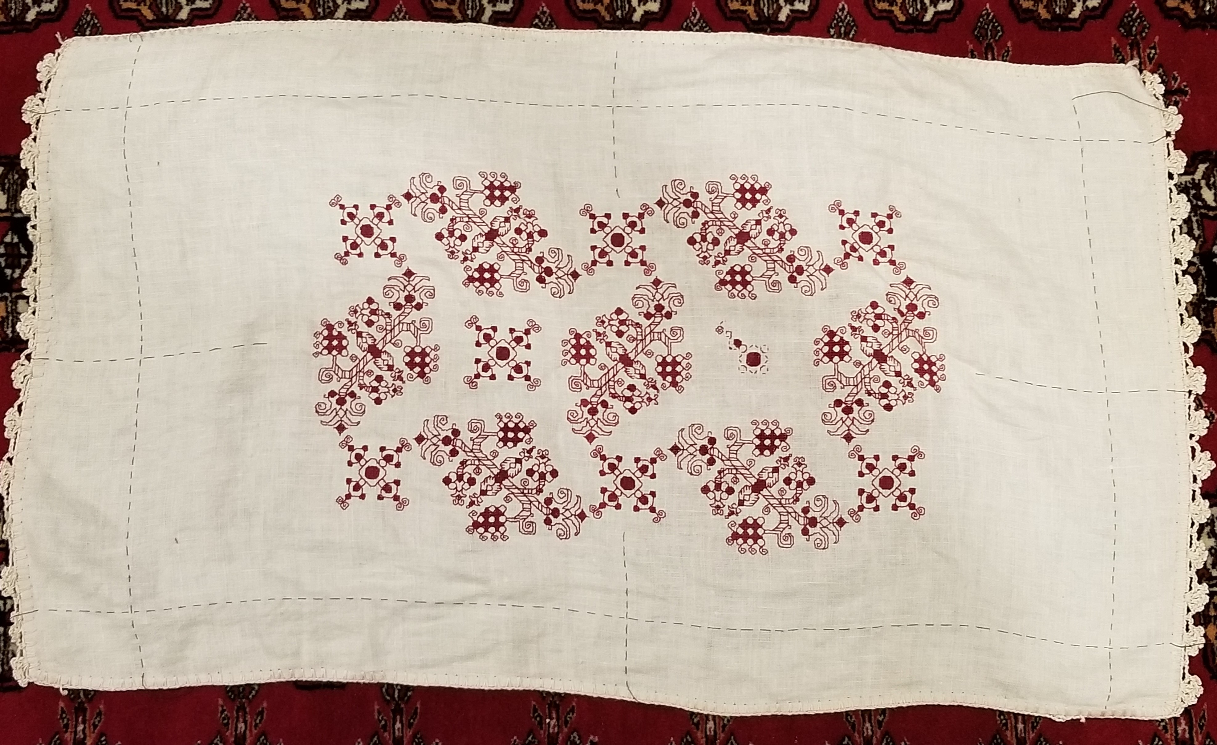
I worked both the top and bottom borders to the same logical stopping point. Since I had begun both of them aligned to the exact center of my piece and was careful to follow the design exactly, the ends of both lined up. More or less. There’s actually one FEWER unit one one end of the top of the end strip than there is at the bottom. But I also bet that without knowing it was there, zooming in and looking for it, you would never have noticed. Again, a variance but not a fatal error, and far less egregious than the errors I’ve spotted on historical pieces.
There’s a lot of “white space” to the right of the stitching, but bear in mind that the opposite side is the one with the wonky end has less free space to play around in (it’s not just photo foreshortening, it’s really not parallel to the edge line I based on the true grain of the fabric). So in order to leave enough room even at the narrowest point, I have allowed for more “waste ground” on the more generous edges. I also am not sure exactly what I will be doing for the border yet. I was thinking a simple hem and some needle lace (picking up something I haven’t done in decades), but there’s also the temptation of a withdrawn element Italian style hemmed edge. And I may just leave all such elaborations off for a bit, to mull it over some more and possibly rehearse those very rusty techniques.
Anyway, back to the stitching at hand. Note also that in the shot above, I was working the bottom border out to the left, to the exact same stopping point as the edge on the right. I continued and finished both long side borders. So it was on to the second short side.
In the photo below the piece has been flipped so that the bottom in the shot below is now at the top. But where to place that second border?

Since the left and right ends of both long side strips end in exactly the same place, it’s easy. I went over to the finished work, determined that the “collision line” where the border meets the field pattern aligns with the curly end of one of the little sprigs that grows up from it. So I found the corresponding point on the second side and began the first pass of double running down it. I didn’t do the whole side, because I know I’ll be working those curls and sprigs eventually, and rather than risk a massive miscount due to the long run between those sets, I would prefer to work the larger floral border, then fill in the little secondary one once that’s been finished. But I DO need to know where the collision line is so I can fill out the truncated edges of my main field design.
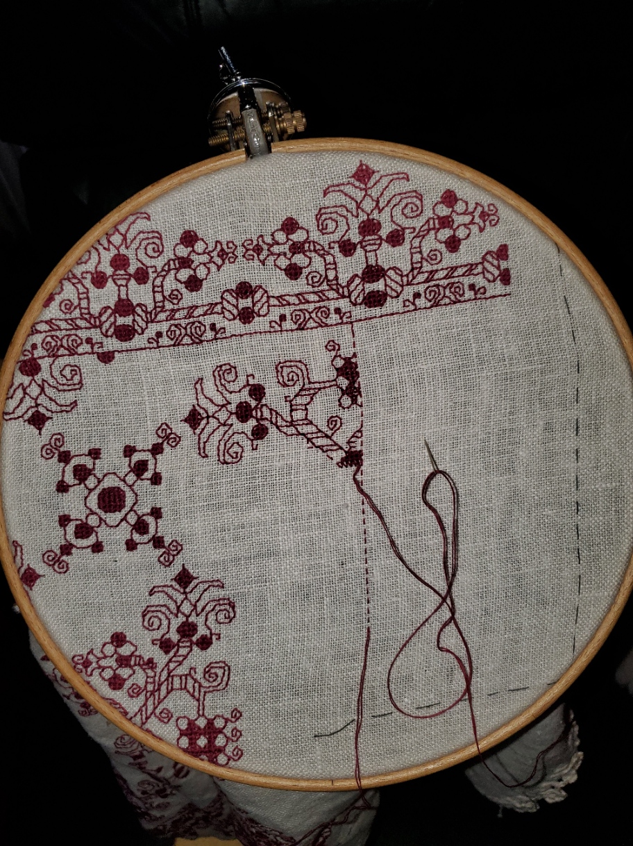
I will probably begin the large border again from the center, although since the end points of my other short side border are known, I could just mirror those. We will see where whim and fancy take me. At this point, all of the known issues have been worked out, mitigated, or blissfully ignored. It’s just dogged completion of the motifs and borders from now on.
GADGETS – THE BADGE TETHER
Last year I mentioned using a retractable badge holder to help corral my scissors at the beach.

I clipped it onto the straps of the drink holder of my beach chair. That worked so well, I’ve been looking for ways to do something similar at home. I tried clipping the things to me or wearing my old work lanyards. Too fussy. My favorite stitching chair is wood and leather, with no good clipping spots on it. But I’ve been working this current project on my Hardwicke Manor sit-upon hoop/stand combo. It has a nice, long screw clamp. The clip jaws of one of my badge holders fits exactly on the exposed screw.

While I’m showing the thing holding my favorite scissors and laying tool, with both lapped in front of the work, in actual play the angle of the badge head suspends them behind and away from the fabric, so catching isn’t a hazard. I love the convenience of not fishing around for often-used tools, and the fun of repurposing these tiny work albatrosses for greater ease.
Oh, and on my big flat scrolling frame, remember those penny size strong magnets I glued to the uprights? They hold the badge leashes quite securely, too. So I have the advantage of tools-to-hand on my flat frames, too.

INTO UNKNOWN SEAS – METHOD DESCRIPTION
A couple of people have sent me private notes asking about how I go about designing a larger project without graphing the entire thing. I attempt to answer, using the current Dizzy Grapes sideboard scarf/placemat as a possible approach.
It’s true I didn’t know how I was going to proceed when I began this project. I had a graph for the main field repeat, but only one iteration of the design, but not a chart for the entire area that design would inhabit. I didn’t have a border (yet). I had a piece of cloth of dubious cut and unknown count, and I had picked a thread well represented in my stash, with known easy-care laundry properties. I knew I wanted to make a large placemat type sideboard scarf, as big as attainable given the materials on hand.
The first thing to do was to figure out the largest possible area I could stitch on my unevenly hemmed ground. Leaving a bit of a margin around for easy hooping, I took plain old sewing thread and basted in a to-stitch area, with a bit of a margin. In doing this I discovered that the person who had reclaimed this bit of antique linen and done the crocheted edge treatments had a rather liberal interpretation of rectangles in general. Once my edges were basted in, I used simple measure/fold to determine the center lines, both north/south and east/west. Those were basted, too. Here’s that first step:

I also determined the thread count of this well washed, buttery soft vintage linen. It averages about 32 threads per inch, but is quite uneven, ranging from 28 to 34 in places, but didn’t dwell on that beyond satisfying myself that there was enough “real estate” inside my designated area to accommodate at least two full repeats of my chosen design across the narrow dimension.
Having the dead center of the piece determined, I chose a center point on the field design. I could have used the center of the smaller motif. That would probably have been easier, but I wanted the large rotating floral shapes to dominate instead of the largely unworked area surrounding the smaller motif. That was a bit tricky because the motif has a square unit in the dead-center, but I worked that straddling my basted center mark. Then I began working, snipping back my basted center guides as I went. (From here on the piece is shown rotated, with the narrow dimension north/south and the wide one east/west).

The shot above shows that first center motif in process, with the center guides being snipped back as the work encroached.
From there it was a simple matter of adding more floral motifs and the smaller X motifs they spiral around. Then after a group of four florals were complete, defining the space between them, centering the free-floating X in that area. Here are shots of those two processes. Note that as a Lazy Person, instead of tedious counting in from the established stitching, I used temporary basting to determine the centerpoint for the free-floating X motifs.
How did I know where to stop? No clue initially. I figured I’d get as close to the edge of my defined real estate as I could with full motifs, then pause to assess. It’s clear in the left photo that another full cycle of the repeat would not fit neatly between the established work and the basted guideline. But that area is also a bit wide to be entirely border. The proportions would be off. Plus that small X motif in the center bottom looks odd without at least a partial snippet of the floral motif spinning off its bottom leg.
So I did a rough count of the width left and decided I wanted a border that was about two inches wide at its widest (about 5 cm). Back to the drawing board to draft out something that complemented the design, and was somewhere around 30 units tall. I doodled up a couple of possibilities before settling on one. One strong consideration was the use of an inner line to contain the field pattern, so it had something even against which to truncate.
Once I had my border in hand, I decided that a bit of the center flower in its repeat could scallop below the basted edge line, so allowing for those 6 units, I counted up from my basted edge guide, and beginning at the center point I started the border of the first side. Then I worked right and left until I got to the edge of the “uncertainty zone” – the area as yet unworked at the left and right of the piece. Here’s the first side’s border in process.
As I established the border’s top edge (that field containment line), I went back to the main field, and worked the truncated snippet of the floral motif to fit. You can see that first snippet in the photo above.
Now on to that second side. But I had a cheat! Instead of starting it by counting down, I looked at that center floral snippet on the first side. Then I worked the floral snippet on the opposite side to the same point. That established the containment line on the second side, and I began the border at the center of the second side, working out to the left and right.

Now on to the ends. You can see now that I’m making these decisions on the fly. When I started I had no clear idea of what I was going to do beyond “Field. Border. Big.” I’m handling the problems and decisions as they are encountered, with minimal fretting about perfection along the way.
I chose to do butted borders on this piece. Neatly mitered, squared, or fudged border corners do exist on historical pieces, but they are in the minority. Even though my self-designed border isn’t particularly period representative (those repeating centered units with their own bounce repeat, as opposed to simple twigs all marching it the same direction), I wanted to use a non-mitered corner. I could have ended each off, designed a separate corner square, but I didn’t want to introduce another design variant – the border was already too busy.
Where to start that side border? What happens to the longer top and bottom borders? Do they just end or should I try to end at a visually logical place? Well, I chose the latter. I kept going on the bottom border to the right until I ended at the center of the bounce repeat. It’s just a few units shy of my designated basted edge. Not a lot of waste there. And knowing the height of the border, I established my north-south containment line.

You can see that I’m working on the first of the two spin-off floral sprigs along this side. When that’s done I will go to the centerpoint of the right hand edge and begin working the border from there, headed back to the corner shown. The side borders will end where they end. They will truncate oddly for sure, but having made the bottom and top congruent, what is on the sides, will be what it is. The side as a whole however should truncate in the same spot where it meets up to the border on the top. But no one is perfect. If it’s off by a unit or two, I will have accomplished the same degree of precision as most of the Ancients. They weren’t perfect either.
Stay tuned! The Grand Excitement of seeing the final product remains; and with it how things meet up, how close to symmetry I achieve, and how any as yet unknown problems are solved. And that’s before I decide how I’m going to edge and trim the piece out. Needle lace and/or a withdrawn/pulled element hem are both possibilities I haven’t yet ruled out.
So there you have it. Another adventure in bungee-jump stitching – starting a project with little or no detailed planning, no full project chart (just a partial chart showing the minimum needed), and no clear idea at outset on handling challenges encountered en route. I hope sharing this process inspires folk to take up their own self-composed projects.
EPIC FANDOM STITCHALONG – BAND 19
WHOVIAN NIGHTMARE
Too late. You peeked.
After more than a year since Band 1 was debuted, we go out in style. And I know that a lot of you were waiting for this one in particular. In this design you never know what’s lurking in the interlaces, waiting to trip you up.
Like the other panels that feature shading, this one can be worked voided if you so desire and the grey area on the chart indicates the logical areas for that background’s inclusion. However the design is a bit full, so if you do opt for voided, I suggest something that’s quite open, or is done with thinner threads than the main outlines, so that the foreground motifs, sprigs, and twigs are not obscured.
Time Factor 5, mostly for size. Time factor 5++ if you choose to work this voided with a background fill, but by now you are old pros at this and nothing I say will daunt you.

Use one color, multiple colors, or variegated threads, as you prefer. As with the rest of Epic, there are no rules or must-do approaches.
As usual this band plus working notes and hints has been appended to the bottom of the write-up on the SAL page, accessible via this link or via the tab at the top of every page here on String-or-Nothing.
If you are working our Epic Fandom SAL either as a whole or as a strip excerpt, please let me know. It gives me great joy to see how my “pattern children” fare out in the wide, wide world, especially when they meet up with creative, playful people. And if you give permission, I’d be happy to share your pix of this developing sampler, it in its finished state, or derivative projects including one or more of the Epic bands here on String, in a gallery post, with full credit to you as interpretive artist.
This is the last band of the project. I sincerely hope you have enjoyed it. For those who haven’t started yet, these files will remain here as long as String-or-Nothing persists.
GALLERY
That photo display opportunity mentioned above is a real offer. I will be starting a stand-alone gallery page here on String to celebrate progress and finishes of works inspired in the whole or in part by patterns from this SAL and from my books and single sheet releases. The new Gallery will replace the gallery tag in the general subject index. I would be happy to post any pix of anything derived from my designs, including projects knit from my patterns.
If you do send me photos, please indicate that you are giving permission to post your material, and let me know whether you want your name (or any nickname you choose) and/or a live link to your own page or website to appear alongside. I am happy to withhold names on request (not everyone wants fleeting Internet fame). And thanks for helping me spread the fun!
#EpicFandomSAL
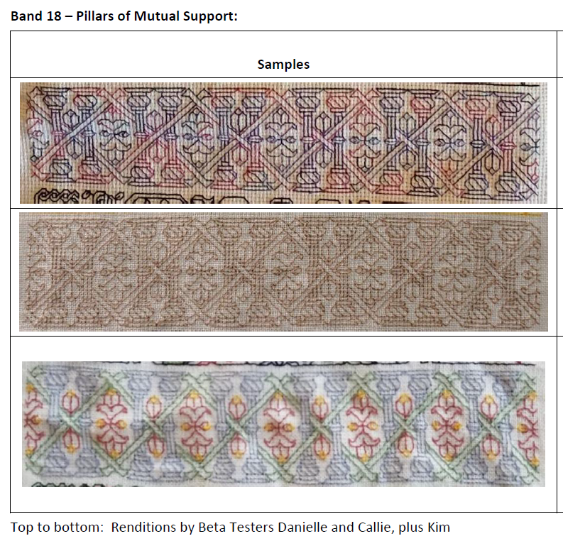
EPIC FANDOM STITCHALONG – BAND 18
PILLARS OF MUTUAL SUPPORT
You’ve stuck with this for a good long while now, and we’re almost done. Just one more strip after this. So please excuse me for inserting a bit of serious into all this silly.
Greater Fandom as a whole depends on the output of creative professionals. These range from big-money movie studios, highly paid actors and other high-impact performers/public personalities and well known/successful writers; to small one-person artisan shops selling on Etsy and other venues, authors struggling to get a toehold in the market, and independent musicians, artists, designers, costumers, actors, craftspeople, and artisans. Times have been tough for us all, and things have been especially hard for the creative community who depend on in-person consumption of their content, either in theaters or arenas, on screen, or interaction with their books or other publications. Many creative folk have just barely eked by for the past two years, and are hoping against hope that this year is an improvement.
If you have the means, please consider paying forward the time and attention invested in this free group project by purchasing something – it could be something as small as a 99-cent short story on Kindle – or otherwise offering support and acknowledgement. If you are hurting, too, consider leaving an honest review for a maker/writer/performer whose wares you might have bought and enjoyed in better times. The arts, especially those that feed the imagination, are what keep us human when all else conspires to strip back mutual respect, compassion, and empathy. Let’s work together to preserve them.
Time Factor 3, mostly for size. The over/under crosses can be a bit tricky, however, the repeat isn’t very long, and being quite symmetrical is quick to memorize, and is an easy field in which to spot errors.
Use one color, multiple colors, or variegated threads, as you prefer. As with the rest of Epic, there are no rules or must-do approaches.
As usual this band plus working notes and hints has been appended to the bottom of the write-up on the SAL page, accessible via this link or via the tab at the top of every page here on String-or-Nothing.
If you are working our Epic Fandom SAL either as a whole or as a strip excerpt, please let me know. It gives me great joy to see how my “pattern children” fare out in the wide, wide world, especially when they meet up with creative, playful people. And if you give permission, I’d be happy to share your pix of this developing sampler, it in its finished state, or derivative projects including one or more of the Epic bands here on String, in a gallery post, with full credit to you as interpretive artist.
Band 18 debuted on he Facebook Enablers group on 2 August. Band 19 was posted there today, and will be echoed here on 30 August.
#EpicFandomSAL
THOSE OLD LINENS…
First, progress on my Dizzy Grapes sideboard scarf. I’ve doodled up a companion border that I like, and I’ve begun working it. Now you can see what I meant when I said the field design would truncate where it intersects the border, rather than floating inside it.
The border is Italian Renaissance in feel, but with significant stylistic departures from standard borders as seen on museum artifacts. For one, there are mirrored bounces in the repeat. That’s not uncommon for main field designs, but not something I’ve encountered before in the companion borders. Usually the motifs in those repeat, all with the same directionality, as if they were all marching in precision following an unseen leader. The heavy reuse of design elements from the main field is a second departure. It’s not uncommon for borders to repeat bits of the design from the main field, and sometimes they do quote sections verbatim, but it’s relatively uncommon for those elements to be recomposed in this manner. Still, I’m not planning on entering this in any competitions where my usage and adaptation are judged.
Old Linens
I’ve gotten a couple question about the linen piece I used – where stuff like this can be found and the like. It so happens I lucked into a couple more old needlework and linen pieces yesterday. Younger Spawn was describing the treasure-hunt fun that can be had at estate sales, so we zipped off to one nearby. We both found goodies.
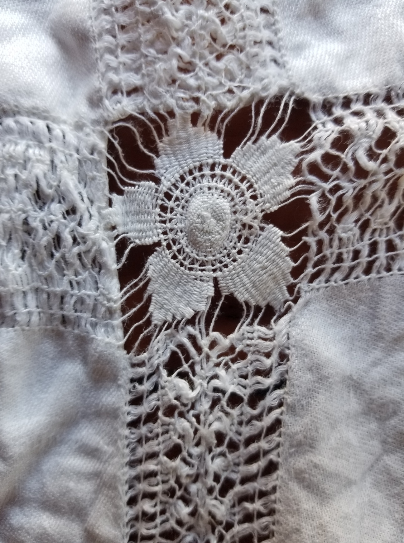
Among my discoveries were two darned net bridge cloths (small square table spreads). The substrate is hand knotted, in cotton, as is the darning and embroidered embellishments on top. I’m not good at dating/sourcing these pieces, but I suspect these are Sicilian Modano work, not earlier than 1920. Both are in very good condition with a couple of tiny brown “age spots” – probably the legacy of old spills. I don’t know enough to differentiate the earlier pieces of Modano from those of its 1980s revival. In the detail shot you can see the two weights of threads used for the darned fills, plus the long attached woven bullion style “picots” – not exactly sure what that stitch is called, plus a bit of straight stitch outlining.
Both are of exactly the same design, but one looks to have been savagely washed with bleach – it’s much whiter and about 20% smaller. One thing that does make me think they might be earlier is their size. By the 1980s bridge cloths were not exactly in style.
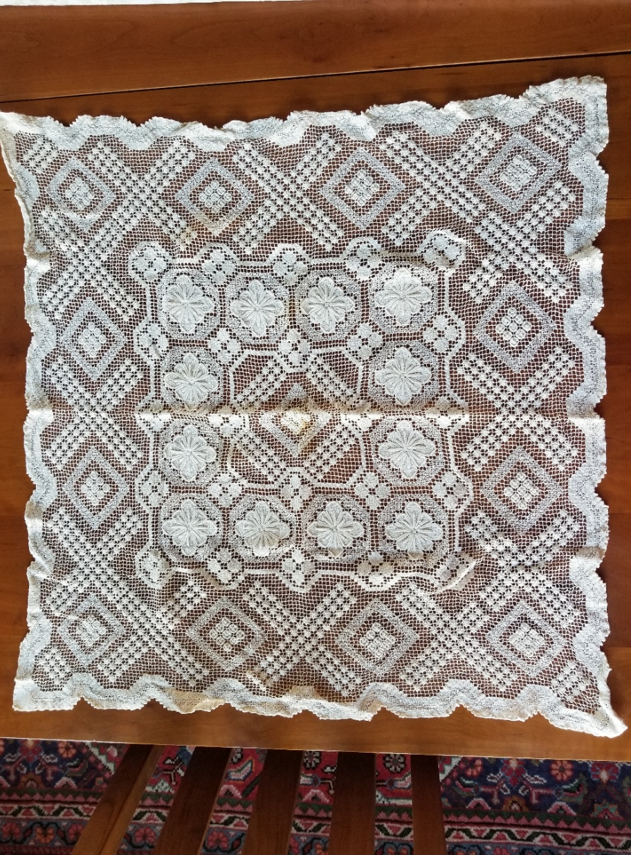

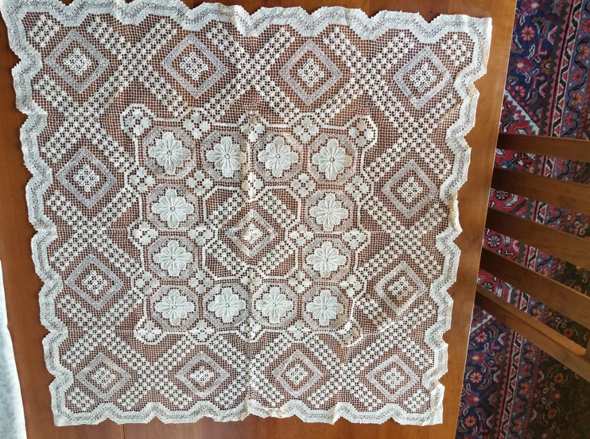
I’m not sure what I will do with these, but I couldn’t leave them there balled up, unloved and tagged at $1.00 each.
Lovely, but not actually linen. Moving on.
This is a tablecloth. The main body is twill weave linen, not suitable for counted stitching, but fantastic for surface embroidery. The hand-done withdrawn thread edgings are mostly intact, although the rondels in the corners are all slightly damaged. The main body of the cloth though is stain and damage-free. I won’t be using it at table – it’s too small for my dining room, but again the price was right, and the right person might be able to make a wonderful 16th/17th century Italian underdress/smock from it. $2.00 for about two yards of 60-inch wide linen? Not a bad price.

And at last – that upon which I will be stitching. I have some specific ideas for these twelve machine finished napkins. They are not uniform in size – some have shrunk significantly. A couple have stains that must be worked around.


The thread count on the one I’ve “penny-ed” is representative – roughly 38 x 38 threads per inch. Some variation and slubbing, and some of the napkins are a bit more worn, but 12 roughly 14″ (about 36 cm) squares of evenweave for $6.00? That’s a good deal.
So there you have it. Yard sales. Consignment stores. Estate sales. Look for the hamper of neglected household linens. Sort past the old sheets and cafe curtains, maneuver around the ladies looking for interesting souvenir tea towels, and wadded up in the bottom of the bin may be treasure to appreciate, to re-use, or to stitch upon.
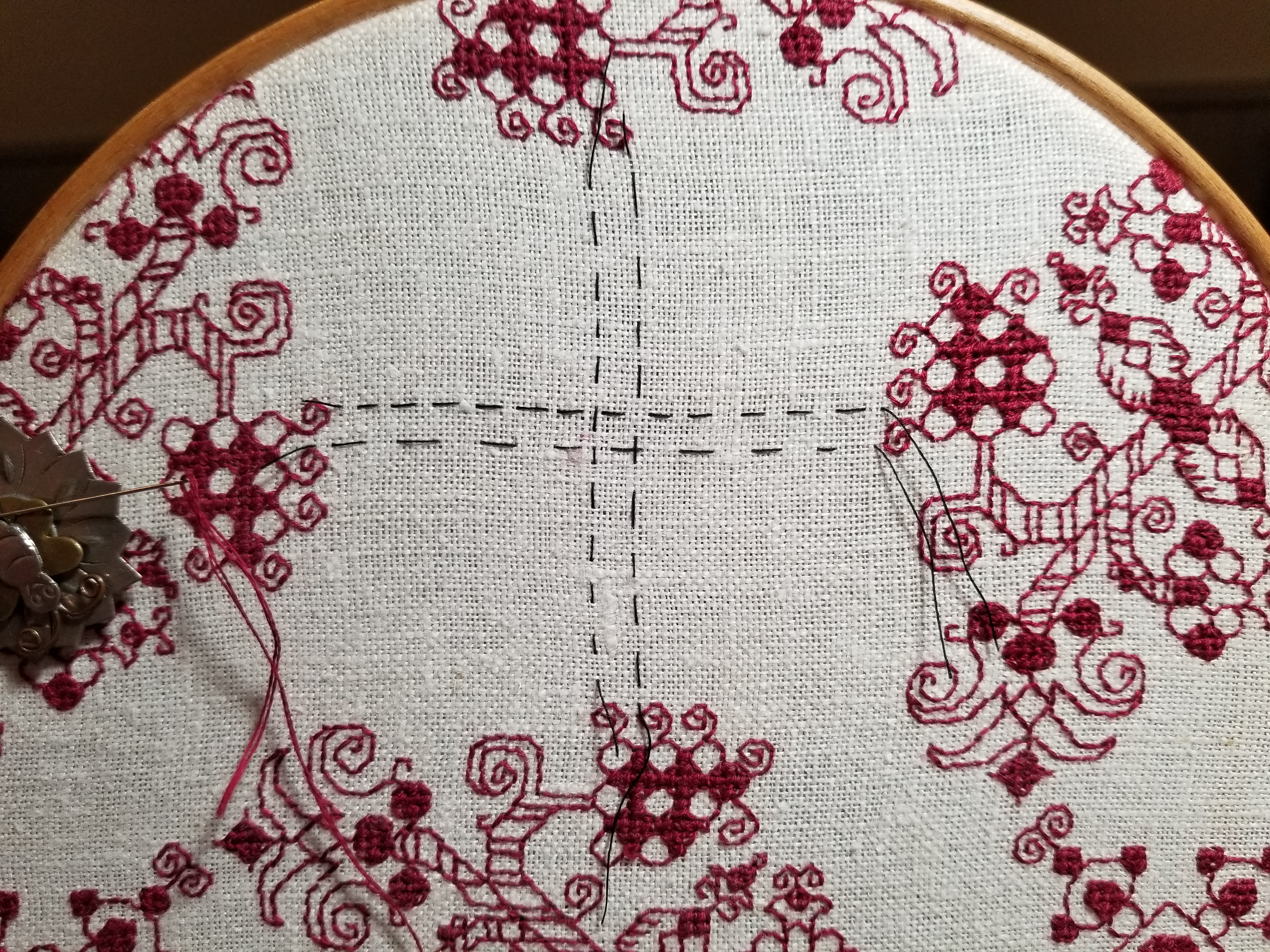
LAZY CENTERING
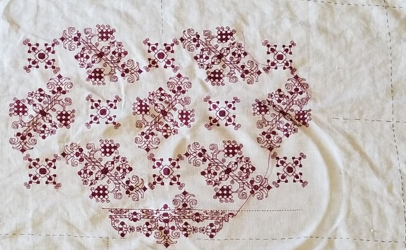
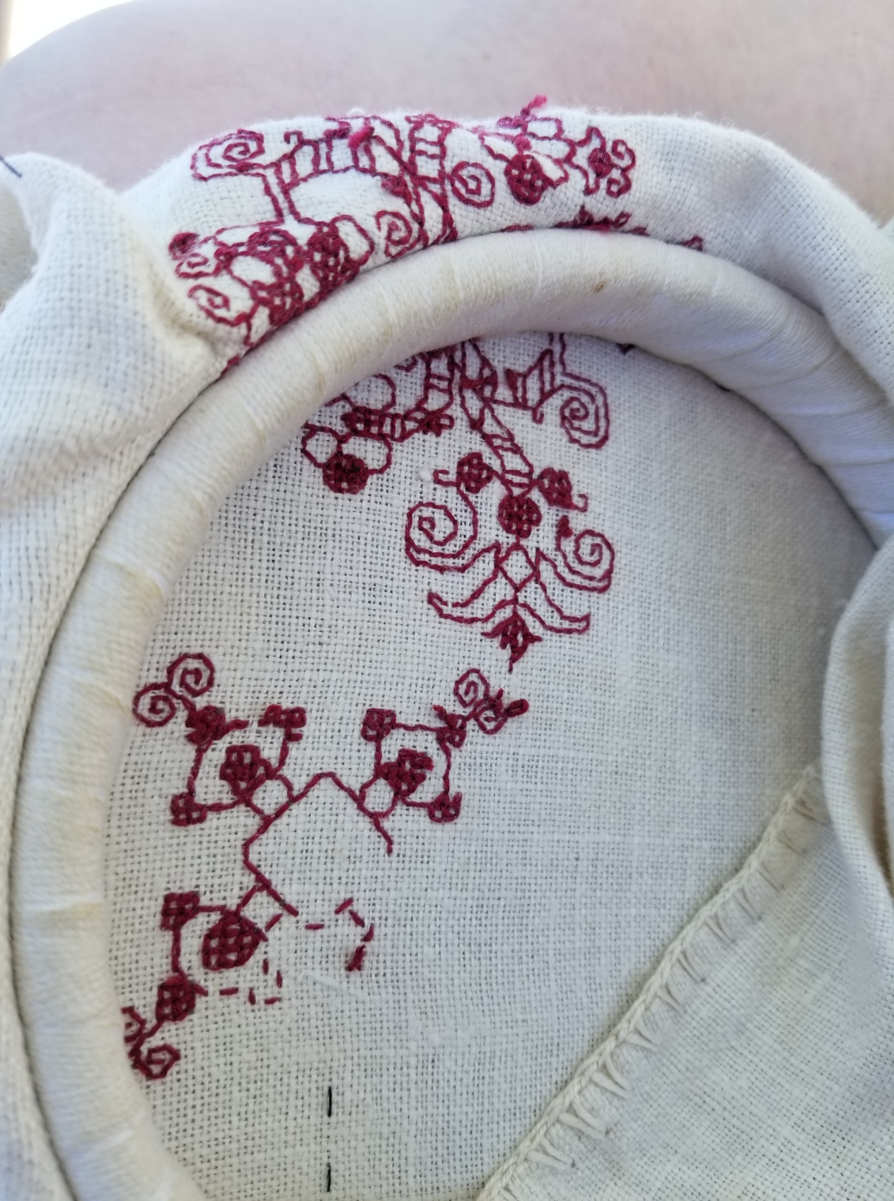
I continue along with what has been nicknamed The Dizzy Grapes sideboard scarf. I successfully rounded the second group of main motifs, and am up to working the small one in the center of the field.
As you can see, there’s plenty more to stitch, including the border. And you can also see the slow rise problem I described earlier. The cloth is flipped from the last set of photos, but the repeat on the right is one unit skew to the one on the left – an inevitable complication of this design.
So. That center unit. Given that it doesn’t align perfectly with the previous one, how to go about placing it. The most obvious way is to pick an easy to spot point on the established stitching, and now that I’ve done one, just count over the same number of stitches to a similarly distinctive spot on the motif to be stitched, then just start in.
But I’m lazy, know that long stretches of counting blank linen are one of my weaknesses, and given the long span, extreme variation in the thickness of this linen’s threads, and frustration after several false starts, I decided to try something different.
Its easy to determine the center point of the large floral motifs. It’s the centermost stitch in the dark center “knot” around which the branches are symmetrically inverted. That aligns with the dark stripe in the grape motif that’s closest to its stem. But those centers are all offset from each other, so just using a simple ruler or single straight edge is problematic. Instead I picked the same spot on each of the four motifs that bordered the field in which I wanted the smaller X pattern to appear, and quick basted a line across that field. One basted line for each big floral produced a 3×3 area. The center unit of that 3×3 area became the center of the large dark spot in the middle of the X pattern. (Yes, if you zoom all the way in you’ll see that one of my basted lines was off by one thread, but I compensated).

You don’t see the basted lines on the full piece, above because once I did that centermost stitch, I removed them. I never stitch over my guidelines, I always snip them away from the work as I approach.
I did this for the other placement of that center X, too, but I didn’t think to document the process. I did try the count in and start method for the second one. You may be able to see the remains where I picked out my three false starts, but the basted line method turns out to be vastly quicker, less fraught, and more accurate.
I am still aiming for full coverage – not just these two repeats centered on the otherwise bare cloth. Now its time to go into hypergear and finish designing the companion border. Once I’ve got that and have my distance from repeat worked for the long sides, I can establish that line and then work my field up to it with confidence.
RISING SUN DESIGN CHALLENGE
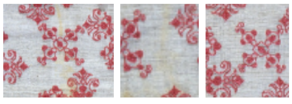
I’m working along happily on my grapes wine-opening placemat, using the motif I redacted from the 17th century Hermitage artifact.
One big problem with my graphing of the design is that the original doesn’t stick to count on the placement of the individual large and small motifs. While each motif is worked true to count, their scattering across the piece is a series of eyeballed guesses, with no two offset by the same spacing. Here are a couple of enlarged snippets from the museum original that showcase the variance:
However, when I graph up a design I try to “regularize” it – often averaging the deviations among many repeats to create an easy to replicate canonical version of the design. In T2CM I note the degree to which I normed the repeat in each redacted design, so those who are interested in total veracity know that I’ve done a bit of tinkering, and can refer back to the original and determine if that level of deviation complies with their intent.
I played with the two main elements of this all-over repeat until I hit upon something that was regular and that accommodated the use of the smaller motif both as the “pinwheel” spinning off the larger grape/floral motif, and to occupy the center of the circle formed by the grape/florals. And I began stitching.
Now the placement I ended up using does have a flaw. The march of the grape/florals is offset one unit each iteration by the pinwheeling. That means that in the sample above, the right-most grape/floral presents one unit ABOVE the line established by the one immediately to its left. This is the problem that the original stitcher tried (with limited success) to combat by eyeballing placement rather than sticking to the count. Even with their best effort, the original artifact’s overall design does migrate a bit in the same way, like a time lapse photo of a rising sun, each pattern repeat appears ever so slightly above the one to its left.
This isn’t much of a problem for a large field design with no edges that matter, but for a smaller work the migration does become evident. Especially if an edging or hard border is used.
And I want to use a hard border. I’ve designed a companion border for this field, to be worked in the same color as the rest of the piece. Or I should say I’m still in the process of designing one because I haven’t settled on exactly the **right thing** yet. But this is getting close. I’m using the cinched rope visual trope contemporary with the field design, and incorporating elements of the grape/floral with it.

Yes, it’s blurry. It’s not ready for prime time yet, but you can squint and make out the basics – the rope, the pendant flowers borrowed from the field, and the line above running parallel to the rope. That line will save me, and whatever variant of this edging I end up using will include it. I will work the edging in strips, butting the corners instead of mitering them (a very historically accurate way of dealing with pesky corners), doing it in the neighborhood of the basted black guideline threads. Then I will work the field pattern up to and touching the edge line.
The rising sun anomaly will still be there, but the piece as a whole should be both bound and defined by the border. Or so I hope. Stay tuned! It’s going to be a while before I get to actually stitching that part. All the more time to refine my edging graph. 🙂
DIZZY GRAPES
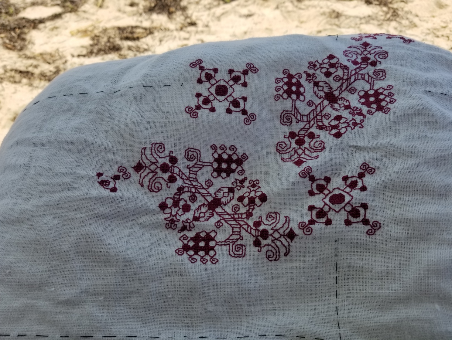
Fueled by a week at the beach; hot, dry, and windy weather; paella, sufficient wine, and other indulgences, my grape-adorned sideboard placemat grows.
First an observation on the ground cloth itself. I had intended to preserve the simple crocheted edging that this piece of well worn linen came with. But as you can see – “loving hands at home” were at work when this remnant was rescued from a larger prior incarnation, and the edges of the cloth are far from parallel. The thin black lines are my basted guidelines, done on the weave to mark the absolute center, and also about 1.5 inches in from the edges. Obviously they are not parallel to the edges. The short sides are especially skew:
Eventually I will have to trim off the edges and hem. Then possibly finish with a bit of simple needle lace. I haven’t done that in a while, so it should be an interesting adventure. But for now, I will stick to the inside of the designated rectangle. I’m still contemplating designing a companion edge pattern to the field of the original artifact, so I won’t get too close to those basted lines, just to make sure I have ample room for both the edging and the field.
So, that being said, I started in the center. Note that I don’t stitch over my basted guidelines – I snip them out as I come close.
You can really see the even/uneven nature of the ancient linen in the shot above. Yes, I am working it in a hand-held hoop (although I’ll probably switch to my sit-upon later tonight). I’m using plain old DMC six-strand floss, color #615. This piece will become a placemat on my sideboard, where wines are generally opened. The grape motif is fitting, but there is ample chance for spills, and washability is my prime concern. The linen itself is already far from pristine, so a few more stains won’t make much difference, but I didn’t want to use silk or faux silk (rayon), to make care less complicated.
According to the updated notes on the museum photo, the stitches used are double running and an Italian double sided cross stitch. The original has a design that’s truncated around the outer edge, and might have been cut down from a larger work. I do believe that The Ancients were just as practical as we are today. If something wasn’t going to be seen flipped over, it didn’t merit the additional work of making it perfect on both front and back. A bold leap of surmise on my part, but since I have no earlier larger work to repurpose into this sideboard mat, I’m comfortable with not extending the extra effort. Plus, I am doing this entirely for me. I have no intention on documenting it and entering it in any historical needlework exhibit or arts competition.
The variant of the two-sided cross stitch I’m using produces a boxed cross stitch on the front and a square grid on the back. If you zoom in on the original the scrum of stitches does look like a cross in a box. I could have used meshy, either pulled tight or relaxed to go double-sided, or long armed cross stitch (another historically congruent approach), or even satin stitch, but I wanted to try something new. Here’s the back. You can see the little grids where on the front the presentation is solid color.
And of course, since nothing can be perfect, especially after all the wine referenced above – this particular iteration of the secondary motif was in the wrong place. I haven’t done it yet, but the whole square has to be picked out. But I made progress none the less. The offending misplaced robot-headed square is mostly unseen over my knee in the general progress shot below. The other two secondary motifs are correctly placed.
I will continue on with this cloth, filling in the additional iterations of the main and companion motifs. Still thinking of doing a companion edging, but treating it as they most often did contemporary with the design, by using butted rather than mitered corners. We’ll see what I come up with…
I’m “off paper” now, mentally rotating/flipping as needed, hence the dizzy title of this post. I like that extra challenge, too.
This design may end up being in The Third Carolingian Modelbook, a project I’ve already begun. But frankly there has been very little uptake of either of my two earlier citation rich for-sale books, and only marginally more from my free releases of mostly original material or from the free pattern broadsides or the SAL on this website. Sales and downloads, yes – but very little actual stitching from any them. It’s disappointing, and I am not sure I want to take the time if folk are just looking for shelf fodder and not actual stitching inspiration.
Have you done something from my pages? Please let me see it. If you give permission I would be happy to post your work here on String under a gallery tag, either with your name or anonymously as you prefer.
END OF DON’T, BEGINNING OF THE NEXT
Just finishing up Don’t. I think the Mystery Neice will be happy with it. We worked together to pick out the colors, typefaces, and border design used, so there was ample recipient-input on this one.
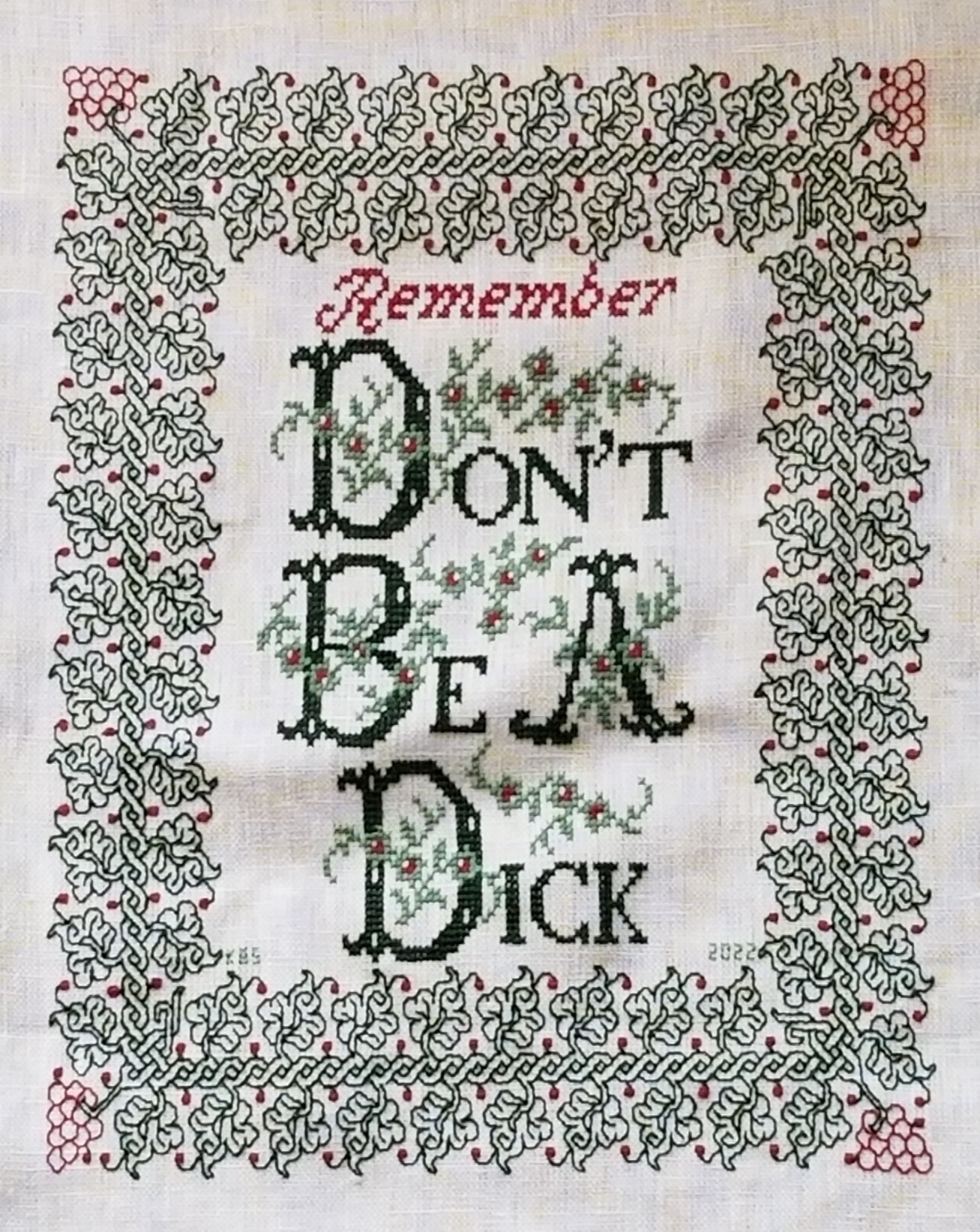
I’m happy with it, too. Although I have to confess a bit of a mistake at the outset, which has necessitated a somewhat rueful kludge.
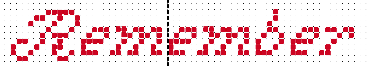
The original did not include “Remember.” Why is it there?
Because when I started stitching the border at the left center line, instead of starting it at the center of one of the sprigged spirals, I started with one of the spirals that grows a leaf. That de-centered the inscription north/south. I walked happily down the left edge, across the bottom, and up the right side. When I got to the top I noticed that (horrors!) to make my corner fit there would be larger space between it and the words than there is at the bottom. Nine units more, to be exact. So I thought about what I could put there. More flowers? Possibly. Another ornament? Again possible. But the more I thought about it, the more I wanted to NOT add mass on top which would draw attention to the lack of space at the bottom. So a word was the way to go.
I decided on adding “Remember” and went pawing through alphabet resources to find something thin, elegant, and nine units tall – something that would fill space without adding too much bulk. The initial script R is from an antique Sajou booklet at the Patternmaker Charts site. The lower case letters needed to be smaller, and I found a good candidate in Creating Historic Samplers by Grow and McGrail – the same source I used for the lower case letters in the main area. It’s not a profoundly useful book, but it does have a section of beginners’ advice, plus some sample US Colonial era motifs, alphabets, and borders. Best of all for those just starting out, it’s very inexpensive on the used market.
Now on to the next – Grape Sideboard Scarf.
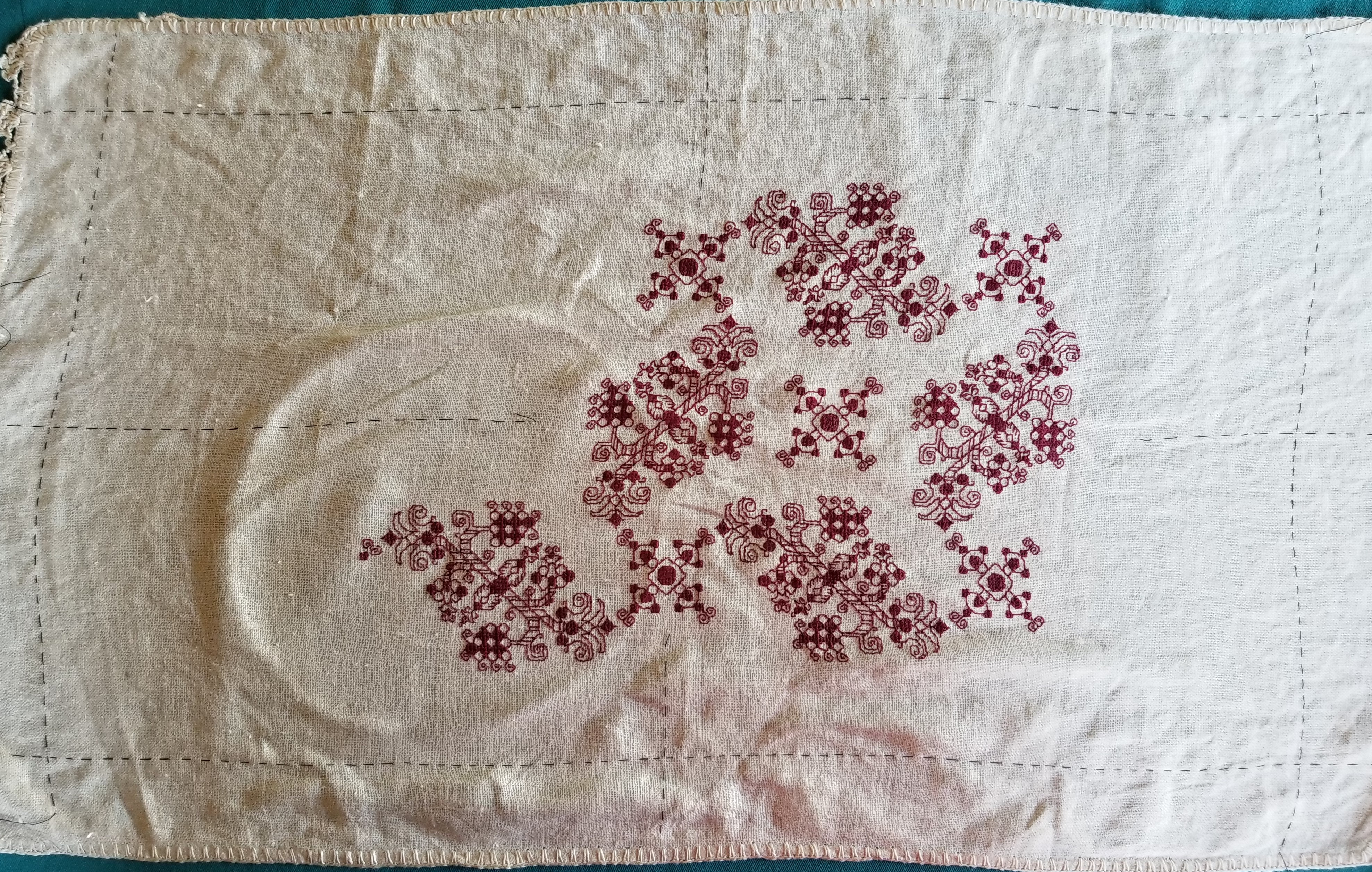
For the next project I’ve decided to use a well washed linen piece I picked up at a yard sale in Silver Spring, Maryland easily 42 years ago. It’s a dresser scarf, trimmed with a hand-turned hem secured by a simple crochet, with a crochet picot edge on the short sides. Based on the materials and back story I suspect it was cut down from a larger cloth and trimmed out sometime in the late 1930s or 1940s. I got it the same time as I got the larger finished linen piece that became my Everything is Worth Doing Well sampler, although they were not cut from the same source. Yes, it’s worn and a bit discolored from storage even before I got it, but it’s sound.

The stitchable area is about 16.5 inches x 28.5 inches (about 49.9 cm x 72.4 cm), and the thread count is roughly 32 threads per inch. That’s about16 units per inch using a 2×2 thread grid, with a total design area of 264 units x 456 units. That varies a bit across the piece, so I’m averaging measurements taken at several spots (penny method for easy thread counting here).

I’m going to stitch it in red, using a pattern I’ve recently redacted from a 17th century Italian cushion cover held in the Hermitage Museum (Accession T-2736 in case the link breaks). A thumbnail of the original is below. It’s about 40 x 48 cm, roughly 15.75 x 19 inches. No info on the thread count of the artifact.

Obviously I am going to maintain the dresser scarf’s edging. Also depending on the scale the design works up to I may only stitch to within 1.5 inches of the existing hems, then devise a coordinating sprouting edge to encircle the center field.
As far as the charted redaction went – this one was tricksy. There’s a major sub-sub-element that is off-grid; meaning that when I get to it (and write this here so I remember) I will have to “split the difference” on my evenweave, and shunt that bit over one thread.
Since this will be used as a protective placemat on my sideboard largely for opening the evening wine, the grape motif is appropriate. And I’ll use a DMC 6 ply floss, one of the garnets – 615 or 616, I haven’t decided yet on which one yet. I go for cotton instead of silk on this for washability because spills WILL happen.
The next step is to baste in my horizontal and vertical center lines, plus that 1.5 inch margin inside the hems. Then I begin, working center out.
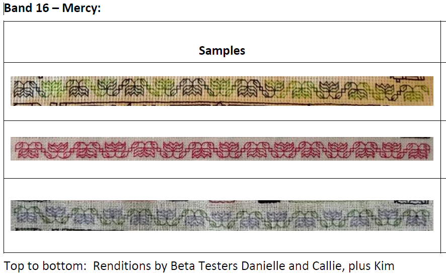
EPIC FANDOM STITCHALONG – BAND 16
MERCY
After the last band, everyone who is still sticking with this project deserves something simple. Very simple. This would also be a useful learning exercise for someone wanting to try a first strip in double running or back stitch. There are no surprises here at all.
Time Factor 1 for a nice, quiet, symmetrical repeat that returns us to alignment with the indicated project center line.
Use one color, multiple colors, or variegated threads, as you prefer. As with the rest of Epic, there are no rules or must-do approaches.
As usual this band plus working notes and hints has been appended to the bottom of the write-up on the SAL page, accessible via this link or via the tab at the top of every page here on String-or-Nothing.
If you are working our Epic Fandom SAL either as a whole or as a strip excerpt, please let me know. It gives me great joy to see how my “pattern children” fare out in the wide, wide world, especially when they meet up with creative, playful people. And if you give permission, I’d be happy to share your pix of this developing sampler, it in its finished state, or derivative projects including one or more of the Epic bands here on String, in a gallery post, with full credit to you as interpretive artist.
Band 17 debuted on he Facebook Enablers group today and will be echoed here on 19 July.
#EpicFandomSAL
