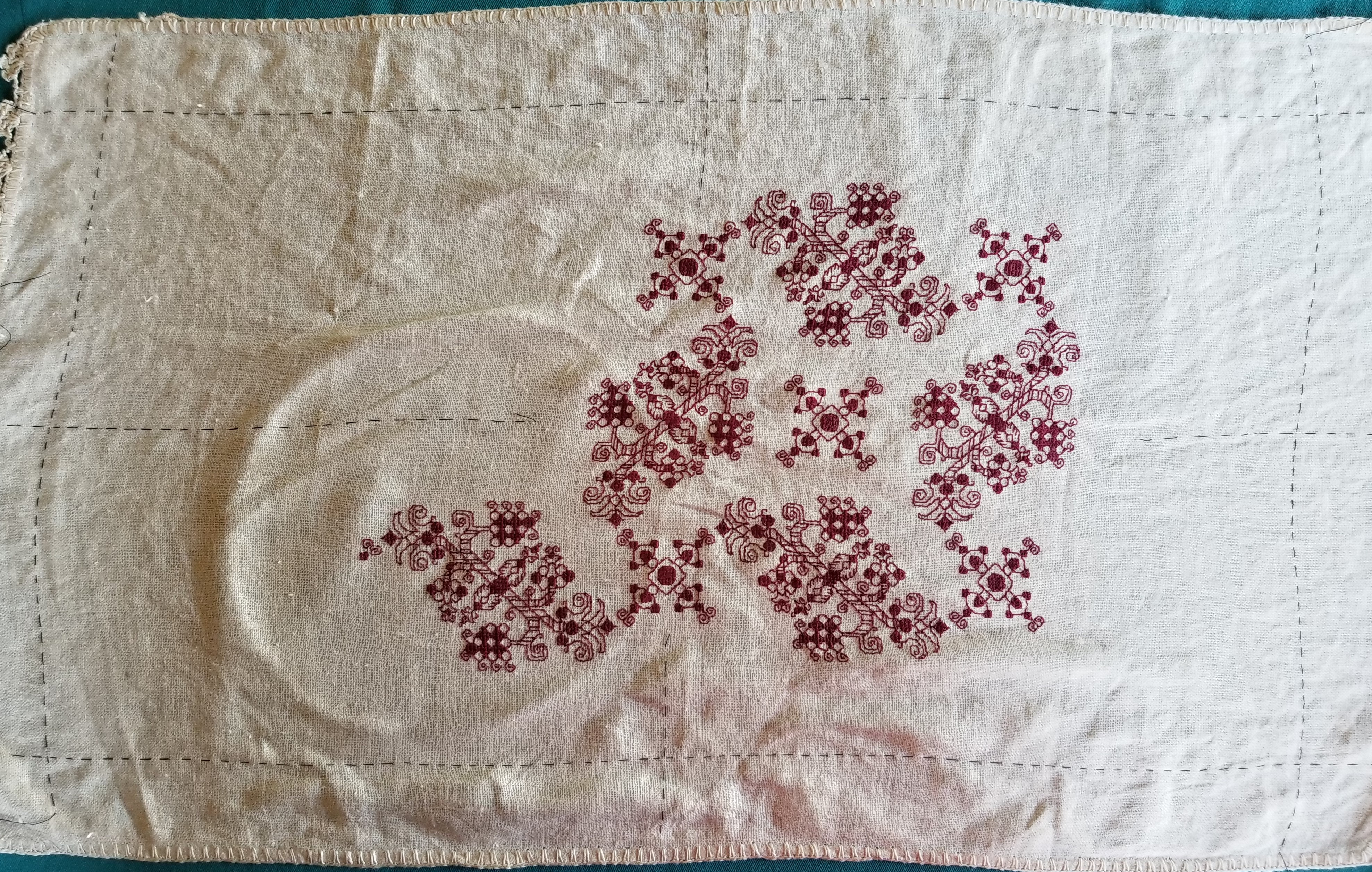
UPDATING THE PENNY METHOD
A while back I posted about using a penny, a cell phone, and a bit of math to determine the thread count of linens, both evenweave and skew. And now the US penny is quickly charging to extinction, abandoned by the US Mint, and soon to disappear entirely from circulation. Which means that I need to issue an update.
Voila!
The Dime Method.
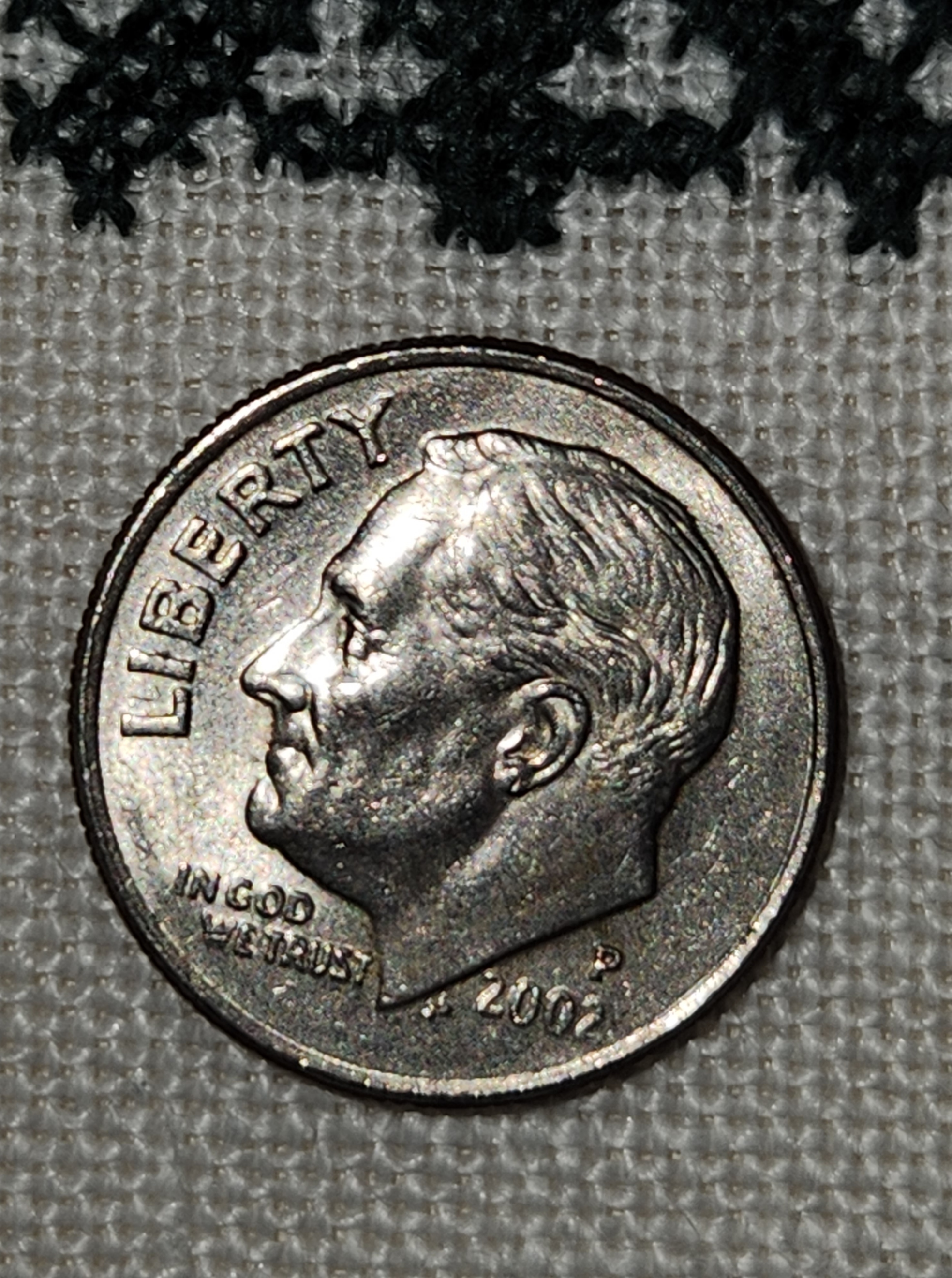
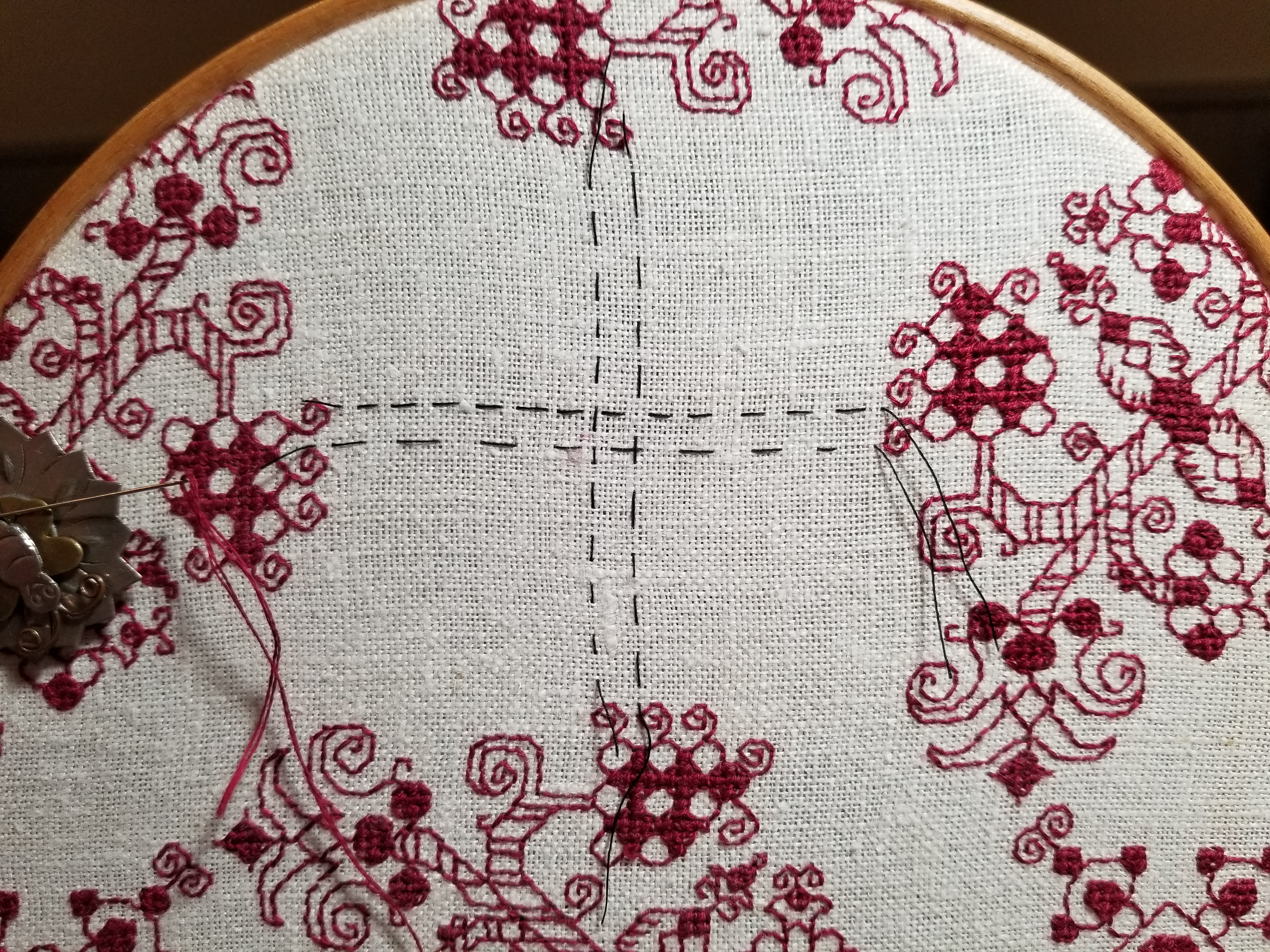
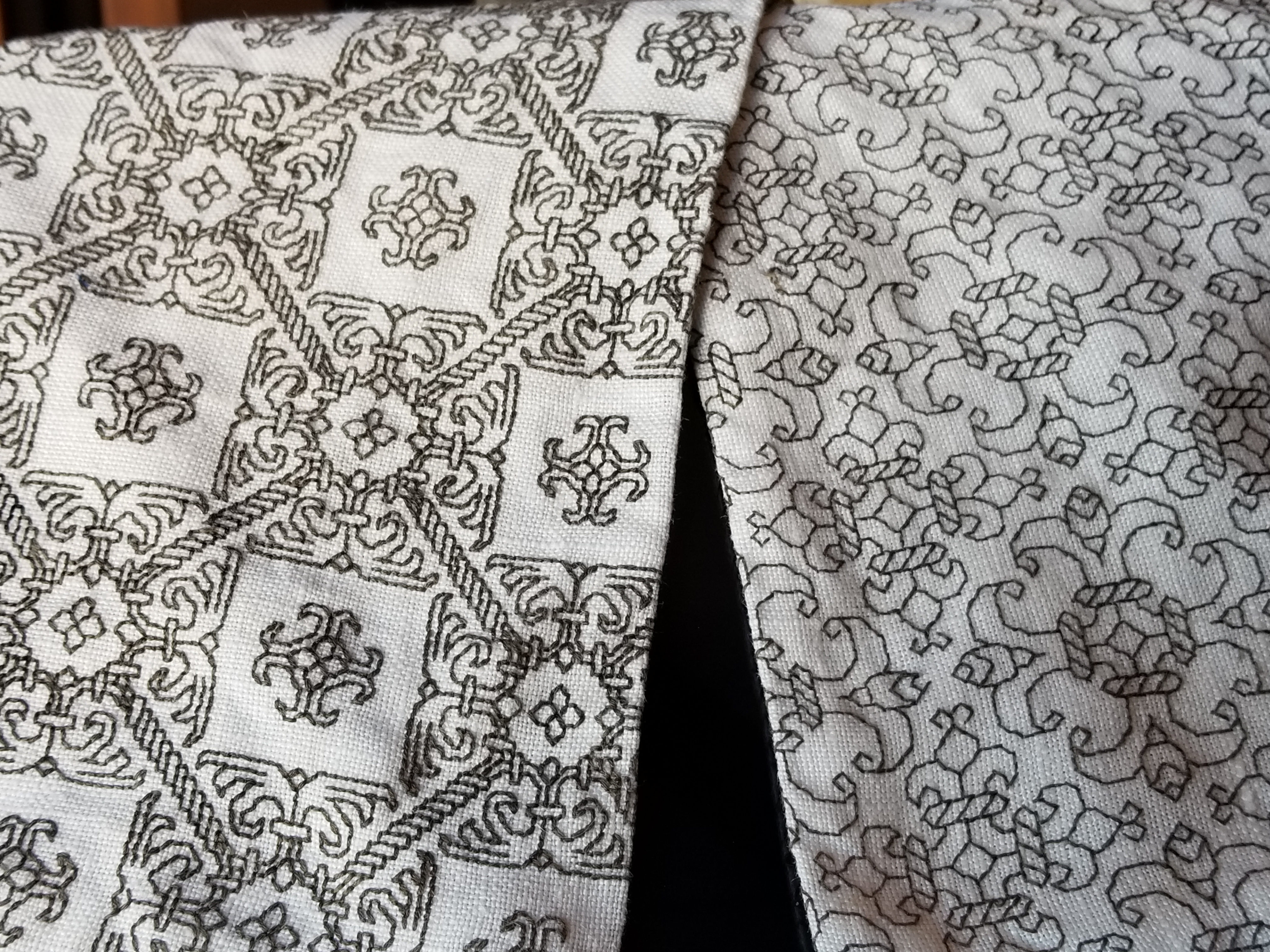
I picked the dime because it’s smaller than the nickel or quarter, and easier to count around the outside edge without losing your place. Counting the threads totally covered by the dime, heading north to south, we get a total of 26. And by counting the number of totally covered threads east to west, we also get 26. The first conclusion is a happy one. We have an evenweave.
Now for the math.
The official diameter of a US dime, as stated by the US mint, is 0.705 inch (17.91mm). I will continue the math here with threads per inch rather than metric to avoid confusing US folk, but the same method works perfectly well with metric measurements. And if you know the measurements of any other coin used anywhere else in the world, you can adapt this for local convenience, worldwide.
So what we have is 26 threads over 0.705 inches. We divide 26 by 0.705 and we get 36.88 (roughly). We can round that up to 37. My fabric in this sample is 37×37 threads per inch.
Let’s confirm that.

Yes, 37.
And you are right that’s a decimal inch ruler. I am proud to be an Engineer’s Daughter, and have many of my dad’s old drafting aides. I deliberately did NOT add any assisting lines to the ruler photo as proof of my assertion that it is FAR easier to count the threads obscured by the coin, going around the edge of the coin, than it is to do a straight line count across a ruler’s edge. It’s also FAR more likely that I would have a dime handy than a ruler in my pocket when I am out and about in the wild.
Try again. This time finer.

I get 31 in the north-south direction and 28 in the east west direction. This piece of linen is a skew count, with more threads in the vertical than the horizontal. Doing the math:
- Vertical (north-south) 31/0.705 = 43.97, rounded up to 44 per inch
- Horizontal (east-west) 28/0.705 = 39.71, rounded up to 40 threads per inch
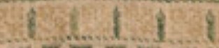
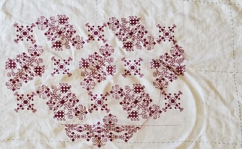
Now, does a skew count mean that effective countwork can’t be done? Absolutely not. Here is the piece that I used for the second example:

The slightly skew count means that over the same length there are more stitches in the vertical direction than there are in the horizontal. My mermaids are then a bit squished in height compared to their width because the vertical stitches are a tiny bit shorter than the same number of stitches over the horizontal. But the only place that this is evident are the large, symmetrical flowers just above their tails. You can just make out the height elongation in them because (logically) they are supposed to fill a square volume, not a rectangular one. Here is an old post that discusses this challenge further, and shows what happens when you wrap a design around a corner on a skew count fabric, and confesses that flipping your measurements is an easy mistake that even I make..
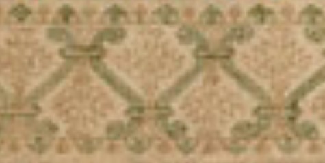
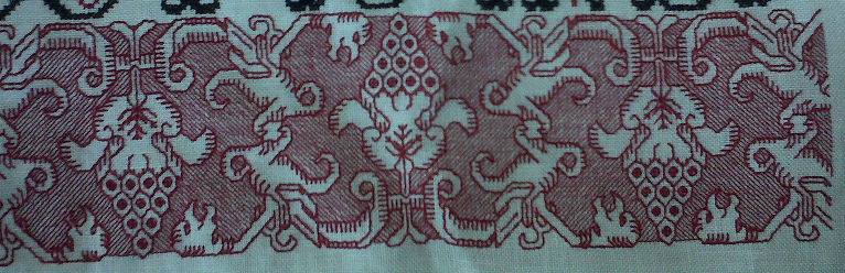
For the record, I stitched this piece in 1994, from a chart I redacted myself. The photo source that I worked from was in Schuette and Mueller-Christensen’s Pictorial History of Embroidery. I presented this chart along with my own original accompanying border on Plate 75 in my own The New Carolingian Modelbook, published in 1995.
As for the piece I used for the first example? The full Don’t Panic chart is a free download on my embroidery patterns tab, right here on String-or-Nothing.
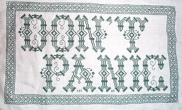
Don’t Panic is in fact the best advice I can give to the math anxious among us.
TWO COLOR DOUBLE RUNNING STITCH – TWICE THE FUN
As promised, here is a round-up of what I’ve been looking into on double running stitch, done in two alternating colors. First, heartfelt thanks to Melinda Sherbring and the gang over at the Facebook group Historic Hand Embroidery.
I knew I had seen examples of this type of work on samplers, but my own research notes are particularly poor in samplers. I tend to focus on the small fragments of household and body linen that lie quietly and largely unnoticed in museum research collections. Samplers receive far more attention, are often under licensing restrictions or have been fully charted by reproduction houses. So in a fit of laziness (it being vacation) I put out a call to the group and asked for assistance. Many people responded, Melinda especially so, furnishing 85% of the material I will cite below. So copious thanks, Melinda! I bow to your greater expertise on these, and will accept any/all corrections.
First, here’s what I am talking about. Here is a simple graph of a sprig pattern, worked in double running of a single baseline.

Note the alternating color stitches in the baseline. If I were to stitch this, I’d start with black, take that first stitch at the baseline’s left edge, then in double running work the rest of the first flower in black as a detour from my baseline. When I returned to the baseline, I’d continue on to the next black stitch, then I could continue working the whole thread of black until I ran out, carefully counting the units between black flowers. After that I’d start again from the left, filling in the missing green stitch, and taking detours to work the green flowers. Or I could do it the easier way – parking my black threaded needle, taking up a green one, and working green stitches until I got to the first green flower, working that as a detour in the standard manner, and marching on for a few stitches after, then catching up and leapfrogging ahead with the black. Note that using two colors means one will always be traveling along the baseline in the same direction. There is no doubling back to fill in second pass double-running stitches as one can if a single color is used.
After some experimentation, I found the “leapfrog” method far easier, in spite of having to be careful not to snag the parked thread. Less long distance counting means fewer errors for me. I suspect that close examination of encroachment on these historical pieces will turn up that leapfrogging was the way they did it, too. It’s just so intuitive and so much simpler.
One more observation – an alternating baseline is a giveaway that the band was done in double running. It would be quite awkward and wasteful of thread to achieve this effect in back stitch. And using back stitch to do the branching detour sprigs would mean having to terminate the thread on each one, or stranding over to return to the baseline. Again, something wasteful to be avoided.
Examples
Melinda provided far more than these photos, but I am cherry picking the ones with details that display the best. Click on the sampler institution/accession/date link to see the full pieces. A couple more of Melinda’s citations are at the end of this post, for those who want to do their own deep dive.
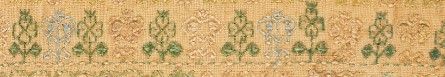
Ashmolean WA2014.71.3 (1631-1700) The boxers/urns panel has a companion border at the bottom with alternating pink/blue sprigs and a clear two-tone baseline. There’s also another pair of companion borders at the bottom that uses a band of green stitching with the alternating color sprigs and two-tone baseline immediately along its edge:
Ashmolean WA2014.71.27 (mid 1600s) has the alternating color sprigs on a two-color baseline on the topmost motif. This is the one I dimly remembered from tiny illustrations in a sampler book. Note that additional satin stitching was done in the centers of the motifs to bring extra dimensionality and color, but the double running outlines are still there.
Burrell 31.7 (1640-1670) Sadly, no high resolution image. But on the bottom-most strip – its framing border, top and bottom strongly looks like two-tone sprigs, and probably has an alternating baseline but it’s hard to make out the detail on the baseline. More investigation on my part needed. As an aside, it’s nice that the Burrell gives thread counts for the linen ground – 28 warp x 25 weft per cm, or 71.12 x 63.5 threads per inch. I’ve included the main strip because it or a close sibling pops up in connection with alternate two-tone borders in other works.
Burrell 31.9 (1640-1670) Third strip from the bottom. Again, certain ID limited by photo quality, but it does look like that much wider strip was done with a two-tone WIDER baseline (same spirit as mine, but a different pattern), with alternating color detours. Shares a lot of the aesthetic and some bands with Burrell 31.7 – interesting!
Cooper Hewitt 1981-28-70 (1600s) Love their high resolution photos. Another clear hit. The companion border around the bottommost wide strip, for sure – done in at least THREE colors (wow!) with a multicolor baseline and single color sprigs. A green, a blue, and possibly a red and a pink, the red and pink are very much faded. Or it might just be green, blue, and pink. It’s very hard to parse but it does look like the baseline was done in pink-green-red-blue-pink-green-red-blue, which would leave very long skips, overlapping on the reverse. I’d love to see the back to confirm that, and to confirm the number of colors.
There are more possibilities on this same piece, but for the most part they are heavily overstitched in satin stitch or (possibly) hollie point or another detached looping/weaving stitch, worked on the outline and for the most part obscuring it. It also looks like the second color was not necessarily used on the double running stitch outline for the sprigs, but was employed in the fill treatment Here’s one with an alternating baseline of blue and pink(?). The pink looks like it was used to outline the acorn and leaf shapes with double running. Pink and green were used for the detatched stitch fills for the acorn and leaf, but the blue of the baseline seems to have ben employed to fill the twigs between the acorns and leaves.

Fitzwilliam T.59-1928 (circa 1680) I stumbled across this one looking for the other items Melinda cited. I saw tiny black and white photo of this in one of the first embroidery history books I borrowed from the library – a book published before 1965 or so. I charted some of the strips from it with a magnifying glass, and used them on a piece I did in high school, long before I found the SCA. I haven’t seen this piece since. (People looking to chart now have no idea how much easier it is today with on line access to zillions of primary sources and high resolution photos, all of which can be enlarged right on the screen. A far cry from being smuggled into university libraries to stare at fuzzy microfiche images, or taking magnifying glasses to low quality black and white photos in books.) There is clearly a two-tone companion border with an alternating color baseline accompanying the prominent rose band:
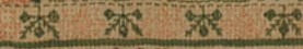
By way of contrast, this bit from the same sampler was NOT done with a two-tone baseline. Even if there are pink straight stitches between the green diamonds and other motifs in the uniting center band, those sprouting leaves in pink are independent from the true baseline, which is solid, unbroken green.

Fitzwilliam T.61-1928 (1677) Also stumbled upon, and sadly a bit blurry. Two possibilities in the photo below – and the lower wide border to which one of the candidates is the companion one looks to a design that’s a cousin to the one from the Burrell sampler above. The two-tone companion is clearly not the same design, even though it’s difficult to see.

More citations:
Ashmolean WA2014.71.44 (1633) Not a sharp photo, but the red/green framing bands on the boxers strip does look like it is probably done in the dual tone baseline, alternating color detour method.
Fitzwilliam T.82-1928 (1691). Looks like there could be a couple of candidate bands, especially in the framing borders around larger strips, but the photo resolution isn’t quite there, and I can’t be sure that the colors are united by a two-tone baseline. I need to do more investigation.
Conclusions:
I have not seen this treatment in portraits, or in fragments of household linen – only on band samplers. I will keep looking, but I think Melinda’s generosity makes it clear that double running done in two colors, with a two-tone baseline and sprigs alternating between those colors was a 17th century innovation, popular in England of that era. She has given us lovely data points from 1629 to the 1690s. Given the paucity of extant samplers before 1600, that is to be expected. Thanks again Melinda!
But I never say never. All I can say is “I haven’t seen it yet.” And who knows, maybe someone out there HAS a citation for use of this technique before 1625, a sighting in works from other times/locations; or evidence on a textile fragment or portrait that it was used on clothing or household linen. If so, please add a comment with that reference here, and I’ll be happy to do a follow-up post.
And my own progress?
I’m up to the outer framing border. I just realized that I forgot to plot the way the wreath-springs work in the corners, so I will do that later or tomorrow, and concentrate on finishing out the upper edge tonight.
Yes, the colors are a bit disjointed, and I’m not entirely pleased with how prominent the diagonals turned out. But I am working under severe materials quantity constraints. Most of the colors were too light to show well in this style of work, and those that are are in single 8 yard six-strand skeins, most of which were already nibbled by the original owner for her prior projects. I am still splitting each strand of the six, to double the yardage, but it’s going to be tight.
THE SYMMETRIES OF LINEAR STITCHED FILLS AND STRIPS
As promised here’s a rundown on pattern repeat type, and centering fills and strips in designated spaces on your project. For one, there’s really very little need to sit down and stitch-by-stitch completely graph out the design to your final dimensions. In general knowing where the edges and centers of your space, plus the pattern repeat type is all that’s required. These hints go for both fills in regular and irregular shapes, and for strip or band type designs that march along the width of your project, or decorate the edge of a garment.
And a note on grounds, if I may. Aida, Hardanger, Anne Cloth, and Monks Cloth are types of purpose woven grounds used for modern countwork. They feature prominent holes outlining their base size units. Departing from that established grid can be very difficult and involve piercing the fabric in the solid spots between the built-in holes. Partial stitches do exist in the purpose-woven world, and are much despised by stitchers. Working multiple grids skew to each other on the same piece of purpose woven ground is almost never done. I’d say never-never, but somewhere it might exist, although I haven’t seen it nor the rants of despair from folk who have encountered it.
Evenweave (or near-evenweave) is a bit more flexible. Since the stitchers count threads on evenweave instead of hole-defined units, they can employ multiple grids on one piece. If the stitcher decides to work their unit over 2×2 threads, two adjacent spaces can use different grids, offset by one thread so long as the juncture where they meet is taken into consideration. I did this on my Two Fish piece, using the skew alignment to hint at undulating motion. Note the knot and grid filling. Not only is it stitched discontinuously across the bel, I also interrupted the grid. Both sides are worked 2×2, but NOT on the same 2×2 grid – the tail section is displaced one thread up and over.

So when you see me talking about skew grids or using partial stitches when centering various types of symmetry on a single piece, please know that the ability to do this is mainly something that can be done on evenweave. Purpose woven grounds like Aida will limit the way patterns of differing symmetries can be centered against each other. It’s just a fact of life.
Before I begin, all of the fills and bands charted on this page are available in my Ensamplario Atlantio series, my Epic Fandom Stitch Along, or previously shared here on this blog. All are available as free downloads for personal use. Links are provided.
OK. Finally getting into it. Patterns can be grouped into a few basic clusters, with some caveats.
Center Line Repeats
First we have simple line-center repeats. These are designs that cover even numbers of units, and mirror along a center line. The chosen pattern may be a band or strip, with one vertical line where the design mirrors to its left and right. Or it might be an all-over design or fill, with at least one vertical and one horizontal mirroring line.
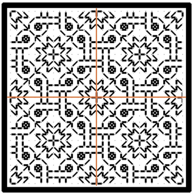
This blackwork fill/all-over design has both a horizontal and a vertical center line, marked in red. The motif tiles into square blocks of 14 units. The easiest way to use it is to either count to or (if irregular) eyeball the visual center of the space to be filled, then begin stitching the design at the spot where the two center lines meet. Even if the space to be filled is NOT a multiple of 14 but is any other even number of stitches, if centered this way the design will truncate neatly around the edges, as it does in the sample from Ensamplario Atlantio Volume 1, below.
But if the space to be filled contains an odd number of stitches you will either have to displace the center lines so that there is one more unit to one side or the other, or you might have to work partial stitches all the way around the perimeter for full coverage.
Some people insist on using a single grid for ALL of the fills on an inhabited piece. That means that even if they are working over 2×2 threads on evenweave, where adapting the grid you are using to the space at hand would be quite easy, they choose not to. They end up having to either accept minor misalignments between adjacent patterns, or employing partial stitches to eke out the design. That can be avoided by NOT mixing fills or bands with this type of symmetry with some of those discussed later in this article.
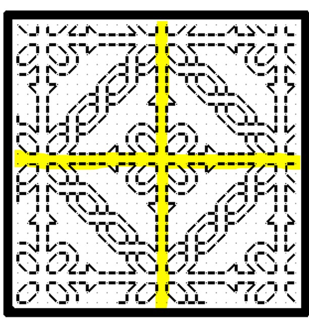
Here’s the same type of symmetry expressed in a band pattern. This one is from my Epic Fandom Stitch Along. Note that in this simple meander there are two lines of symmetry (sometimes called mirror or bounce lines). The pattern replicates in mirror image on either side of them, just as it does in the all-over fill. One full repeat is 36 units, and alignment in your desired space can be focused on the center/mirror/bounce lines of either the up or down facing fronds.

Regardless of symmetry type, if you are filling an irregular spot, and you are eyeballing the center alignment point you might end up having to work half stitches around the edge of your area, again to eke out the coverage. This is one reason why some instances of inhabited blackwork (the kind with the freehand drawn outlines infilled with counted geometrics) rely on heavily stitched, thick outlines. Those “fig leaf” the offending partial stitch spots and make the work look neater.
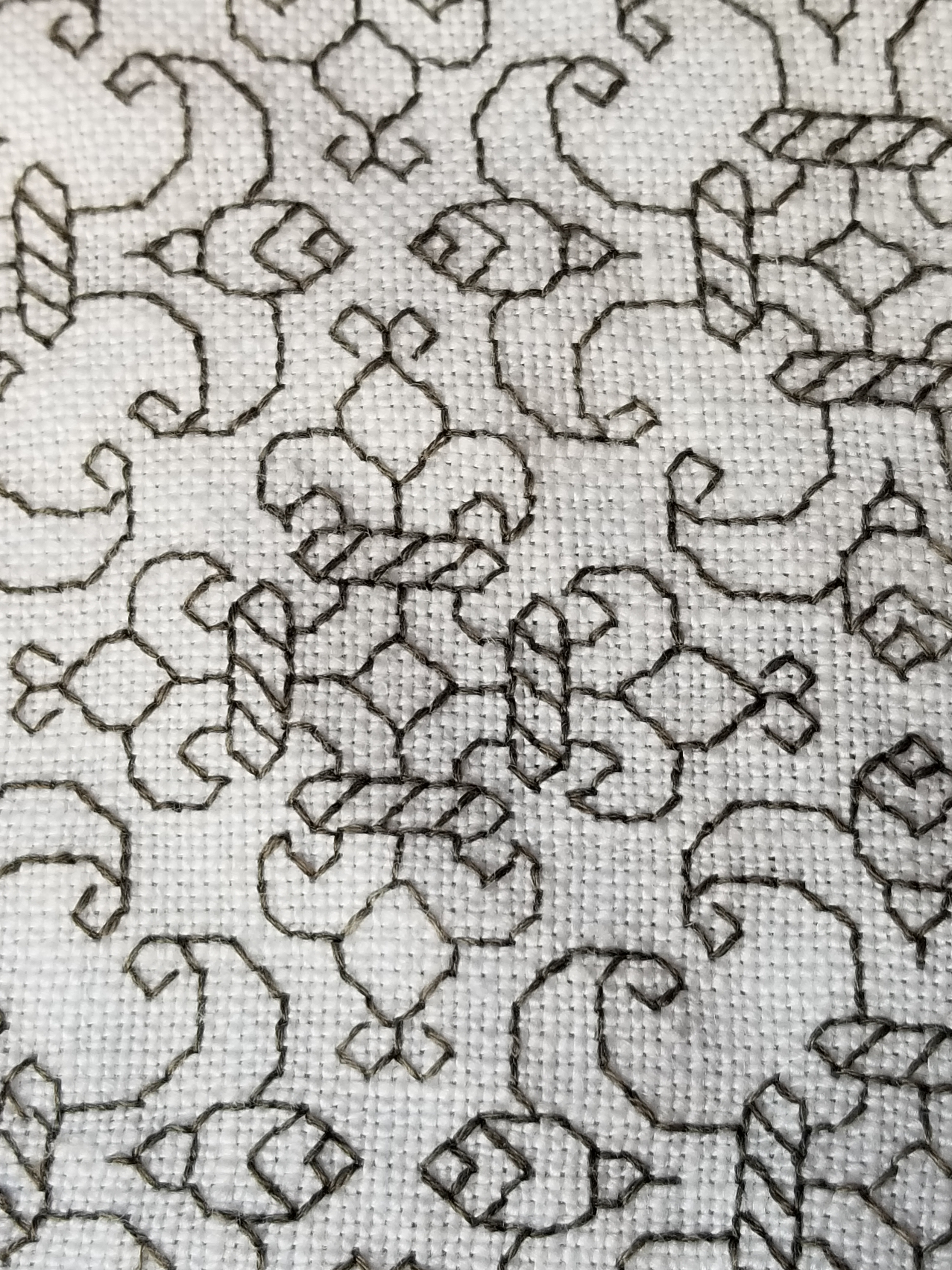
Here’s a bit on my Unstitched Coif, where I eyeballed the alignment of the fill, worked a ton of half stitches (a challenge on 72-74 count near evenweave, stitched over squares of two threads), then went back and put in heavier outlines to hide irregularities. Zoomed waaaaay in like this you can see them around the edges. For scale, that little bud at the upper left is smaller than a US penny.

Now there are some exceptions and complications. We’ll get to those later.
Center Unit Repeats
All well and good you say, but the symmetrical repeat I want to use doesn’t meet up neatly at a center line like those. In most cases your repeat has a “spine” of a single unit rather than a center line. That column or row of units is repeated only once, and is not mirrored, although the design itself does mirror left and right (or up and down) that non-repeating column or row. That means that a full repeat of the design includes two symmetrical wings, plus that pesky center unit – an odd number of units, total. Here’s a fill/all-over design that features center units. In this case one full repeat is a square of 23 units (one center unit, plus 11 more units to the left, and to the right of it).
And here’s a strip repeat, also with a simple center-unit style symmetry. Like the line unit band above, there are two possible centers. Either one can be used, although convention on band samplers is to feature two main motifs in the center of the stitched area – in this case the pair of beak to beak chickens.

The strip above is from my Workshop Handout broadside, another free download here at String you can access via this post or via the Embroidery Patterns tab at the top of every page.
Hybrid Repeats
Some designs display a delightful flexibility when it comes to centering because they incorporate BOTH a center unit and a center line bounce point/mirroring. This happens with fills/all-overs and for strip/band patterns.
Here’s a sample of a fill that includes both. I’m only marking one repeat of each type on it, otherwise the thing will end up looking like a swatch of plaid.

This design can be aligned either to the center lines (red), or center units (yellow). And here’s an example of the same type of pattern in a strip or band. The center can be the red line or one of the yellow columns.

Again, if a combo of center line and center column symmetrical strips are used on a band sampler in a mixed environment that doesn’t deviate from one universal grid note that true center alignment will not be possible. The even-number repeat centerline bands will all line up with each other. But if you insert a design with center unit/column symmetry but have to use the same “stitch holes” in Aida as the rest of your project, that center column will not line up with the true center of the rest of the piece. Which may or may not matter to you. Food for thought.
Staggered Drop Repeats
Now it gets harder to identify these. This style of repeat is common in fills/all-overs, but less common in strips/bands, but they do occasionally pop up. For the most part they employ mini-motifs, sometimes in straight-on replication, sometimes with mirroring or rotation; and use regular offsets to place them. Sometimes its a simple half-drop, sometimes it’s a larger interval or not regular when the horizontal and vertical offsets are compared. Most of the time these staggered or evenly scattered mini-motifs do resolve into very large area true repeats, with the same motif repeating in the same relative position in the field, but it’s rare to use these in areas big enough for that resolution to happen. How to center them? It’s a bit more complicated.
Here are three with different rates of periodicity (how big the sample has to be before it manifests a true, full repeat), presenting different problems. These are all from Ensamplario Atlantio Volume 1, Second Edition.

The flowers at left can be centered in a panel in one of two ways. Either using the regular center-line symmetry of the very simple little four petaled flower, or by counting to identify the centerpoint of the more complex sprigged flower. Either way will work, although I think using the smaller mini-motif would be visually more pleasing. Note that regardless of the size or count of the space you use these repeats “walk” and will always truncate around the edges.
The snail garden square at the right is a hybrid. It can be effectively centered either on the tiny squares and on the larger snail-bearing unit. Both work nicely. Which I would choose would depend on the size of the space I wanted to fill with it. If the space was large enough to accommodate four of the snail gardens without truncation, I’d probably use the tiny squares as my center alignment point. The snail gardens rotate around them, and optically form a flower-like shape when viewed from a distance. If the space was small, I’d put the garden in the middle to ensure at least one full iteration of it was represented.
The griffin/dragon beastie in the center presents a harder problem. There’s only one element here, and it has no clear center line or center column/row. Additional complications come from the rotation and offset of the beastie motifs. The easiest way to center this one is to find the center point of the beastie itself, match that to the center point of the area to be filled, and work the others around the first, completing the truncated ones as possible. In the photo below, this is what I did with the wing like bits, second from the right in the photo below, and what I SHOULD have done with the little dolphins in the box next to them, but obviously didn’t.

The myriad mistakes in my current piece are what inspired this post. In addition to the errant dolphins in the latest section, you can see that the voided bit currently underway wasn’t properly aligned. It’s a center line repeat, I have an even number of units across, but if you compare the left and right edges, you’ll see that the design is shifted two units to the right. The center of that strip does not align with the center of the set of boxes, above. The dolphin box is intentionally shorted one unit compared to the others in its row because my count across is not divisible by four (available area minus 6 units total for the gutters between the boxes). There are more similar mistakes in the previously completed part, now wound around the roller bars of my stretcher frame.
I confess to making many alignment sins on this one that together have landed me in this predicament, including initially basting the center guideline that runs the entire length of the piece offset to the right by three units; never going back and measuring, but instead working the other vertical guidelines off that one; starting the first blocks and not bothering to confirm centers or edges until it was too late to pick out and start again; fudging everything in to try to compensate for the pile of errors that was accumulating behind me; and not paying enough attention to centering the various fills in their boxes.
I will continue on to completion with this one, warts and all, but I may revisit the base concept of voided strips alternating with boxed fills in a future work.
LETTERS FROM THE PAST
Antipodean social media pen pal and long time needlework/knitting co-conspirator Sarah Bradberry recently posted about a thrift store find – a 1971 vintage book entitled Lettering for Embroidery. It’s available for borrowing at the Internet Archive (free account sign-in is required). It’s an interesting read, although its overall aesthetic now looks 60s-retro rather than cutting edge fresh. Which is to say that it’s back in style.
Her post made me think about some of the unconventional alphabets I’ve drawn upon for my various non-traditional samplers, why I picked them, and how I used them.
To begin, I like letter forms – perhaps an inheritance from my grandfather Mack who owned a printing company. He would point out the often tiny differences among various typefaces and font sizes in printers’ samples, advertising materials, newspapers, and in books, and how those differences contributed to the overall message of the printed piece. While I obviously didn’t follow him into the family business, some of what he showed me must have stuck.
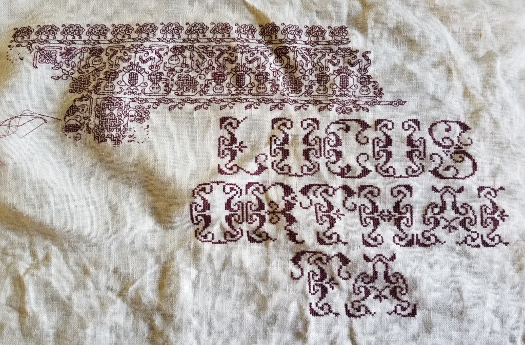
Let’s start with one of the more outrageous. It’s a phrase in an non-Terran language, picked up from my one of my Resident Male’s writing ventures. The book itself isn’t out yet, but I can say that in the text, it is translated as “Life’ll kill you.”
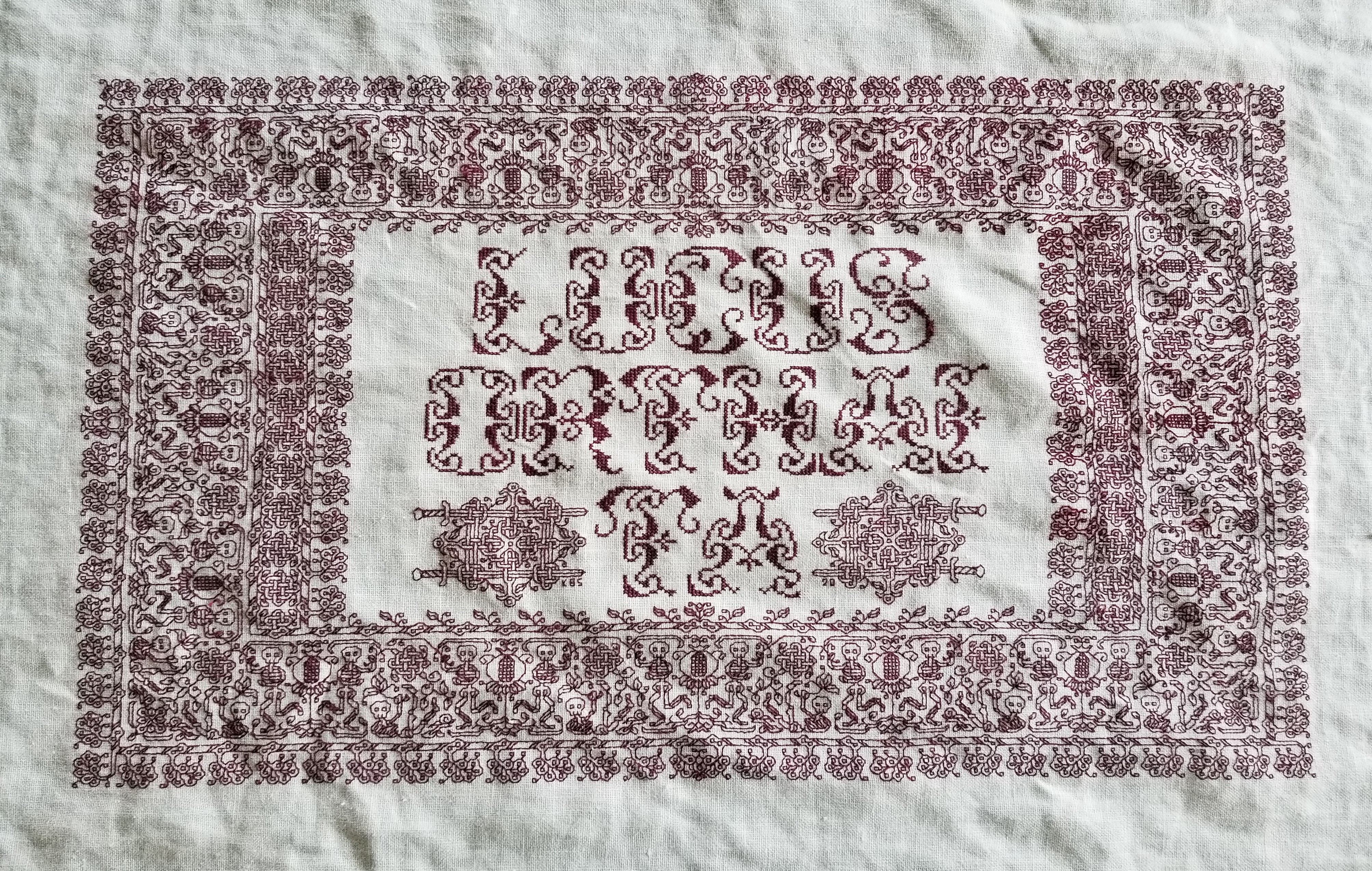
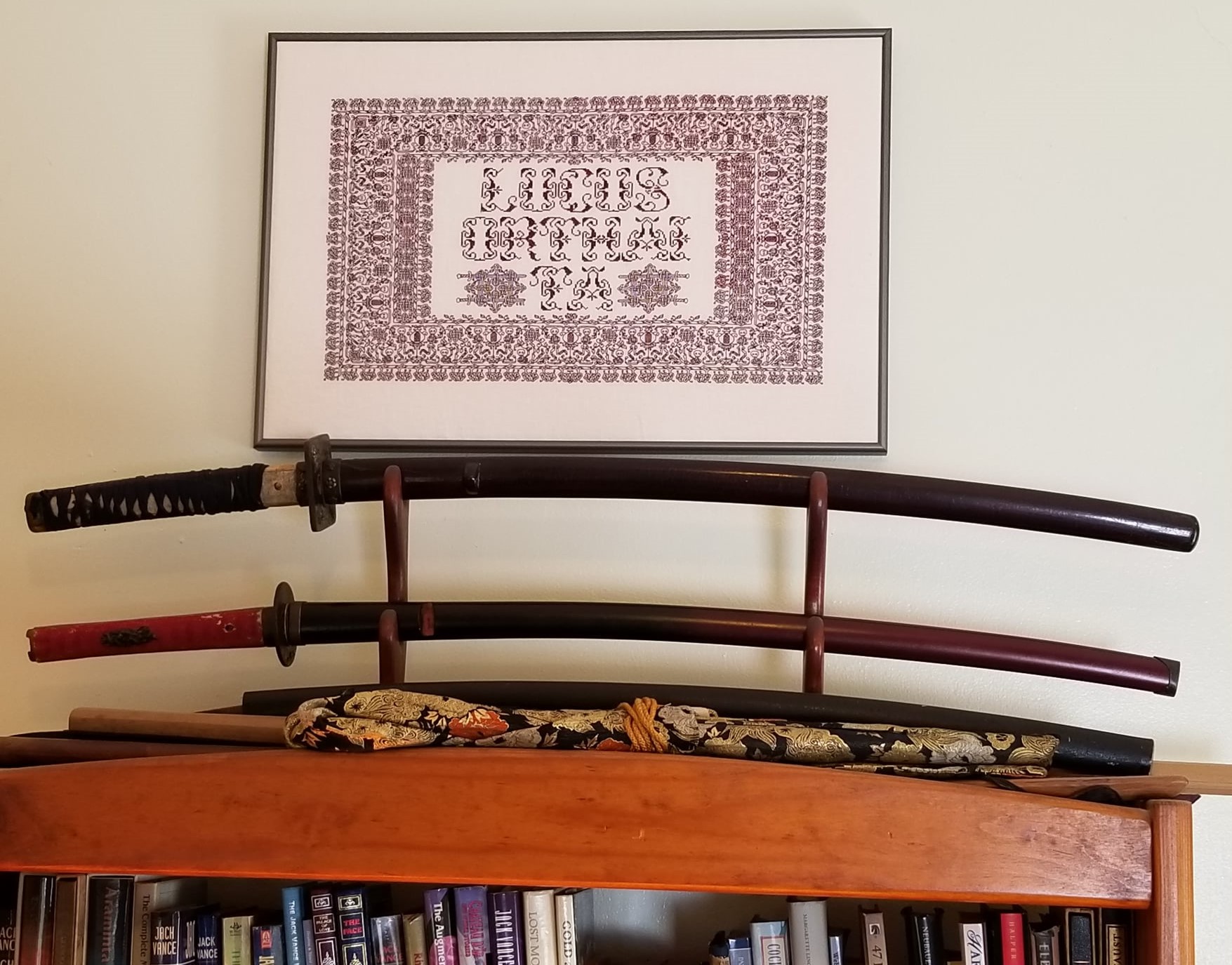
Ringed with my dancing skeletons, and bedizened with sword bearing interlaces to echo the stated meaning, I wanted to use an almost unreadable other-worldly set of letter forms; shapes that themselves danced. I went to my go-to spot for graphed alphabets – the free Patternmaker Charts collection of antique Sajou, Alexandre, and other leaflets. This one is from the Rouyer #248 booklet. I kerned and leaded the rather large letters tightly, to accentuate the flow of the curls across the words. (Kerning is the space between letters, leading is the space between lines of type). In terms of composition, the three words are centered, with no regard for how the letters stack vertically. These letters are also proportionally spaced because they vary so much in width, and cannot be easily worked monospaced (the way an old fashioned fixed-width Courier typewriter prints.)
Here’s another where I tried to fit form to the statement. The full chart for Don’t Panic is free here on String.

Yes, I know in the Hitchhikers’ Guide books the phrase is described as being “in large, friendly letters,” but this was going into my office where I managed frantic people wrestling deadlines under extreme pressure. I thought a jittery sign would be funnier. My favorite source to the rescue, this alphabet is from Sajou #325. It drips nervousness, even though the firm serifs imply regular stability.
Note that as with many of these vintage alphabets, the letters I and W are omitted, in keeping with the paradigm of classical calligraphy. I extrapolated the I, and doodled a matching apostrophe. Again, I kerned tightly, although I’m not fond of the space between the A and the N. I should have tucked them closer together, as I did between the P and the A. But As are problematic. I also chose not to center these words one on top of the other. The offset adds to the perceived unease.
Here are two more (slideshow presentation to save space, click on arrows beside the photo to advance). In these I chose to use the words as horizontal bands of ornament, flush left and breaking words when I ran out of space. I went back and eked out the bands to come up to the right margins. Mostly I did this because I was impatient. I didn’t want to take the time to do a full arrangement of the motto as it would appear before working the rest of the piece. I knew I’d have space to work the full quotation, but just stitched them letter by letter, with no advance planning. Since I had seen historical samplers that did just that, I felt confident beginning flush left and cutting words in the middle as space dictated.


I am not sure where I got the alphabet for the “Do not meddle in the affairs of wizards” piece. I stitched it circa 1994/1995, just before I began keeping a blog. Obviously the source followed the additional classical convention of presenting just a V shape to cover both that letter and U. I’m also pretty sure I extrapolated the I. In any case, the thread count on this one is no where near as fine as on the others above. There was less room for larger lettering, and I had to find something small enough to fit (most of) the words in, with minimal truncation.
The Arthur C. Clark quotation uses another alphabet from the Patternmaker collection, this time from Sajou #55. It may even be the project on which I stumbled across that source. Being a two-color piece, I wanted something that combined both, and that had an old-fashioned, formal look without being very stuffy. The red swirls suggested a bit of obfuscation and incantation as they tendril around the more solid letter forms. Again I extrapolated the I (thankfully there are no Ws in the phrase). This alphabet with the exception of the I has a very blocky, chunky and solid appearance in spite of the red whisps. There was no need to play with kerning, and spacing between words was easy and regular. The general look of boxy solidity underscores the sentiment expressed. For the A.C. Clarke attribution, I was lucky to find a tall and narrow alphabet in Sajou #172 to fit remaining space on the final lettering line. I will say that after this piece I lost my appetite for broken words.
At the risk of alienating all, my two coarse language pieces (behind the eyeball fig leaf image, also in slide show) use formal typefaces to express very informal and direct sentiments. If you are easily offended by rude words, skip ahead.
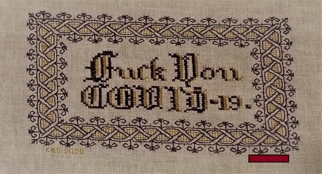
The Covid sentiment, done in a blackletter typeface, uses two alphabets from a German book, available on Patternmaker Charts. One is uppercase, the other lower. The lower case alphabet also supplied the numbers. Again I had to invent a matching letter I. Blackletter family typefaces are reserved for formal documents like diplomas, and newspaper mastheads here in the US. I wanted to play on that gravitas.
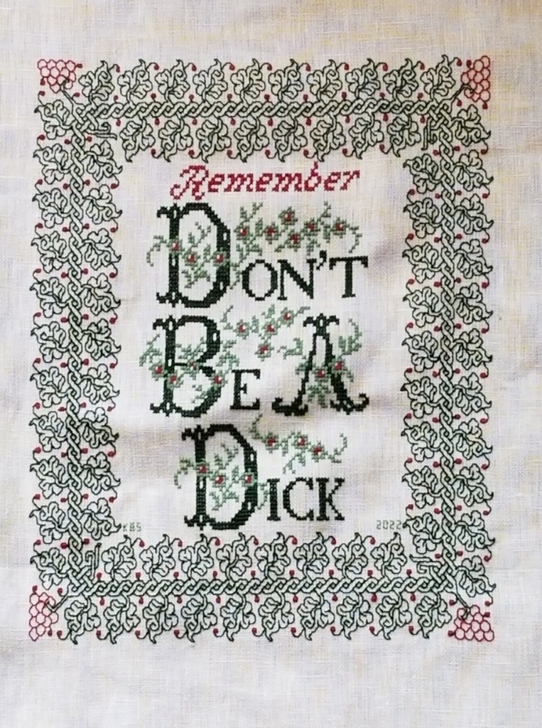
Similarly, for the admonition done in green, I wanted to evoke the greeting card world of hearts and gentle sentiment, to contrast the general scolding represented with sweetness and light. I picked one of the flowery alphabets from Patternmaker Chart’s Sajou #160 but leavened it with a smaller yet still uppercase typeface for the rest of the lettering. That classic form serif alphabet is from Grow and McGrail’s Creating Historic Samplers. The R of Remember is from Sajou #1 also on Patternmaker Charts, and the lower case lettering for the rest of that word can also be found in the Grow and McGrail book. I also adapted the floral ornaments from the initial letters for use as fill to surround the lower case one.
Pay Attention to Trifles has the most typefaces I’ve ever used on a single piece. I wanted the word Attention to leap out, Trifles to be the most ornate, and the message to be decoded only on a second glance. And I wanted a vaguely carnival type over the top mix of styles to complement the extremely busy design that is stuffed full of buried “Easter Eggs” as requested by the recipient.

All of these are from the Patternmaker Charts website.
- Pay – Sajou #652
- Attention – Sajou #654
- Even to – Alexandre #143
- Trifles – Sajou # 53 and 203
The dual tone coloration on these was not always noted in the original. Some I tarted up myself. I kerned each line separately, trying to best suit the alphabets being used, squishing ATTENTION a bit made it shout louder. Letting the other lines straggle a bit more made them a bit more lyrical.
While busy, the mad assortment is just over the top enough to gentle the nagging advice of the motto. If I had done the entire thing in the same face as Attention, the statement would have been way to strident. Throw in a bit of whimsey and it becomes an in-joke between the donor and the recipient. The centered text with the balanced motifs left and right is in contrast to the rather chaotic jumble of gears done in inhabited blackwork. There is repeating arrangement of the gears (more or less), but not the strict centering of the lettering. I think that adds to the haphazard playfulness of this piece.
I have done lots of other pieces with mottoes or words on them, but they don’t really showcase different approaches. The last one I’ll cite here is the piece on which I’m currently working. I’m almost done with the penultimate band, and have designed another custom-fit to go below it and end off the work as a whole.
I can’t say for sure where I found the alphabet I modified for use on this one. I found the image in my notes folder, with no attribution other than mid-March 2020 save date. I ended up upscaling from the typeface as charted by using a block of four units for every single unit in the original, and smoothing angles accordingly. Using the squared fill for the shadowing was intended to make the text reminiscent of a brick wall. That the span of the words is larger than the rest of the piece and contributes to that effect is serendipity, not planning. My count was off, and (thankfully) having started in the center, at least the motto protrudes mostly evenly left and right, looking even more monumental than I had planned.

I did kern aggressively to make the motto fit the space, but I should have lost one more unit between the B and Y of by. Still, I think it works. It’s blocky, yet because the letters are represented by outline and shadow, it contrasts nicely with the rest of the piece, overrun as it is with very busy fills.
OK. A conclusion now. Sort of.
If you are designing your own motto bearing piece, there are lots of choices out there that can make a real impact on the design, above and beyond the decorative elements that surround it. If you are unburdened by time/place restrictions (you are not designing a piece in the style of a specific location, school, style, or era), you are free to play. Think of the lettering as another element you can manipulate to underscore the message of your motto, or to convey a mood in which you would like it to be received.
Want to be playfully threatening, like an admonition to keep the kitchen or bathroom clean? How about using a different typeface and font size for each letter, to make it look like a ransom note. Want to convey warm wishes and affection to your extremely sweet and caring (but possibly somewhat humorless) family member? How about one of the ornate flower-bedecked alphabets from around 1900? Have a Goth leaning pal whose heart beats for irony and sarcasm? Use that same flower font in funereal black and purple to express an over the top sentiment.
You can speak words with typeface choice, font size, color, and spacing beyond the actual ones you stitch.
INTO UNKNOWN SEAS – METHOD DESCRIPTION
A couple of people have sent me private notes asking about how I go about designing a larger project without graphing the entire thing. I attempt to answer, using the current Dizzy Grapes sideboard scarf/placemat as a possible approach.
It’s true I didn’t know how I was going to proceed when I began this project. I had a graph for the main field repeat, but only one iteration of the design, but not a chart for the entire area that design would inhabit. I didn’t have a border (yet). I had a piece of cloth of dubious cut and unknown count, and I had picked a thread well represented in my stash, with known easy-care laundry properties. I knew I wanted to make a large placemat type sideboard scarf, as big as attainable given the materials on hand.
The first thing to do was to figure out the largest possible area I could stitch on my unevenly hemmed ground. Leaving a bit of a margin around for easy hooping, I took plain old sewing thread and basted in a to-stitch area, with a bit of a margin. In doing this I discovered that the person who had reclaimed this bit of antique linen and done the crocheted edge treatments had a rather liberal interpretation of rectangles in general. Once my edges were basted in, I used simple measure/fold to determine the center lines, both north/south and east/west. Those were basted, too. Here’s that first step:

I also determined the thread count of this well washed, buttery soft vintage linen. It averages about 32 threads per inch, but is quite uneven, ranging from 28 to 34 in places, but didn’t dwell on that beyond satisfying myself that there was enough “real estate” inside my designated area to accommodate at least two full repeats of my chosen design across the narrow dimension.
Having the dead center of the piece determined, I chose a center point on the field design. I could have used the center of the smaller motif. That would probably have been easier, but I wanted the large rotating floral shapes to dominate instead of the largely unworked area surrounding the smaller motif. That was a bit tricky because the motif has a square unit in the dead-center, but I worked that straddling my basted center mark. Then I began working, snipping back my basted center guides as I went. (From here on the piece is shown rotated, with the narrow dimension north/south and the wide one east/west).

The shot above shows that first center motif in process, with the center guides being snipped back as the work encroached.
From there it was a simple matter of adding more floral motifs and the smaller X motifs they spiral around. Then after a group of four florals were complete, defining the space between them, centering the free-floating X in that area. Here are shots of those two processes. Note that as a Lazy Person, instead of tedious counting in from the established stitching, I used temporary basting to determine the centerpoint for the free-floating X motifs.
How did I know where to stop? No clue initially. I figured I’d get as close to the edge of my defined real estate as I could with full motifs, then pause to assess. It’s clear in the left photo that another full cycle of the repeat would not fit neatly between the established work and the basted guideline. But that area is also a bit wide to be entirely border. The proportions would be off. Plus that small X motif in the center bottom looks odd without at least a partial snippet of the floral motif spinning off its bottom leg.
So I did a rough count of the width left and decided I wanted a border that was about two inches wide at its widest (about 5 cm). Back to the drawing board to draft out something that complemented the design, and was somewhere around 30 units tall. I doodled up a couple of possibilities before settling on one. One strong consideration was the use of an inner line to contain the field pattern, so it had something even against which to truncate.
Once I had my border in hand, I decided that a bit of the center flower in its repeat could scallop below the basted edge line, so allowing for those 6 units, I counted up from my basted edge guide, and beginning at the center point I started the border of the first side. Then I worked right and left until I got to the edge of the “uncertainty zone” – the area as yet unworked at the left and right of the piece. Here’s the first side’s border in process.
As I established the border’s top edge (that field containment line), I went back to the main field, and worked the truncated snippet of the floral motif to fit. You can see that first snippet in the photo above.
Now on to that second side. But I had a cheat! Instead of starting it by counting down, I looked at that center floral snippet on the first side. Then I worked the floral snippet on the opposite side to the same point. That established the containment line on the second side, and I began the border at the center of the second side, working out to the left and right.

Now on to the ends. You can see now that I’m making these decisions on the fly. When I started I had no clear idea of what I was going to do beyond “Field. Border. Big.” I’m handling the problems and decisions as they are encountered, with minimal fretting about perfection along the way.
I chose to do butted borders on this piece. Neatly mitered, squared, or fudged border corners do exist on historical pieces, but they are in the minority. Even though my self-designed border isn’t particularly period representative (those repeating centered units with their own bounce repeat, as opposed to simple twigs all marching it the same direction), I wanted to use a non-mitered corner. I could have ended each off, designed a separate corner square, but I didn’t want to introduce another design variant – the border was already too busy.
Where to start that side border? What happens to the longer top and bottom borders? Do they just end or should I try to end at a visually logical place? Well, I chose the latter. I kept going on the bottom border to the right until I ended at the center of the bounce repeat. It’s just a few units shy of my designated basted edge. Not a lot of waste there. And knowing the height of the border, I established my north-south containment line.

You can see that I’m working on the first of the two spin-off floral sprigs along this side. When that’s done I will go to the centerpoint of the right hand edge and begin working the border from there, headed back to the corner shown. The side borders will end where they end. They will truncate oddly for sure, but having made the bottom and top congruent, what is on the sides, will be what it is. The side as a whole however should truncate in the same spot where it meets up to the border on the top. But no one is perfect. If it’s off by a unit or two, I will have accomplished the same degree of precision as most of the Ancients. They weren’t perfect either.
Stay tuned! The Grand Excitement of seeing the final product remains; and with it how things meet up, how close to symmetry I achieve, and how any as yet unknown problems are solved. And that’s before I decide how I’m going to edge and trim the piece out. Needle lace and/or a withdrawn/pulled element hem are both possibilities I haven’t yet ruled out.
So there you have it. Another adventure in bungee-jump stitching – starting a project with little or no detailed planning, no full project chart (just a partial chart showing the minimum needed), and no clear idea at outset on handling challenges encountered en route. I hope sharing this process inspires folk to take up their own self-composed projects.
BLACKWORK THREAD THICKNESS AND GROUNDS
I’ve recently had chats with several folk who ask about the number of threads they are supposed to be using when working linear blackwork (fills or the strapwork designs commonly done in double running or back stitch).
I attempt to answer, and the answer isn’t a plain, flat “always.”
There are several factors to consider for counted work. First there is the ground fabric. Some people favor purpose-wovens like Aida, Hardanger, Monks’ Cloth or Anna Cloth. These are made with large, prominent holes for easy counting. They come in a variety of stitch-per-inch (or cm) sizes. They range from 9 to around 22 stitch per inch (aka “count”). The more stitches per inch, the smaller those stitches are.
Other types of grounds are also used, with even weave (or near-even-weave) being less popular than the purpose-wovens. These grounds are flat tabby woven fabrics. They do not have a system of prominent holes for easy counting – to use them the stitcher counts the threads of the weave itself. Most sold specifically for embroidery are more or less true and square, with very close equivalent measurements of the threads running the length of the bolt (the warp), and across the bolt (the weft). The measurement of fineness of weave for these fabrics is expressed as threads-per-inch (or cm), and they can range from around 20 threads-per-inch (tpi) all the way up to 50 tpi or more. Stitchers generally work over a visualized square of 2×2 threads, so a 24 tpi piece of even weave would yield the same 12 stitches per inch as 12-count Aida, but the holes between the threads would be far smaller and less obvious.
Now aberrations exist. Not everyone works over 2×2 threads on even weave, and it is possible to work counted styles on anything you can actually see well enough to count, whether or not the warp thread count is even close to that of the weft. But in general, the ground cloth world splits into purpose-woven/larger more prominent holes; and (near) even weave/smaller, less evident holes.
On to thread.
It’s all over the map. The most common thread used today is standard 6-ply embroidery floss, but there are hundreds of other options. And even plain old embroidery floss is NOT uniform. Not even if they are of the same fiber. For example, DMC and Anchor cotton flosses have very slight differences in ply thickness, with the DMC (most of the time) being ever so slightly thicker than the Anchor. And even within a line, there can be variation because different colors take up dye differently, or because of visual impact of the color used (a dark thread will often appear heavier than one of a lighter color, even if there is no actual difference between them). And if you begin comparing across fiber types/spin types even more complications ensue – One ply of DMC cotton 6-ply is thicker than one ply of Au Ver a Soie six-ply silk, for example.
Here are three examples on even weave (please excuse me for not having Aida samples to hand – I don’t use it.)
First, here is an example of 32-count even weave linen (16 stitches per inch), worked with two strands of a six-ply silk – a small lot product produced by a boutique hand-dyer. Note that the individual stitches are about as thick as the ground cloth’s weave. They fill the holes into which they are stitched completely, and in fact are a bit jammed up into them, making intersections just a bit muddy and tight:

Here is that same ground, worked using just one ply of the same thread used in the previous sample.
You can see that the stitched thread is significantly thinner than the ground cloth’s weave, and that corners and angles are sharper. But the stitching thread still fills the holes, and doesn’t “rattle around” in them. There is another difference – the stitching doesn’t look as even. It’s harder to achieve a uniform appearance with skinny threads, but the difference that shows up in extreme close-up is less evident at normal viewing distance.
Which is better? It depends. One or two threads are both suitable for use with this fabric. Do I want a light and lacy effect? Do I want something darker and more strident? Should I accent the close, dense and angular aspect of a design (as on the left), or should I try to bring out the curves and delicacy (on the right)?
By contrast with these two balanced examples, there’s the piece I am working on right now. I am working the black bit with one strand of standard DMC 6-ply cotton floss. It’s about 14 stitches per inch (28 threads per inch).

Obviously the count on this stuff is skew. It’s not true even weave. Were it so the enmeshed ovals would present more like circles. But it’s close enough so stitched-it-will-be. Look closely at the size of the thread and the holes in the weave. Even though the black thread is slightly thinner than the fabric’s threads (like the lacy sample above) – look at it in comparison to the gaping holes between the fabric’s threads. It’s tiny and spindly. It’s lost. It wobbles. Corners are extremely difficult to keep square, angles are being pulled, and the threads that make up the design do not present in nearly as neat rows as the previous example. This same ground, with two plies of DMC? Much better looking:

In this case, I would advise AGAINST using this particular ground with only one ply of standard floss. It’s holes are too big. I’ll finish out my black interlace mask pieces, but I won’t be using a single on this stuff again.
And mixing thicknesses? It’s a great tool. Jack Robinson – the UK’s Blackwork Patron Saint (now of blessed memory) – was a strong advocate for both historical and modern pieces that mixed thread thicknesses.
Here are a couple of examples of doing so, from my own work. I find it of special use for giving modern-style voided pieces a lighter background touch, although I have also used it to de-emphasize veining inside particularly complex leaves on non-voided work.
First: In addition to using a different background pattern for each, the yellow ground on the left is done with one strand of DMC floss, and the yellow ground on the right, with two so you can see the density.
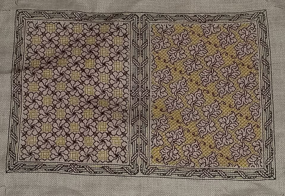
Second: Foreground and background in the same color, but the foreground is worked with two strands, and the background with one.
Now how does this work out on Aida? Again, I apologize for not having samples to hand. I don’t use it. The reason why I don’t is that I find the holes to be a visual distraction that take away from the presentation of the work as a whole. I’ve seen magnificent stitching on Aida, and I throw no shade on those who prefer it. But to me those holes can be way too big for the thread choices many people use. Like my wobbly sample above, the threads have too much play, and even tension without distortion at the corners or avoiding jaggy lines can be more difficult to control because the holes are big compared to the stitching thread.
For myself and my own work aesthetic, I prefer a well-stuffed hole (sometimes bordering on over-stuffed), and select my threads accordingly. One strand on Aida? I’d suggest two. Or three if it’s 12 or 14 count. But as in all things, my practice is not a yardstick by which you should measure your own preferences.
Look closely at your product. Try to understand why the threads behave as they do. Are you happy with your stitching? Think about your design goals. Even if you are interpreting a pattern by someone else there is plenty of scope in there for your own design choices. Thread thickness and proportion to the ground and to the size of the holes are just more variables you can play with to make any piece visually distinctive and uniquely yours.
Remember my family’s latke rules. Every family’s latkes are different, and every family’s latkes are the best. The same goes for stitching.
PROOFING
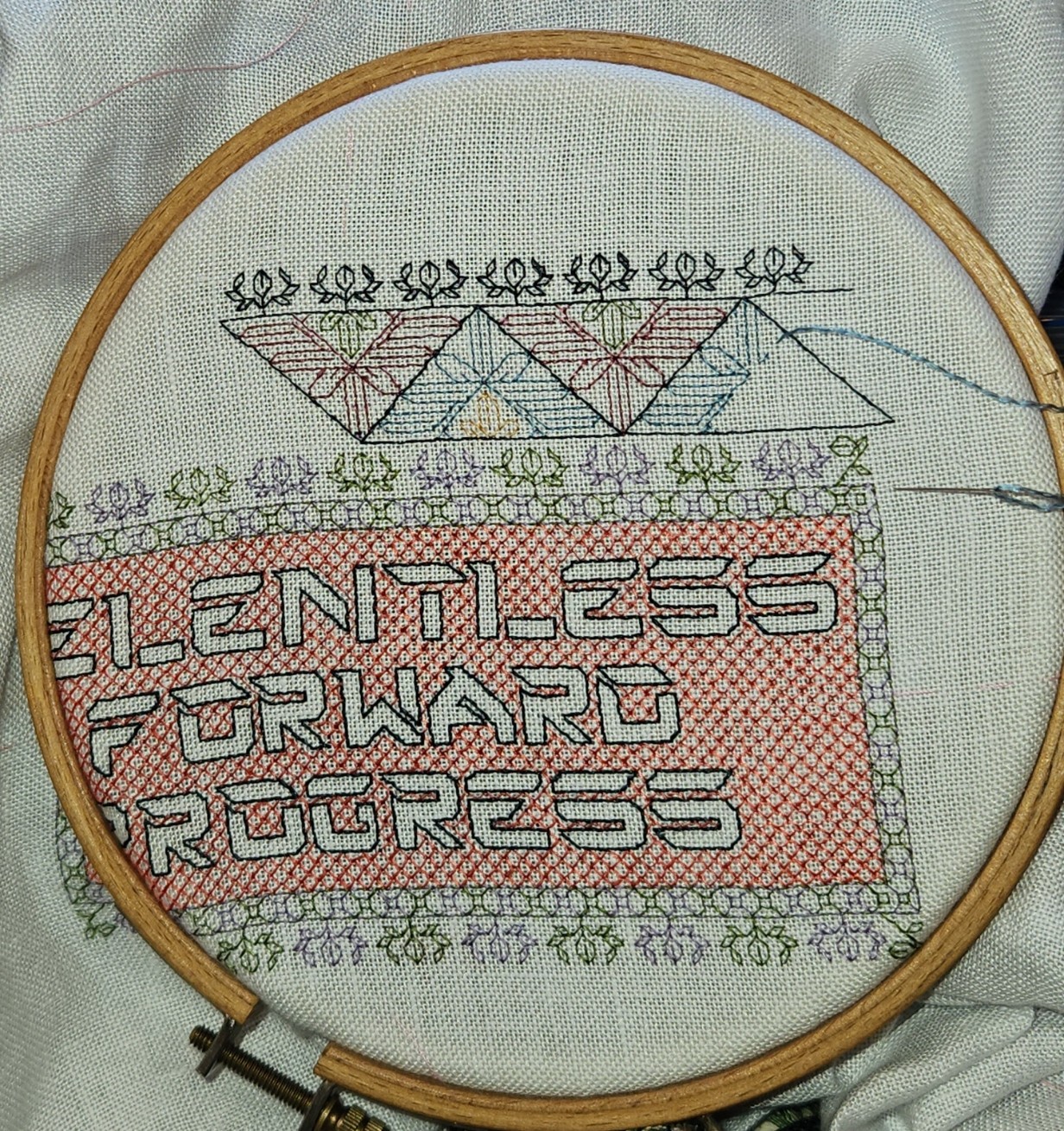
And we march around the perimeter, making skeleton after skeleton.

I’m just shy of half-way now, and I had to extend a tendril out to that point to make sure that I’m hitting my center mark. And I did!

As you can see comparing the blue line on the photo and the red line on the snippet of my chart, I’m spot on for alignment – not even a thread left or right of my center line.
One question I keep getting is how I maintain my location and ensure everything is in the correct spot without pre-gridding my work (without basting in an extensive set of guidelines to establish larger 10 (or 20) unit location aid across the entire groundcloth). I generally reply, “By proofing against established work,” but that then generates the second question. “How?”
So I attempt to answer.
For the most part I almost never work on fully charted out projects, with every stitch of the piece carefully plotted in beforehand. I compose my own pieces rather than working kits or charts done by others, and as a result I never have a full every-stitch representation as my model. My working method is to define center lines (and sometimes edge boundaries), but I pick strips or fills on the fly, starting them from my established centers, and working from smaller charts that are specific to the particular motif or fill that’s on deck. However, if lettering is involved I am more likely to graph that part out to completion prior to stitching, to ensure good letter and line spacing. (Leading, spacing, and kerning are close to my heart both as someone whose day job deals in documents, and as a printer’s granddaughter.)
For this project I DID prepare a full graph to ensure the centered placement of my very prominent text motto against the frame. I also wanted to miter the corners of the frame (reflect on a 45-degree angle) rather than work strips that butt up against each other, AND I wanted the skeleton repeat to work out perfectly on all four legs of the frame. To do that I had to plan ahead more than I usually do. (Note that the repeat frequency of the accompanying smaller edgings are different from the skeleton strip, so I also had to “fudge” center treatments for them so they would mirror neatly – another reason to graph the entire project).
But even with a full project graph available against which work, I didn’t grid – I worked as I always do, relying on entirely on close proofing as I go along.
The first step is a “know your weaknesses” compensation. To make sure I am on target I almost never extend a single long line ahead of myself, especially not on the diagonal because I make the majority of my mistakes miscounting a long diagonal. Instead I try to grow slowly, never stitching very far away from established bits, so I can make these checks as I work:
- Does the stitching of my new bit align both vertically and horizontally with the prior work? Am I off by as little as one thread? Am I true to grid?
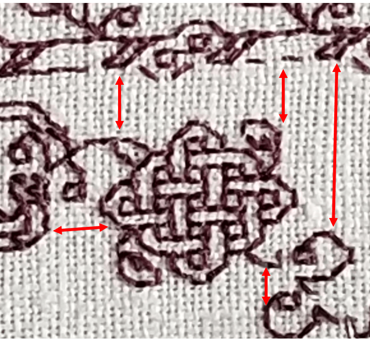
- Is my new bit in the right place? Does the placement of the design element align with what’s been stitched before? For example, in this case, is do the toes of the mirror imaged bois back to back to the pomegranates match in placement in relation to each other and to the bottom of the pomegranate’s leaves?

Are my motifs in the right place?
- Am I working properly to pattern? It doesn’t matter if I am using a small snippet with just the strip design or fill that’s being stitched, a full project chart, or (as I am now) using prior stitching as my pattern – copying what’s been laid down on the cloth. Am I true to my design as depicted?


(Note the compression due to uneven thread count of the fabric.)
As I work, I constantly proof in these three ways – checking to make sure that my work is true. And if I discover a problem, I trace back to see where I went wrong, and I ruthlessly eliminate the mistake. For the record – there’s nothing to be gained by letting off-count stand in the hope of compensating later. Trust me – you’ll forget, mistakes will compound on mistakes, and you’ll end up wasting even more time, thread, and psychic energy on the eventual fix.
I hope this explains what I mean by proofing as you go. I know for most of the readers here, this will be second nature, and they won’t have thought of it as a disciplined approach, but for newer stitchers the old maxim “Trust but verify” should become a mantra. Verify, verify, verify. The sanity you save will be your own.
Finally, for Felice, who doubted I was using double running stitch for such a complex project in spite of the in process photos that showed the dashes of half-completed passes, here’s the reverse.
Yes, I do use knots for work with backs that won’t be seen, but I do it carefully so that the knots don’t pull through. Point and laugh if you must, but I reserve the right to ignore you.
DANCING AROUND THE CORNER
Having gone on and on about straight repeats as my bony bois march across the top of my piece, we have now come to the first corner.
Thankfully, my count is spot-on and everything is in place.
But why did I start with the strip of skeletons doomed to dance upside down? Because I knew that I would probably make some tiny adjustments to the design as I went along. The viewer’s eye is drawn to the closest point of the work, and the most logical part – that’s always the strip across the bottom, where the motifs are all right-side-up.
It’s unlikely that any small tweaks would be noticeable in the upside-down part at the top. So being too lazy (and waaay too short of thread I can’t replenish) I started there, knowing that I would not be ripping back vast regions to norm those tweaks.
Closer up, in a more normal orientation:
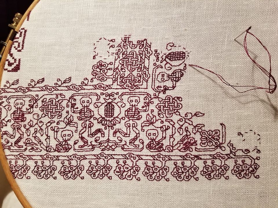
My last post discussed the non-historical use of the same framing element on either side of a mirrored repeat with horizontal directionality. Here’s another feature of this strip that’s not often seen in museum artifacts – the mitered corner.
The majority of corner treatments in surviving historical fragments have butted-up or improvised corners. Carefully plotted mirror images across a diagonal (mitering) are quite hard to find. But I decided to do one anyway. You can spot the diagonal running through the center line of the rightmost internal knot, down through some leafy bits, and into a flower-like shape. I’ve also established the beginning of the 90-degree flipped border, with the upper part of that skeleton plus the first pomegranate underway.
I’ve also rounded the outside corner. In a serendipitous happenstance (I can’t claim I planned it ahead of time), the width and height counts of my marching plumes are equal, so I was able to fudge the corner with one last plume on a long stem.
Side note: At this point I really don’t need to refer to my printed pattern any more, I am mostly working off prior stitching, with occasional glances back at my chart to make sure all is aligned and true.
But that inside edging – it’s different. I’ve introduced another element, playing with the eternity knots and tying them into the plume strip. I did this because the thread count of the warp (the threads that stretch up-down in the detail photo) is denser than the thread count of the weft (those that go across in the detail photo). The closer together the threads are, the more compressed the design will be in that direction. My skeletons marching up/down the sides of my piece will end up looking ever so slightly shorter and chunkier compared to their more lanky brothers that tumble across the top and bottom. BUT I can draw the eye away from that difference by adding the additional knotwork strip.
So it turns out that my design is all about insouciance, breaking historical composition precepts, and visual deception. Still for all of that I think that its look is more closely aligned to the aesthetic of historical blackwork rather than more modern pieces. Just my opinion, feel free to differ.
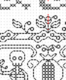
Class Handout Page
And for having the patience to read down this far, here’s another present. I was going through some older files and came across this class handout page. I’ve taught several workshops using it. The last one I came equipped to do was for a public SCA demo in Rhode Island, although the circumstances and attendees made just sitting and chatting about the stitching a better option. Still, I did update the handout, and it may as well be of use to someone.
The patterns are (more or less) ordered in level of complexity, and are intended to be a self-tutorial in double running stitch. When I teach I provide the page below, a strip of Monk’s cloth and length of standard embroidery floss and needle, plus an inexpensive hand hoop (if I have some to spare). Depending on prior experience, stitching proficiency, confidence level I encourage the participant to select one of the designs from the leftmost two columns, to try out face-to-face in the workshop. Then I encourage everyone to use the rest for self-study at home.
For self study, what I suggest is to just grab a piece of cloth and begin – no need to plan an intense, composed sampler. Pick a point anywhere on your chosen ground, then starting at the spot in the upper left column where you feel comfortable, continue down that column to the simple acorns. Then keep going. The next design in the complexity sequence is the flower spring at the top of the next column. Go down that column to the folded ribbons.
After that, I’d suggest attempting the birds at the bottom left. From there the vertical star flowers, then the knots, four-petal flower meander, and the design immediately above the title. Once you’ve done all that the remaining four intermediate patterns on the page should be well within your grasp (the heart flower all-over, fancy acorns, geometric strip, and oddly sprouting peppermint-stick squash blossoms).
Of course you can be totally random and just use these designs as you will. No need to march in lock step with the protocol, above.

Download this handout in PDF format from my Embroidery Patterns page. It’s the last one listed (click on the thumbnail there to get it, then save it locally).
As ever, if you stitch up something from any of my designs, please feel free to send pix. I always get a big smile out of seeing you having fun with the pattern children. And if you specifically say so and give permission to re-use your photo, I will be happy to post it here and index it under “Gallery”.
BOOKMAKING 108: RIPPING OUT AND RECOVERY
The last post of mea culpa probably left people wondering how it was going to all turn out. Here’s the result:

I only needed to tease out one straight line of stitching – the former rightmost edge of the previous side. Now the two borders join to make one larger mirrored strip that takes up the spine area and wraps around to be visible on the front and back. Not as I originally planned, but acceptable.
And I have been able to keep going on the second side, working my double leaves in red, and the diamond fill ground in yellow. Again, not as originally planned – the repeats will not be neatly centered left/right, but because this particular fill is eccentric, I bet it won’t be noticed by anyone who isn’t aware of the problem in the first place. (Mom, avert your eyes).
Now on to today’s submitted question:
How do you rip back?
With great care.
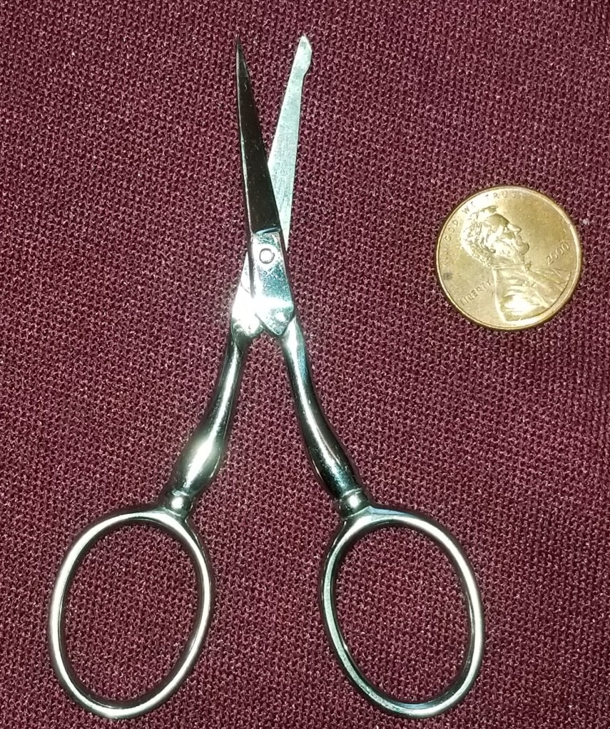
It’s very easy to inadvertently snip the ground cloth, and that’s a tragedy when it happens. But I have some tools that help.
The first thing is a pair of small embroidery scissors with a blunted tip. These are the latest addition to my ever growing Scissors Stable, and a recent holiday gift from The Resident Male. Note that one leg has a bump on it at the tip. That’s the side that is slid under the errant stitch being removed, to make the first snip. Although these are sharp all the way to the tip, the bump helps prevent accidentally scooping up and nipping the ground cloth threads.
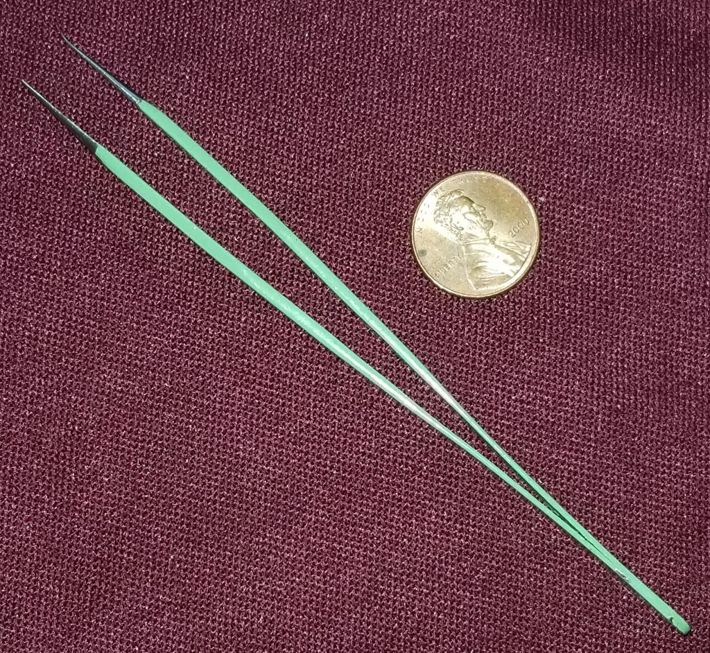
To rip back taking all due care, I snip a couple of stitches on the FRONT of the work. Then I employ a laying tool and a pair of fine point tweezers for thread removal. The laying tool was also a gift from The Resident Male, and replaces a procession of thick yarn needles I used before I had it. My tool is about 3 inches long (about 7.6 cm).

My pair of tweezers is one intended for use in an electronics lab. I found it in the parking lot of a former job, probably dropped by someone testing robots in the back lot. I tried to return it, flogging it around to likely techfolk for several months, but had no takers. Seeing it was to remain an orphan, I adopted it into a new fiber-filled life. I love it. It’s wicked pointy, and even with the dented end (probably damaged when it fell off the test cart onto pavement), does a great job of removing tiny thread bits.
Having snipped the threads on the front, I use the laying tool’s point (augmented by the tweezers) to tease out the stitches in the reverse order they were worked, doing it from the back. Luckily this style of work has a logical order and it’s usually pretty easy to figure that out. But in some cases it gets harder. When that happens, it’s another judicious snip on the front, followed by use of the tweezers from behind to remove the thread ends for discard. (While I can sometimes recover/reuse a live thread after I catch a mistake of a few stitches, in general if the run is long, or I’ve ended off the strand there’s little point in trying to save it and stitch with the now-used and damaged/fuzzy piece of thread.)
If the color is in the least bit friable and liable to crock on the ground fabric, I cut more and pull less – making sure to remove all threads from the back rather than pull them forward to the front. This minimizes color/fuzz shed on the front, public side of the work.
If any snipping needs to be done on the back, flat and parallel to the ground, I pull out another resident of my Scissors Stable – a pair of snips I bought at the SCA Birka marketplace event, two years ago. They look like this:
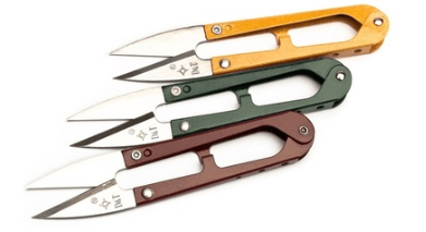
These were a great buy. Inexpensive, super-sharp (I think the snipping action helps keep them sharp), and because they are not held like finger-hole scissors, very easy to manipulate to snip close and flat to a surface.
And what to do if there are fuzzy bits or surface discolorations that remain on the front? Here’s my last resort. I wrote about it before:
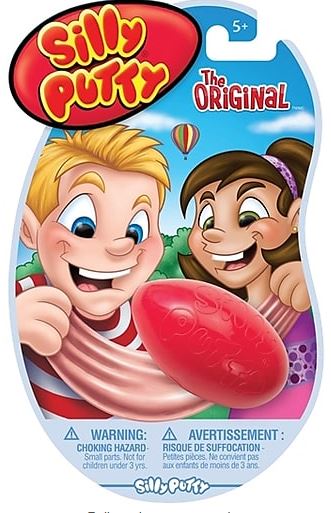
Yes. Silly Putty. I have found that a couple of gentle blots will pick up fuzz and shed bits of color. The trick is NOT to scrub, just support the cloth from the back (I use the top of the stuff’s eggshell container), and press the putty gently onto the affected area – then remove it vertically and quickly. Make sure not to let it dwell on the surface.
I will caution that there is risk doing this. I have no way of knowing if anything exuded by Silly Putty will be a life-limiting factor for the threads or ground in 50 years – if discoloration or other complications might ensue. But the Materials Safety Data Sheet for it doesn’t turn up anything particularly evil, and I am willing to risk it. You will have to make that decision for yourself on your own. Having warned you I take no responsibility if it ends up doing so.
ALTERNATIVE ALPHABET RESOURCES FOR INCLUSIVE STITCHERY
Lately I’ve seen a couple of resources for embroiderers who wish to make samplers or other stitchings to honor friends or family who are differently-abled. I post them here for general reference. [NOTE – THE LINKS BELOW WERE EDITED ON 22 AUGUST 2022, AFTER I LEARNED THAT MR. TAKAHASHI’S WEBSITE IS DOWN.]
First is this alphabet from type designer Kosuke Takahashi. It takes a linear construction alphabet, and overlays Braille dots on it, to form a construction that can be read by those familiar with both type forms.

Sadly, Mr. Takahashi’s website appears to be down, but the article about his invention along with a better visual of the material above can be found here, on Colossal. The author’s old site noted that his workis free for personal use. If you want to compose an item or design for sale, you would need to contact the designer to license the font.
Second is a linear stitch interpretation of the sign language alphabet.
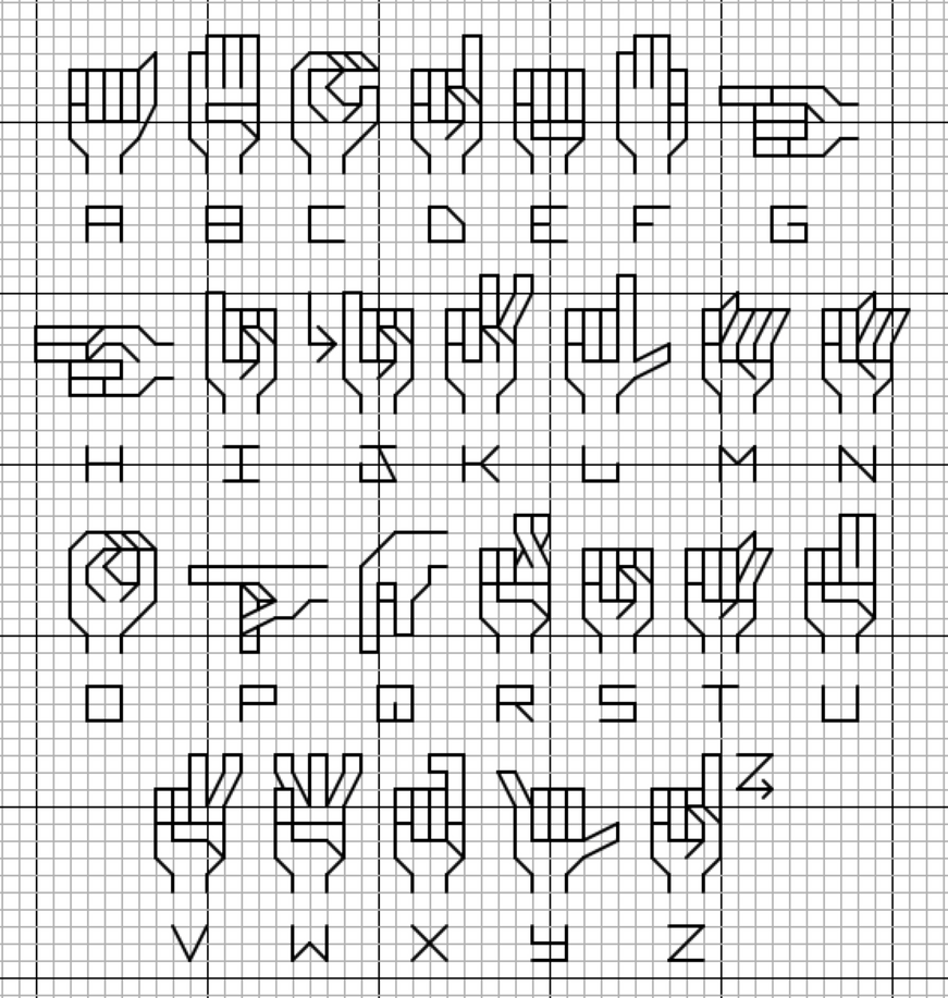
The source is Deviant Art board poster and cross stitch designer lpanne, and is under her copyright. Again, if you create anything from this for sale, please take the time to contact the artist and ask for permission.
Although this last item presents text in a non-standard way, for most of us it makes it less rather than more comprehensible. But it’s a nifty idea for the nerdy-minded among us. Artist Sam Meech knits up scarves using ASCII coding, represented by two colors (one for 1 and the other for 0). He’s able to include entire quotations and text passages in his Binary Scarves. He sells them at his site below.

(photo shamelessly lifted from Sam’s site)
You can read more about Sam’s scarves here.
If you want to create your own binary string, tons of text-encoders abound. I used this one to translate
STRING-OR-NOTHING
into
01010011 01110100 01110010 01101001 01101110 01100111 00101101 01101111 01110010 00101101 01001110 01101111 01110100 01101000 01101001 01101110 01100111 00001101 00001010
If this is new to you – each eight digit “word” is in fact a letter. “N” for example is 01101110. The binary scarves work like early paper punch tape, stacking each octet one above another. So the word “STRING” would come out like this:
01010011 = S
01110100 = T
01110010 = R
01101001 = I
01101110 = N
01100111 = G
There was a time in my distant past that I used paper tape, and could recognize and read the octet patterns by sight. But that was long ago, in a technology forgotten by time…
